Chart position — tracked daily by LaunchShots
Screenshot changes — detected by LaunchShots
Screenshot style breakdown
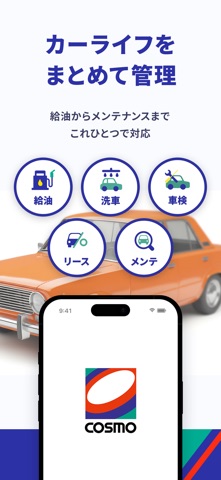
Sampled from 6 of 【コスモの公式】アプリ's App Store screenshots — background, accent and theme, measured by LaunchShots (not something Apple publishes).
#FCFCFC bg
#DDDDDD
#2C34A4 accent
#111111 text
Screenshots


Icon palette
About this app
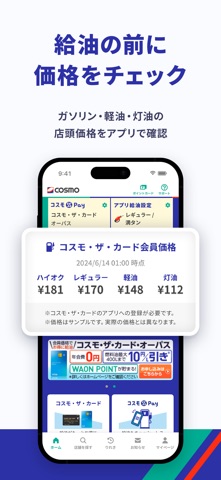
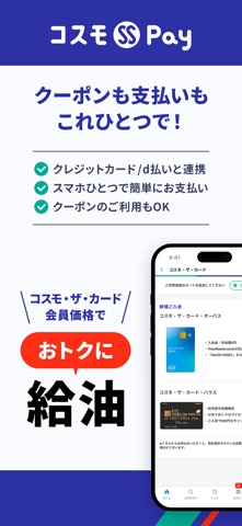
入れとくだけでコスモステーションでのガソリン給油がおトクになる割引クーポンが使用できます!さらにコミっと車検では見積りから決済までアプリで完結、コスモMyカーリースでは簡単にお見積りができます! <主な機能> ●おトクなクーポンで楽しいカーライフをサポート 初回限定の燃料油クーポンでアプリダウンロード後最初の給油は3円/L OFF!! バッテリーやコーティング、洗車などのカーケア商品のおトクなクーポンも届きます。 ※一部、クーポンの利用できない店舗がございます。また、クーポンの内容は店舗によって異なります。 ●アプリ決済(コスモSS Pay)でガソリン・軽油・灯油のお支払いができる アプリにお客様のメールアドレスを登録し、コスモ・ザ・カード、d払いアカウント、提携クレジットカードのいずれかの登録で利用可能。 お支払い方法でアプリ決済を選択いただいた場合、QRコードをかざすだけでお支払いが完結し、給油クーポンがある場合は同時に適用ができます。 ●QRコードをかざすだけで給油前の画面操作が簡単に!アプリ給油設定 事前に「油種…
App details
What you can learn from 【コスモの公式】アプリ
Every shipping app on the App Store has gone through the same decisions you're working through right now: which screenshot goes first, what caption sits over it, which device frame to show, what color the background should be. The 7 screenshots above are 【コスモの公式】アプリ's answers to those questions — they're public, they're real, and they made it through Apple's review.
What the numbers say: 【コスモの公式】アプリ runs a mixed light-and-dark set where the background shifts from screenshot to screenshot (first shot #FCFCFC) — each image has to stand on its own, so the captions carry more of the story. The accent colour we picked up, #2C34A4, is the one to reuse for badges, arrows and highlighted words if you borrow this look. Hit Use this style to open the editor with these exact colours and drop your own screenshot in.
Notice the first screenshot in particular. It's the one users see in search results and on the product page, and it's where most apps spend their best caption and tightest design. Look at the proportion of background to phone, where the text sits, what one thing the image is trying to communicate.
Want to see how other Lifestyle apps approach the same problem? Browse more Lifestyle apps in the showcase.
Take what works into your own screenshots
Open LaunchShots and design your App Store & Google Play screenshots — pick a device frame, drop captions, ship in minutes. Free, in your browser.
Open the screenshot editor →Apps with a similar look
Closest background + accent colours among the listings we've analysed — useful when you want to see the same palette handled by a different team.