Chart position — tracked daily by LaunchShots
Screenshot style breakdown
Sampled from 2 of ゴルフドゥ!公式アプリ's App Store screenshots — background, accent and theme, measured by LaunchShots (not something Apple publishes).
#FCFCFC bg
#DDDDDD
#DC6C2C accent
#111111 text
Reading the caption text from the screenshots in your browser…
Screenshots
iPad screenshots
Icon palette
About this app
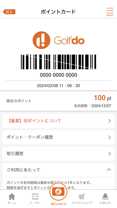
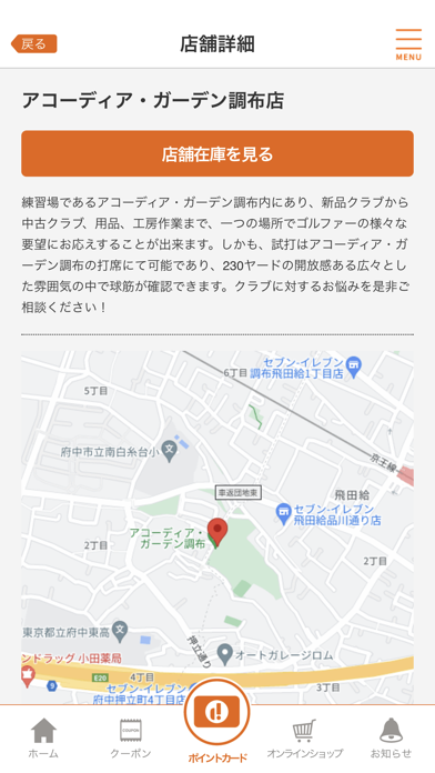
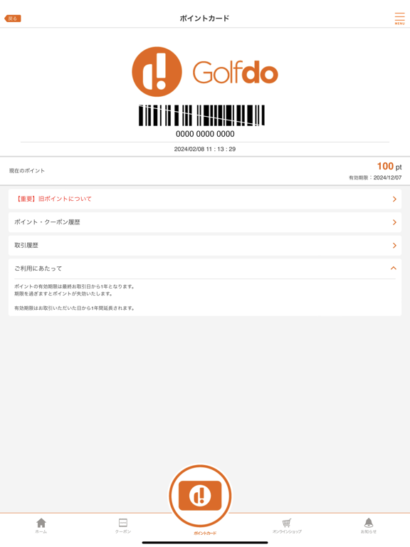
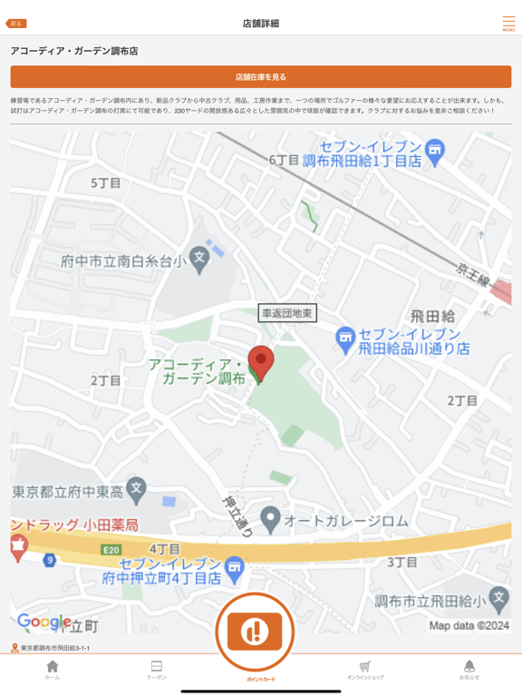
『ゴルフライフをもっと豊かに!』ゴルフドゥ!公式アプリ、パワーアップして新登場! 【アプリの概要】 「ゴルフドゥ!公式アプリ」が全面リニューアル。店舗利用もオンラインショッピングも、この一つで完結。 電子会員カード発行から、限定クーポン提供、リアルタイムなお知らせ、さらにはスクラッチ機能による賞品獲得チャンスまで、 ゴルファーに欠かせないお得で便利な機能を搭載しています。 【主要機能の紹介】 ・電子会員カード: 全国のゴルフドゥ店舗で使用可能。スムーズなショッピング体験を。 ・クーポン発行: 特別割引や限定特典を提供。お得にゴルフ用品をゲット。 ・プッシュ通知のお知らせ: セールやイベントの最新情報を即座にキャッチ。 ・スクラッチ機能: 楽しみながら豪華賞品を手に入れるチャンス。 ・オンラインショップ: アプリから直接、幅広いゴルフ用品を簡単購入。 さあ、今すぐ「ゴルフドゥ!公式アプリ」をダウンロードして、あなたのゴルフライフをさらに充実させましょう! ■サポート情報 ご質問やご提案がございましたら、 …
App details
What you can learn from ゴルフドゥ!公式アプリ
Every shipping app on the App Store has gone through the same decisions you're working through right now: which screenshot goes first, what caption sits over it, which device frame to show, what color the background should be. The 4 screenshots above are ゴルフドゥ!公式アプリ's answers to those questions — they're public, they're real, and they made it through Apple's review.
What the numbers say: ゴルフドゥ!公式アプリ runs a light set with one background colour (#FCFCFC) carried across every screenshot — the listing reads as a single poster when the shots sit side by side in search results. The accent colour we picked up, #DC6C2C, is the one to reuse for badges, arrows and highlighted words if you borrow this look. Hit Use this style to open the editor with these exact colours and drop your own screenshot in.
Notice the first screenshot in particular. It's the one users see in search results and on the product page, and it's where most apps spend their best caption and tightest design. Look at the proportion of background to phone, where the text sits, what one thing the image is trying to communicate.
Want to see how other Sports apps approach the same problem? Browse more Sports apps in the showcase.
Take what works into your own screenshots
Open LaunchShots and design your App Store & Google Play screenshots — pick a device frame, drop captions, ship in minutes. Free, in your browser.
Open the screenshot editor →Apps with a similar look
Closest background + accent colours among the listings we've analysed — useful when you want to see the same palette handled by a different team.