Screenshot style breakdown
Sampled from 6 of Языковая и когнитивная терапия's App Store screenshots — background, accent and theme, measured by LaunchShots (not something Apple publishes).
#FCFCFC bg
#DDDDDD
#3CC4F4 accent
#111111 text
Screenshots
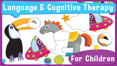
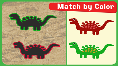
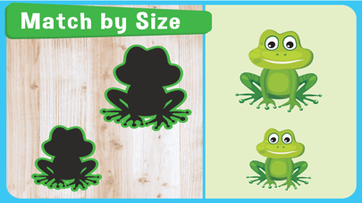
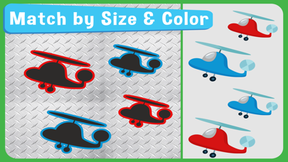
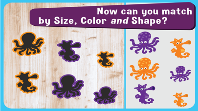
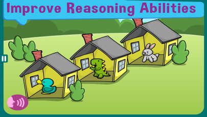

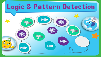
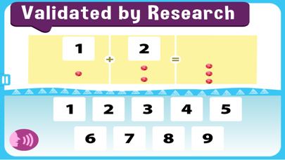
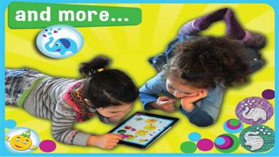
iPad screenshots

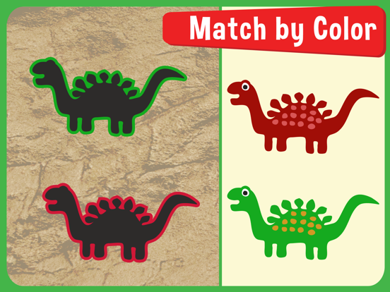
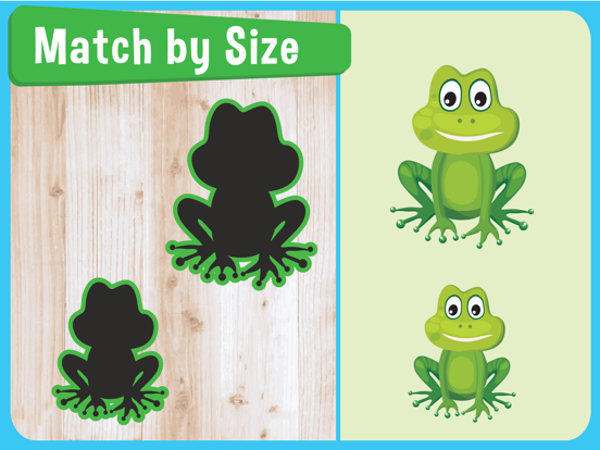

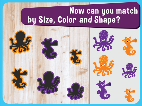
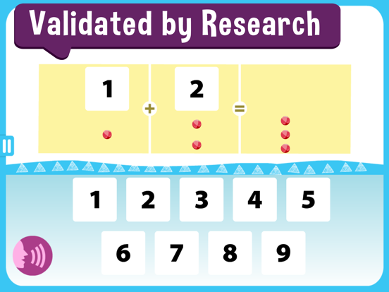


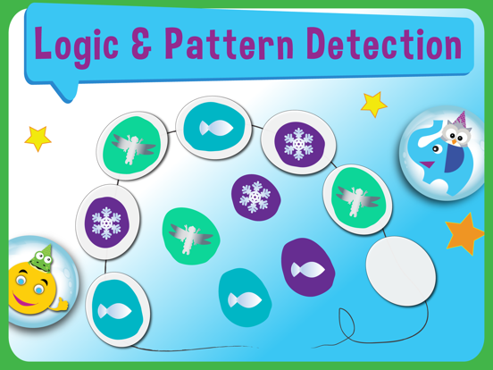
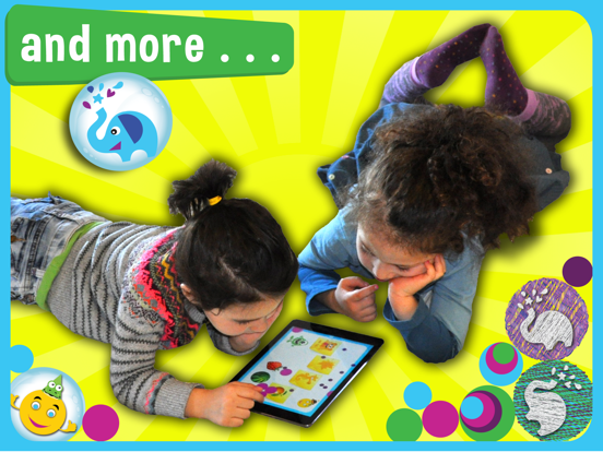
Icon palette
About this app
• ПЕРВОЕ И ЕДИНСТВЕННОЕ ПРИЛОЖЕНИЯ ДЛЯ ЯЗЫКОВОЙ ТЕРАПИИ, ПОДТВЕРЖДЁННОЕ КЛИНИЧЕСКИМИ ДАННЫМИ: В 3-летнем клиническом испытании 6 454 детей с аутизмом оценка языка у детей, участвовавших в MITA, увеличилась до уровней, которые были на 120% выше, чем у детей с аналогичными начальными оценками. Эта разница была статистически значимой (p = 0,0001). Смотрите результаты на ClinicalTrials.gov/ct2/show/results/NCT04108290. • Комбинированные упражнения MITA теперь рассчитаны на 10 лет! • Языковая и когнитивная терапия MITA включает тысячи учебных мероприятий, организованных в 70+ игры. • Отслеживайте успехи вашего ребенка в таблицах и графиках. • Ваши данные о прогрессе и настройки сохраняются в облаке. • Лучший Аутизм App в списке Healthline • Используется более чем миллионом детей с РАС в качестве дополнения к их регулярной терапии • Включает неограниченные языковые и познавательные уп…
App details
What you can learn from Языковая и когнитивная терапия
Every shipping app on the App Store has gone through the same decisions you're working through right now: which screenshot goes first, what caption sits over it, which device frame to show, what color the background should be. The 20 screenshots above are Языковая и когнитивная терапия's answers to those questions — they're public, they're real, and they made it through Apple's review.
What the numbers say: Языковая и когнитивная терапия runs a mixed light-and-dark set where the background shifts from screenshot to screenshot (first shot #FCFCFC) — each image has to stand on its own, so the captions carry more of the story. The accent colour we picked up, #3CC4F4, is the one to reuse for badges, arrows and highlighted words if you borrow this look. Hit Use this style to open the editor with these exact colours and drop your own screenshot in.
Notice the first screenshot in particular. It's the one users see in search results and on the product page, and it's where most apps spend their best caption and tightest design. Look at the proportion of background to phone, where the text sits, what one thing the image is trying to communicate.
Want to see how other Medical apps approach the same problem? Browse more Medical apps in the showcase.
Take what works into your own screenshots
Open LaunchShots and design your App Store & Google Play screenshots — pick a device frame, drop captions, ship in minutes. Free, in your browser.
Open the screenshot editor →Apps with a similar look
Closest background + accent colours among the listings we've analysed — useful when you want to see the same palette handled by a different team.