Screenshot style breakdown
Sampled from 6 of Cut the Rope's App Store screenshots — background, accent and theme, measured by LaunchShots (not something Apple publishes).
#9C3C3C bg
#A95757
#FC642C accent
#FFFFFF text
Screenshots
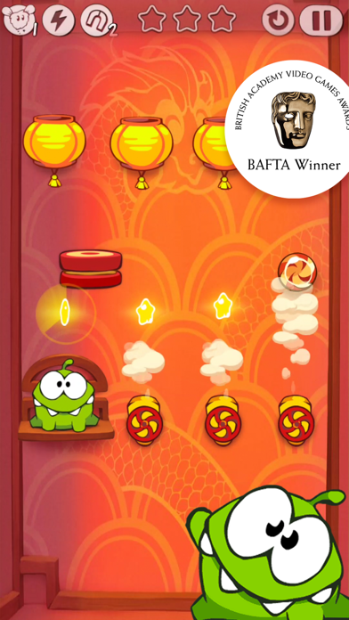
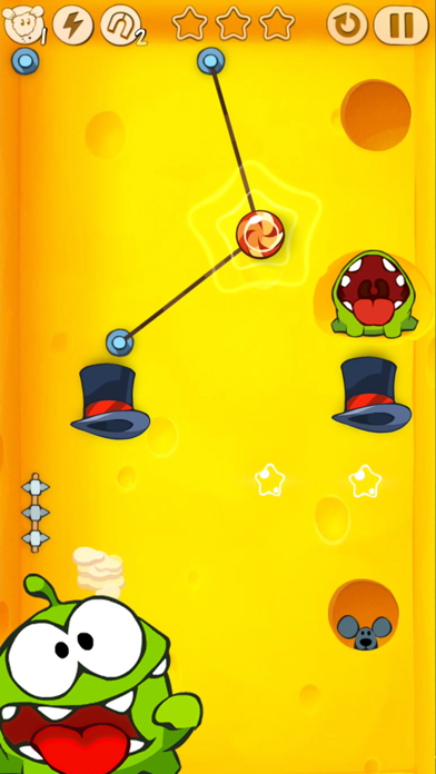
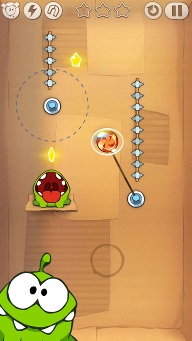


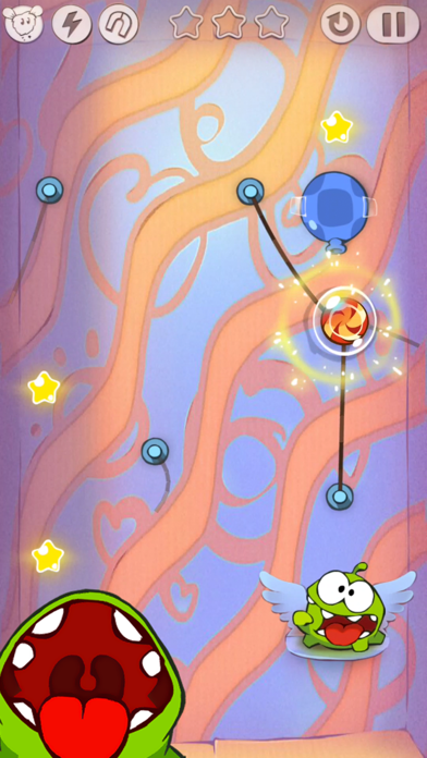

iPad screenshots


Icon palette
About this app
АМ НЯМ ГОЛОДЕН — СРОЧНО НУЖНА КОНФЕТКА! Ам Няму нужна твоя помощь в 425 головоломных уровнях, основанных на физике и спрятанных в 17 тематических коробках в этой по-настоящему культовой игре! Перерезай верёвки, используй хитроумные гаджеты и собирай звёзды, чтобы накормить очаровательного зелёного монстрика Ам Няма с его ненасытной любовью к сладкому! В каждой коробке тебя ждут новые механики и испытания, например: • Игрушечная коробка – платформы-батуты и непредсказуемые сюрпризы • Волшебная коробка – волшебные шляпы и фокус с телепортацией конфеты • Паровая коробка – вентили, пар и механические забавы • Космическая коробка – переключатели гравитации и неожиданные головоломные повороты КАК ИГРАТЬ: • Перерезай верёвки, чтобы доставить конфету Ам Няму • Используй пузыри, воздушные подушки, вентили и даже пчёл, чтобы решать самые хитрые головоломки • Нарушай законы физики с помощью су…
App details
What you can learn from Cut the Rope
Every shipping app on the App Store has gone through the same decisions you're working through right now: which screenshot goes first, what caption sits over it, which device frame to show, what color the background should be. The 14 screenshots above are Cut the Rope's answers to those questions — they're public, they're real, and they made it through Apple's review.
What the numbers say: Cut the Rope runs a mixed light-and-dark set where the background shifts from screenshot to screenshot (first shot #9C3C3C) — each image has to stand on its own, so the captions carry more of the story. The accent colour we picked up, #FC642C, is the one to reuse for badges, arrows and highlighted words if you borrow this look. Hit Use this style to open the editor with these exact colours and drop your own screenshot in.
Notice the first screenshot in particular. It's the one users see in search results and on the product page, and it's where most apps spend their best caption and tightest design. Look at the proportion of background to phone, where the text sits, what one thing the image is trying to communicate.
Want to see how other Games apps approach the same problem? Browse more Games apps in the showcase.
Take what works into your own screenshots
Open LaunchShots and design your App Store & Google Play screenshots — pick a device frame, drop captions, ship in minutes. Free, in your browser.
Open the screenshot editor →Apps with a similar look
Closest background + accent colours among the listings we've analysed — useful when you want to see the same palette handled by a different team.