Chart position — tracked daily by LaunchShots
Screenshot style breakdown
Sampled from 3 of アイシティ's App Store screenshots — background, accent and theme, measured by LaunchShots (not something Apple publishes).
#FCFCFC bg
#DDDDDD
#049CE4 accent
#111111 text
Reading the caption text from the screenshots in your browser…
Screenshots
Icon palette
About this app
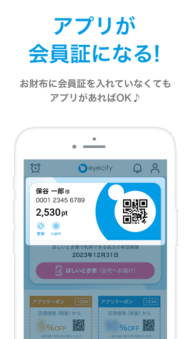
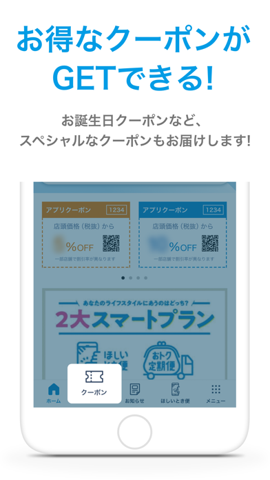
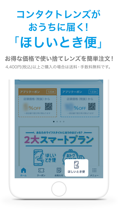
「コンタクトのアイシティ」のお得なクーポンがGETできたり、お得な価格で追加注文ができたりと、アイシティをより便利にご活用頂く為の公式アプリです。 アイシティ会員の方も、初めての方も、皆様がご利用頂けるアプリです。 【3つの便利な点】 1.アプリが会員証になる! アプリが会員証(メンバーズカード)になります!お財布に会員証を入れていなくてもアプリさえがあればOK 2.お得なクーポンがGETできる! お得なクーポンがご利用いただけます。お誕生日クーポンなど、スペシャルなクーポンもお届けします 3.コンタクトレンズがおうちに届く!「ほしいとき便」 おトクな価格で使い捨てレンズを簡単に追加注文!4400円(税込)以上ご購入の場合は送料・手数料無料です。 その他便利な点も、ぜひアプリをダウンロードしてご体験下さい! 【コンタクトのアイシティ】 アイシティはコンタクトレンズ専門店として、国内356店舗(2023年3月1日現在)のネットワーク。 高機能タイプから最新商品まで、豊富な品揃えと豊富な商品知識を持ったスタッフがお待ちしてお…
App details
What you can learn from アイシティ
Every shipping app on the App Store has gone through the same decisions you're working through right now: which screenshot goes first, what caption sits over it, which device frame to show, what color the background should be. The 3 screenshots above are アイシティ's answers to those questions — they're public, they're real, and they made it through Apple's review.
What the numbers say: アイシティ runs a light set with one background colour (#FCFCFC) carried across every screenshot — the listing reads as a single poster when the shots sit side by side in search results. The accent colour we picked up, #049CE4, is the one to reuse for badges, arrows and highlighted words if you borrow this look. Hit Use this style to open the editor with these exact colours and drop your own screenshot in.
Notice the first screenshot in particular. It's the one users see in search results and on the product page, and it's where most apps spend their best caption and tightest design. Look at the proportion of background to phone, where the text sits, what one thing the image is trying to communicate.
Want to see how other Lifestyle apps approach the same problem? Browse more Lifestyle apps in the showcase.
Take what works into your own screenshots
Open LaunchShots and design your App Store & Google Play screenshots — pick a device frame, drop captions, ship in minutes. Free, in your browser.
Open the screenshot editor →Apps with a similar look
Closest background + accent colours among the listings we've analysed — useful when you want to see the same palette handled by a different team.