Chart position — tracked daily by LaunchShots
Screenshot changes — detected by LaunchShots
Screenshot style breakdown
Sampled from 6 of Делимобиль: Каршеринг и Аренда's App Store screenshots — background, accent and theme, measured by LaunchShots (not something Apple publishes).
#04042C bg
#272749
#FC1414 accent
#FFFFFF text
Screenshots
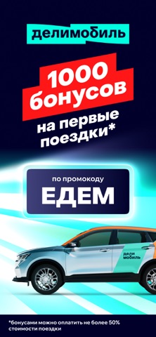

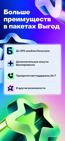
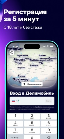


Icon palette
About this app
Делимобиль — ваш прокат авто для городской свободы. Аренда машин с Делимобилем — это современный каршеринг, сочетающий удобство проката авто и гибкость городской мобильности. Берите машину на минуту, час, сутки или даже на несколько дней — без забот о топливе, страховке, мойке или парковке. Делимобиль — это ваш автомобиль, когда он нужен, без лишних затрат. Прокат авто стал проще и доступнее. ・50% скидка на первую поездку. Активируйте промокод «ЕДЕМ» при регистрации и начните аренду авто дешевле! ・Почему Делимобиль — лучший выбор? Краткосрочная аренда: от минут до дней — платите только за время использования. Широкий выбор автомобилей: эконом, комфорт, премиум-класс и электромобили. Городская мобильность: альтернатива такси и общественному транспорту — управляйте сами. Без скрытых платежей: топливо, страховка, парковка и техобслуживание включены в стоимость. Межгород и путешествия:…
App details
What you can learn from Делимобиль: Каршеринг и Аренда
Every shipping app on the App Store has gone through the same decisions you're working through right now: which screenshot goes first, what caption sits over it, which device frame to show, what color the background should be. The 8 screenshots above are Делимобиль: Каршеринг и Аренда's answers to those questions — they're public, they're real, and they made it through Apple's review.
What the numbers say: Делимобиль: Каршеринг и Аренда runs a dark set where the background shifts from screenshot to screenshot (first shot #04042C) — each image has to stand on its own, so the captions carry more of the story. The accent colour we picked up, #FC1414, is the one to reuse for badges, arrows and highlighted words if you borrow this look. Hit Use this style to open the editor with these exact colours and drop your own screenshot in.
Notice the first screenshot in particular. It's the one users see in search results and on the product page, and it's where most apps spend their best caption and tightest design. Look at the proportion of background to phone, where the text sits, what one thing the image is trying to communicate.
Want to see how other Travel apps approach the same problem? Browse more Travel apps in the showcase.
Take what works into your own screenshots
Open LaunchShots and design your App Store & Google Play screenshots — pick a device frame, drop captions, ship in minutes. Free, in your browser.
Open the screenshot editor →Apps with a similar look
Closest background + accent colours among the listings we've analysed — useful when you want to see the same palette handled by a different team.