Chart position — tracked daily by LaunchShots
Screenshot changes — detected by LaunchShots
Screenshot style breakdown
Sampled from 4 of みんなで早押しクイズ's App Store screenshots — background, accent and theme, measured by LaunchShots (not something Apple publishes).
#FCFCFC bg
#DDDDDD
#FCB414 accent
#111111 text
Reading the caption text from the screenshots in your browser…
Screenshots


iPad screenshots


Icon palette
About this app
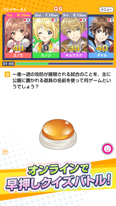
オンライン対戦早押しクイズゲームアプリが登場! ライバルと対戦してレート上位を目指そう! 選べるモードは、ランダムマッチ・フリーマッチ(フレンド対戦)の2種類。 ■ランダムマッチ 全国のライバルとオンラインで早押しクイズ対戦! 対戦に勝利しレートをあげ、さらなる強敵と対戦しよう! ■フリーマッチ 友達と、家族と、パーティーで、飲み会や合コンで、テレビ番組のような早押しクイズをみんなで楽しもう! 出題問題は、3種類の難易度からおまかせ、またはオリジナル問題を作成して出題可能。 自分だけのオリジナル問題を作って全国のみんなに出題してみよう! ■キャラクターと一緒にクイズを楽しもう ゲームに登場するキャラクター達と共に対戦しよう! たくさん対戦してキャラとのキズナが上がるとボイスが開放。 さらに特訓をして専用衣装とスタンプを手に入れよう! 今後も続々と新しいキャラクターが追加予定。
App details
What you can learn from みんなで早押しクイズ
Every shipping app on the App Store has gone through the same decisions you're working through right now: which screenshot goes first, what caption sits over it, which device frame to show, what color the background should be. The 8 screenshots above are みんなで早押しクイズ's answers to those questions — they're public, they're real, and they made it through Apple's review.
What the numbers say: みんなで早押しクイズ runs a light set where the background shifts from screenshot to screenshot (first shot #FCFCFC) — each image has to stand on its own, so the captions carry more of the story. The accent colour we picked up, #FCB414, is the one to reuse for badges, arrows and highlighted words if you borrow this look. Hit Use this style to open the editor with these exact colours and drop your own screenshot in.
Notice the first screenshot in particular. It's the one users see in search results and on the product page, and it's where most apps spend their best caption and tightest design. Look at the proportion of background to phone, where the text sits, what one thing the image is trying to communicate.
Want to see how other Games apps approach the same problem? Browse more Games apps in the showcase.
Take what works into your own screenshots
Open LaunchShots and design your App Store & Google Play screenshots — pick a device frame, drop captions, ship in minutes. Free, in your browser.
Open the screenshot editor →Apps with a similar look
Closest background + accent colours among the listings we've analysed — useful when you want to see the same palette handled by a different team.