Screenshot style breakdown
Sampled from 3 of Namaz Sure ve Duaları Sesli's App Store screenshots — background, accent and theme, measured by LaunchShots (not something Apple publishes).
#FCFCFC bg
#DDDDDD
#0C6C24 accent
#111111 text
Screenshots

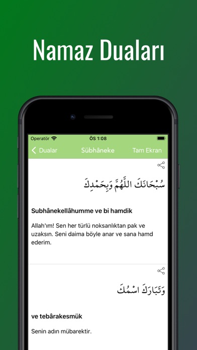

iPad screenshots


Icon palette
About this app
Namazda okunan sure ve duaları Arapça, okunuş ve Türkçe anlamlarıyla birlikte öğrenin. Sesli dinleme, tecvid renklendirme ve ezber modu ile namazda okunan sureleri kolayca ezberleyin. Özellikler: • Sesli Dinleme — Tüm sure ve duaları profesyonel okuyuşla dinleyin • Tecvid Renklendirme — Arapça metinlerde tecvid kurallarını renkli olarak görün • Arapça, Okunuş ve Anlam — Her ayet için üç farklı gösterim • Ezber Modu — Ayetleri tek tek açarak pratik yapın • Ezber Testi — Bilginizi sınayın, doğru ve yanlışlarınızı görün • Tam Ekran Modu — Yatay ekranda rahatça okuyun • Okuma Hızı Ayarı — Ses hızını kendinize göre ayarlayın • Tekrar Modu — Otomatik tekrar ile sürekli dinleme • Koyu ve Açık Tema — Göz yormayan karanlık mod desteği • Kaldığınız Yerden Devam — Son okuduğunuz yere hızla dönün Fatiha, Fil, Kureyş, Maun, Kevser, Kafirun, Nasr, Tebbet, İhlas, Felak, Nas sureleri, Ayetel Kürsi, …
App details
What you can learn from Namaz Sure ve Duaları Sesli
Every shipping app on the App Store has gone through the same decisions you're working through right now: which screenshot goes first, what caption sits over it, which device frame to show, what color the background should be. The 8 screenshots above are Namaz Sure ve Duaları Sesli's answers to those questions — they're public, they're real, and they made it through Apple's review.
What the numbers say: Namaz Sure ve Duaları Sesli runs a mixed light-and-dark set where the background shifts from screenshot to screenshot (first shot #FCFCFC) — each image has to stand on its own, so the captions carry more of the story. The accent colour we picked up, #0C6C24, is the one to reuse for badges, arrows and highlighted words if you borrow this look. Hit Use this style to open the editor with these exact colours and drop your own screenshot in.
Notice the first screenshot in particular. It's the one users see in search results and on the product page, and it's where most apps spend their best caption and tightest design. Look at the proportion of background to phone, where the text sits, what one thing the image is trying to communicate.
Want to see how other Reference apps approach the same problem? Browse more Reference apps in the showcase.
Take what works into your own screenshots
Open LaunchShots and design your App Store & Google Play screenshots — pick a device frame, drop captions, ship in minutes. Free, in your browser.
Open the screenshot editor →Apps with a similar look
Closest background + accent colours among the listings we've analysed — useful when you want to see the same palette handled by a different team.