Chart position — tracked daily by LaunchShots
Screenshot changes — detected by LaunchShots
Screenshot style breakdown
Sampled from 5 of ナムコポイントアプリ's App Store screenshots — background, accent and theme, measured by LaunchShots (not something Apple publishes).
#FCF4F4 bg
#DDD6D6
#F45C74 accent
#111111 text
- #1BANDAINAMCO
Captions read from the screenshots (OCR, may contain small errors): 1 headline, 1 words on average (longest 1), mostly ALL CAPS.
Screenshots



iPad screenshots



Icon palette
About this app
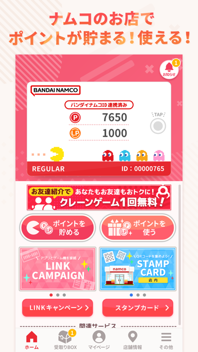
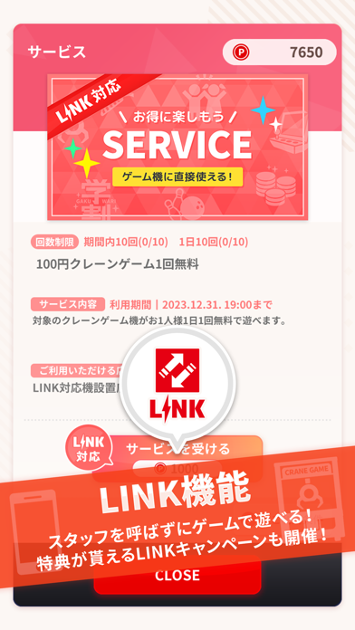
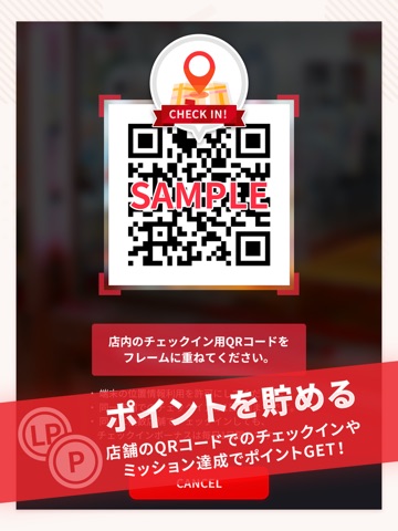
◇◆ゲームセンターの遊びを、もっとお得で便利に!◆◇ ・アプリを起動するだけで毎日ポイントが貯まる! ・ナムコのお店にチェックインしたり、数々のミッション達成で大量ポイントの獲得も! ・貯めたポイントでゲームを無料でプレイ!プレゼント応募も可能! ■お店でサービスを受ける 好みの店舗をフォローすることで、様々なサービスをポイントで受けられます。 ゲームやメダルを無料で遊べるサービスなど多数ご用意しております。 ※サービスの種類はお店や時期により変わります。 ■プレゼント機能 いつも開催されているプレゼントにポイントを使って応募することができます。 応募口数によって当選確率もぐっとアップ。 しかも、抽選結果がアプリでわかりますので抽選日が毎回楽しめます。 ■お知らせ機能 キャンペーン情報はもちろん、お好みのお店から発信される情報をいち早くキャッチ。 好みのお店やキャラクターを登録することで、必要な情報のみをピックアップして表示させることができます。 ■近くのお店を探す機能 今いる場所から、…
App details
What you can learn from ナムコポイントアプリ
Every shipping app on the App Store has gone through the same decisions you're working through right now: which screenshot goes first, what caption sits over it, which device frame to show, what color the background should be. The 10 screenshots above are ナムコポイントアプリ's answers to those questions — they're public, they're real, and they made it through Apple's review.
What the numbers say: ナムコポイントアプリ runs a light set with one background colour (#FCF4F4) carried across every screenshot — the listing reads as a single poster when the shots sit side by side in search results. The accent colour we picked up, #F45C74, is the one to reuse for badges, arrows and highlighted words if you borrow this look. Hit Use this style to open the editor with these exact colours and drop your own screenshot in.
Notice the first screenshot in particular. It's the one users see in search results and on the product page, and it's where most apps spend their best caption and tightest design. Look at the proportion of background to phone, where the text sits, what one thing the image is trying to communicate.
Want to see how other Lifestyle apps approach the same problem? Browse more Lifestyle apps in the showcase.
Take what works into your own screenshots
Open LaunchShots and design your App Store & Google Play screenshots — pick a device frame, drop captions, ship in minutes. Free, in your browser.
Open the screenshot editor →Apps with a similar look
Closest background + accent colours among the listings we've analysed — useful when you want to see the same palette handled by a different team.