Screenshot changes — detected by LaunchShots
Screenshot style breakdown
Sampled from 6 of Английский язык со Skyeng's App Store screenshots — background, accent and theme, measured by LaunchShots (not something Apple publishes).
#AC64FC bg
#B779FC
#74DCF4 accent
#FFFFFF text
Reading the caption text from the screenshots in your browser…
Screenshots


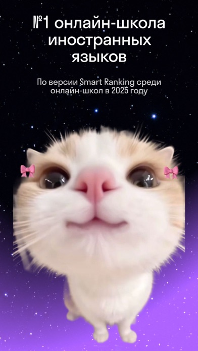
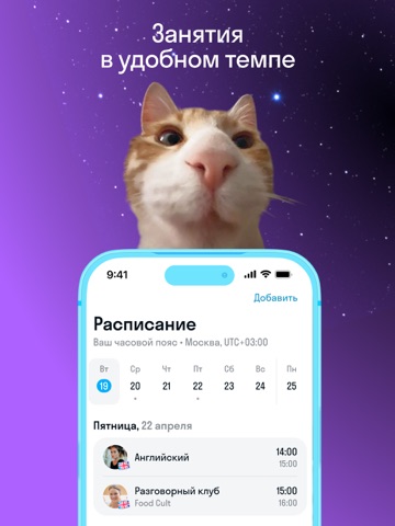
iPad screenshots




Icon palette
About this app
Начни изучать иностранные языки в приложении Skyeng! Выбери язык для изучения В приложении можно учить английский, немецкий, итальянский, французский, испанский, португальский, греческий, японский, корейский, китайский и турецкий языки. Осваивай иностранные языки самостоятельно — Используй встроенный словарь. Учи слова через карточки и другие тренажеры. — Смотри видеопрактики и слушай аудиокниги для улучшения понимания языка на слух. — Прокачай разговорный язык с тренажером ситуаций. — Занимайся в удобном темпе и регулярно отслеживай свой прогресс. Улучши разговорный язык со Skyeng Talks Skyeng Talks — 15-минутные онлайн-занятия с носителями языка из разных стран. Улучши свой разговорный французский, корейский, португальский, турецкий, испанский, итальянский, китайский, японский, немецкий, английский или греческий язык с помощью коротких сессий. Начни обучение с преподавателем — На …
App details
What you can learn from Английский язык со Skyeng
Every shipping app on the App Store has gone through the same decisions you're working through right now: which screenshot goes first, what caption sits over it, which device frame to show, what color the background should be. The 16 screenshots above are Английский язык со Skyeng's answers to those questions — they're public, they're real, and they made it through Apple's review.
What the numbers say: Английский язык со Skyeng runs a dark set where the background shifts from screenshot to screenshot (first shot #AC64FC) — each image has to stand on its own, so the captions carry more of the story. The accent colour we picked up, #74DCF4, is the one to reuse for badges, arrows and highlighted words if you borrow this look. Hit Use this style to open the editor with these exact colours and drop your own screenshot in.
Notice the first screenshot in particular. It's the one users see in search results and on the product page, and it's where most apps spend their best caption and tightest design. Look at the proportion of background to phone, where the text sits, what one thing the image is trying to communicate.
Want to see how other Education apps approach the same problem? Browse more Education apps in the showcase.
Take what works into your own screenshots
Open LaunchShots and design your App Store & Google Play screenshots — pick a device frame, drop captions, ship in minutes. Free, in your browser.
Open the screenshot editor →Apps with a similar look
Closest background + accent colours among the listings we've analysed — useful when you want to see the same palette handled by a different team.