Chart position — tracked daily by LaunchShots
Screenshot changes — detected by LaunchShots
Screenshot style breakdown
Sampled from 6 of SUNLIGHT: Ювелирный магазин's App Store screenshots — background, accent and theme, measured by LaunchShots (not something Apple publishes).
#2C1404 bg
#493427
#C4846C accent
#FFFFFF text
Screenshots


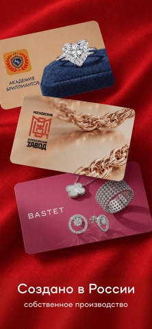

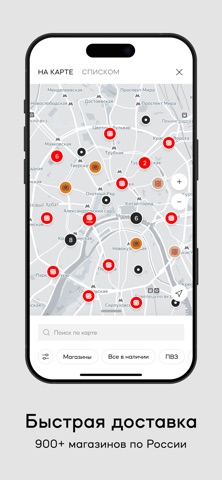

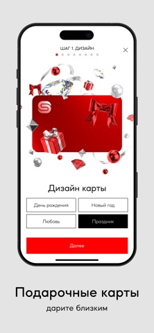

Icon palette
About this app
Ювелирные изделия и украшения из золота и серебра со скидкой до 80% только в SUNLIGHT! У нас есть кольца, цепи, украшения с драгоценными камнями, часы и другие изделия. С помощью удобного приложения вы можете делать невероятно выгодные покупки, получать подарки, купоны и скидки на ювелирные изделия и украшения, а также участвовать в акциях и распродажах в более чем 900 магазинах SUNLIGHT по всей России. Все изделия исключительного качества, в основе которых: золото 585 пробы, серебро 925 пробы и драгоценные камни. В ювелирном магазине SUNLIGHT вы найдете все, что нужно для создания идеального образа: золото, серебро, бриллианты, фианиты, топазы, сапфиры, гранаты, аметисты, изумруды, жемчуг и ювелирные изделия из них: кольца, обручальные кольца, помолвочные кольца, серьги, подвески, браслеты, цепи, шармы, колье, броши, наручные мужские часы, женские часы, аксессуары из разных уголков ми…
App details
What you can learn from SUNLIGHT: Ювелирный магазин
Every shipping app on the App Store has gone through the same decisions you're working through right now: which screenshot goes first, what caption sits over it, which device frame to show, what color the background should be. The 8 screenshots above are SUNLIGHT: Ювелирный магазин's answers to those questions — they're public, they're real, and they made it through Apple's review.
What the numbers say: SUNLIGHT: Ювелирный магазин runs a mixed light-and-dark set where the background shifts from screenshot to screenshot (first shot #2C1404) — each image has to stand on its own, so the captions carry more of the story. The accent colour we picked up, #C4846C, is the one to reuse for badges, arrows and highlighted words if you borrow this look. Hit Use this style to open the editor with these exact colours and drop your own screenshot in.
Notice the first screenshot in particular. It's the one users see in search results and on the product page, and it's where most apps spend their best caption and tightest design. Look at the proportion of background to phone, where the text sits, what one thing the image is trying to communicate.
Want to see how other Shopping apps approach the same problem? Browse more Shopping apps in the showcase.
Take what works into your own screenshots
Open LaunchShots and design your App Store & Google Play screenshots — pick a device frame, drop captions, ship in minutes. Free, in your browser.
Open the screenshot editor →Apps with a similar look
Closest background + accent colours among the listings we've analysed — useful when you want to see the same palette handled by a different team.