Chart position — tracked daily by LaunchShots
Screenshot changes — detected by LaunchShots
Screenshot style breakdown
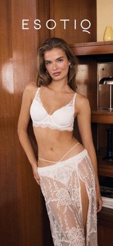
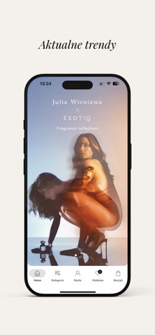
Sampled from 6 of ESOTIQ – bielizna online's App Store screenshots — background, accent and theme, measured by LaunchShots (not something Apple publishes).
#34140C bg
#50342E
#CC946C accent
#FFFFFF text
Reading the caption text from the screenshots in your browser…
Screenshots




Icon palette
About this app
Czas na zakupy online! W aplikacji sklepu internetowego ESOTIQ znajdziesz ponad 1000 modeli bielizny: zmysłową bieliznę fashion, homewear i piżamy, stroje plażowe, męskie kąpielówki i bokserki oraz klasyczne biustonosze stworzone z myślą o Twoim komforcie. ESOTIQ to marka bielizny dla pełnych energii, nowoczesnych i świadomych siebie kobiet. Naszą misją jest tworzenie dopracowanej w każdym szczególe bielizny. Takiej, która pozwoli Ci zawsze czuć się pewnie i wyjątkowo. My kochamy Twoje ciało. Pora, żebyś Ty też zakochała się w ESOTIQ! Dlaczego warto pobrać aplikację ESOTIQ? I. Kupuj bieliznę szybko i wygodnie - Zachowaj swoje dane adresowe i miej dostęp do historii zakupów. - Skorzystaj z darmowej dostawy i zwrotu do salonu stacjonarnego. - Zamawiaj do domu lub salonu i śledź status swojej przesyłki. - Skorzystaj z 30 dni na zwrot. II. Idealne dopasowanie – skorzystaj z usługi …
App details
What you can learn from ESOTIQ – bielizna online
Every shipping app on the App Store has gone through the same decisions you're working through right now: which screenshot goes first, what caption sits over it, which device frame to show, what color the background should be. The 6 screenshots above are ESOTIQ – bielizna online's answers to those questions — they're public, they're real, and they made it through Apple's review.
What the numbers say: ESOTIQ – bielizna online runs a mixed light-and-dark set where the background shifts from screenshot to screenshot (first shot #34140C) — each image has to stand on its own, so the captions carry more of the story. The accent colour we picked up, #CC946C, is the one to reuse for badges, arrows and highlighted words if you borrow this look. Hit Use this style to open the editor with these exact colours and drop your own screenshot in.
Notice the first screenshot in particular. It's the one users see in search results and on the product page, and it's where most apps spend their best caption and tightest design. Look at the proportion of background to phone, where the text sits, what one thing the image is trying to communicate.
Want to see how other Shopping apps approach the same problem? Browse more Shopping apps in the showcase.
Take what works into your own screenshots
Open LaunchShots and design your App Store & Google Play screenshots — pick a device frame, drop captions, ship in minutes. Free, in your browser.
Open the screenshot editor →Apps with a similar look
Closest background + accent colours among the listings we've analysed — useful when you want to see the same palette handled by a different team.