Chart position — tracked daily by LaunchShots
Screenshot changes — detected by LaunchShots
Screenshot style breakdown
Sampled from 5 of Digi Police's App Store screenshots — background, accent and theme, measured by LaunchShots (not something Apple publishes).
#FCFCFC bg
#DDDDDD
#24346C accent
#111111 text
Screenshots


iPad screenshots



Icon palette
About this app
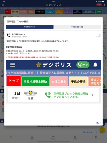
デジポリスは、警視庁生活安全総務課が東京都内の犯罪発生情報や防犯情報をお届けする防犯アプリです。 デジポリスでは、マイエリアを設定すると、設定した地域の犯罪発生状況がトップ画面に表示されます。地図情報では、コメントをつけてSNSやメールなどでご家族やお友達と共有することもできます。 また、新搭載した国際電話番号ブロックシステムを設定することで、スマートフォンにかかってくる詐欺電話(警察が把握した犯行利用電話番号やiOS搭載機能によりブロックされる国際電話番号等の不審電話)をブロックします。 【機能】 ●街頭犯罪や子供に対する声かけ事案の情報 ●子供と女性の安全に関する情報 ●防犯ブザー・痴漢撃退機能 ●特殊詐欺のアポ電情報 ●国際電話番号ブロックシステム ●特殊詐欺まるわかりeラーニングサイト ●サイバーセキュリティに関すこと ●公開捜査情報 ●お知らせをプッシュ通知 ●生活安全部のX ●警視庁HPの表示 ●警察署・交番検索 ●キャラクター成長機能 【国際電話番号ブロックシステムについて】 1 犯行利用電番号ブロッ…
App details
What you can learn from Digi Police
Every shipping app on the App Store has gone through the same decisions you're working through right now: which screenshot goes first, what caption sits over it, which device frame to show, what color the background should be. The 10 screenshots above are Digi Police's answers to those questions — they're public, they're real, and they made it through Apple's review.
What the numbers say: Digi Police runs a mixed light-and-dark set where the background shifts from screenshot to screenshot (first shot #FCFCFC) — each image has to stand on its own, so the captions carry more of the story. The accent colour we picked up, #24346C, is the one to reuse for badges, arrows and highlighted words if you borrow this look. Hit Use this style to open the editor with these exact colours and drop your own screenshot in.
Notice the first screenshot in particular. It's the one users see in search results and on the product page, and it's where most apps spend their best caption and tightest design. Look at the proportion of background to phone, where the text sits, what one thing the image is trying to communicate.
Want to see how other Navigation apps approach the same problem? Browse more Navigation apps in the showcase.
Take what works into your own screenshots
Open LaunchShots and design your App Store & Google Play screenshots — pick a device frame, drop captions, ship in minutes. Free, in your browser.
Open the screenshot editor →Apps with a similar look
Closest background + accent colours among the listings we've analysed — useful when you want to see the same palette handled by a different team.