Chart position — tracked daily by LaunchShots
Screenshot style breakdown
Sampled from 5 of 咕噜美国通 (Guruin)'s App Store screenshots — background, accent and theme, measured by LaunchShots (not something Apple publishes).
#FCFCFC bg
#DDDDDD
#04344C accent
#111111 text
Screenshots
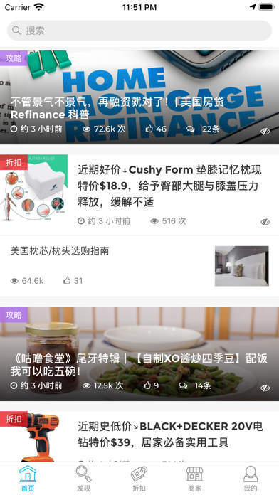
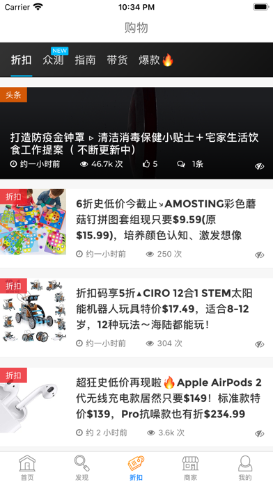
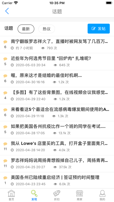


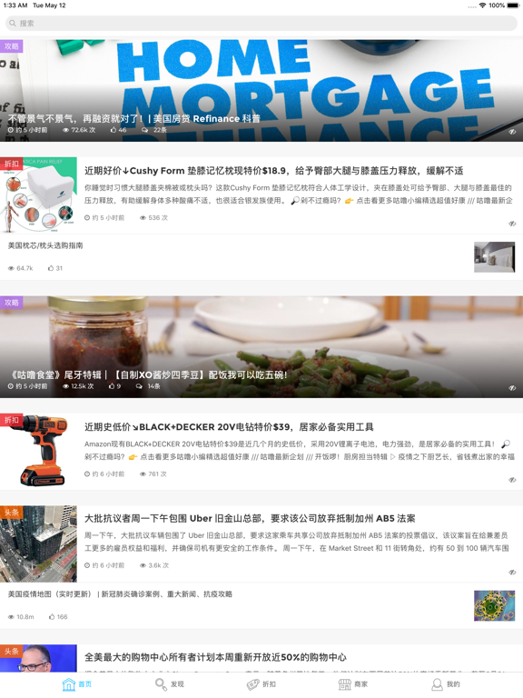
iPad screenshots

Icon palette
About this app
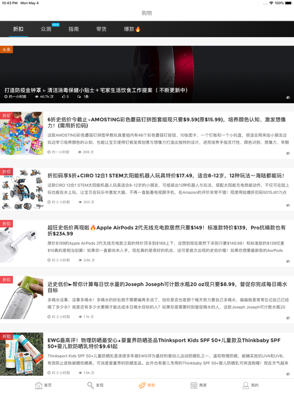
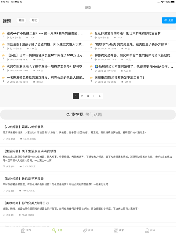
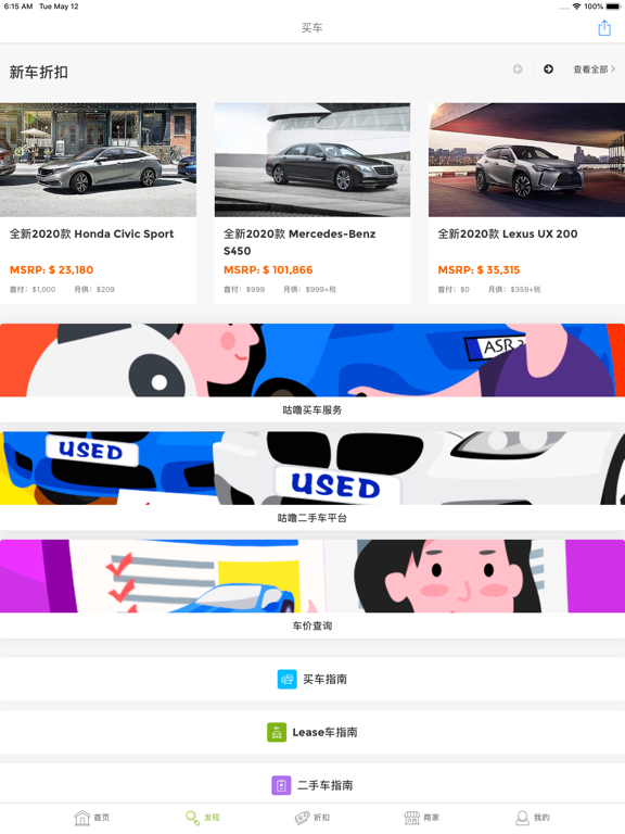
【关于咕噜美国通 - 美适生活口袋书】 咕噜美国通 (Guruin.com) 是美国华人最信赖的生活、娱乐资讯平台。你的一日生活所需,咕噜美国通 APP 一站满足你! * 每日美国头条:第一时间速报美国热点,美国华人资讯全览,瞬间掌握时下最火新闻焦点和热辣八卦 * 省钱购物解压:全网当日 “手慢无” 爆款 Deal 集合,线上线下购物北美省钱情报,美国商家深度折扣,必买好物推荐,实用购物指南,免费体验新产品 * 计划旅游出行:自用推荐两相宜,美国各城市吃喝玩乐情报,像本地人一样玩赏精彩旅游景点,详尽的攻略行程照着走 * 解决移民难题:绿卡排期、移民签证情报、买车、租车、买房、教育、投资、求职、各类保险,工商各领域专家合作分析谘询 * 生活攻略指南:美国生活当中常遇到的困惑、常有的疑难杂症,以深入浅出、系统化结构篇章来回答整理 * 网友群聚吃瓜:人在江湖浪,谁不爱吃瓜,《咕噜话题》新时代论坛天南地北乱聊,没有最劲爆、只有更劲爆 立即下载咕噜 APP,不错过任何一条生活美国生活娱乐实用消息!
App details
What you can learn from 咕噜美国通 (Guruin)
Every shipping app on the App Store has gone through the same decisions you're working through right now: which screenshot goes first, what caption sits over it, which device frame to show, what color the background should be. The 10 screenshots above are 咕噜美国通 (Guruin)'s answers to those questions — they're public, they're real, and they made it through Apple's review.
What the numbers say: 咕噜美国通 (Guruin) runs a light set with one background colour (#FCFCFC) carried across every screenshot — the listing reads as a single poster when the shots sit side by side in search results. The accent colour we picked up, #04344C, is the one to reuse for badges, arrows and highlighted words if you borrow this look. Hit Use this style to open the editor with these exact colours and drop your own screenshot in.
Notice the first screenshot in particular. It's the one users see in search results and on the product page, and it's where most apps spend their best caption and tightest design. Look at the proportion of background to phone, where the text sits, what one thing the image is trying to communicate.
Want to see how other News apps approach the same problem? Browse more News apps in the showcase.
Take what works into your own screenshots
Open LaunchShots and design your App Store & Google Play screenshots — pick a device frame, drop captions, ship in minutes. Free, in your browser.
Open the screenshot editor →Apps with a similar look
Closest background + accent colours among the listings we've analysed — useful when you want to see the same palette handled by a different team.