Chart position — tracked daily by LaunchShots
Screenshot style breakdown
Sampled from 3 of ウエルシアグループアプリ's App Store screenshots — background, accent and theme, measured by LaunchShots (not something Apple publishes).
#D4ECFC bg
#BACFDD
#2484C4 accent
#111111 text
Screenshots

Icon palette
About this app
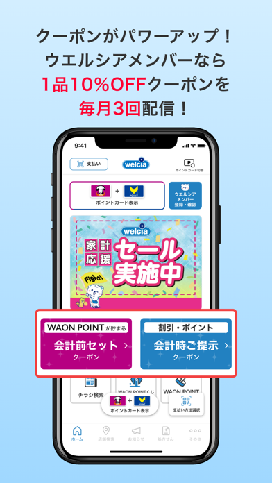
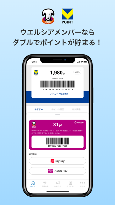
ウエルシアグループのお買物がオトクに便利になる公式アプリです。 【主な機能の紹介】 ■ポイントカード機能 WAON POINTとVポイントの2つのポイントカードを登録できます。カードを持ち歩かなくても、アプリ画面のバーコードを提示するだけでポイントが貯まります。 ※WAON POINTの会員コードは、当アプリを提供している当社店舗のみでご利用可能です。 ※アプリへのWAON POINTカード登録後一定期間が経過した際に、ご本人確認のため「生年月日」の入力を行う認証情報入力画面が表示されます。 ■クーポン 大きく分けて下記2種類のクーポンがございます。 「お会計前にセットするクーポン」と「お会計時にご提示いただくクーポン」。 特典はWAON POINT進呈や値引・割引等、様々あります。 ■各種決済方法との連携 AEON PayやPayPay等、複数の決済方法との連携が可能です。 ※各種決済方法を選択する場合は、予め該当の決済アプリのインストール・設定が必要です。 ■チラシ情報 お近くの店舗のチラシ情報がアプリで簡単に検索ができます。 ■WAON POINTがオトクに…
App details
What you can learn from ウエルシアグループアプリ
Every shipping app on the App Store has gone through the same decisions you're working through right now: which screenshot goes first, what caption sits over it, which device frame to show, what color the background should be. The 3 screenshots above are ウエルシアグループアプリ's answers to those questions — they're public, they're real, and they made it through Apple's review.
What the numbers say: ウエルシアグループアプリ runs a light set with one background colour (#D4ECFC) carried across every screenshot — the listing reads as a single poster when the shots sit side by side in search results. The accent colour we picked up, #2484C4, is the one to reuse for badges, arrows and highlighted words if you borrow this look. Hit Use this style to open the editor with these exact colours and drop your own screenshot in.
Notice the first screenshot in particular. It's the one users see in search results and on the product page, and it's where most apps spend their best caption and tightest design. Look at the proportion of background to phone, where the text sits, what one thing the image is trying to communicate.
Want to see how other Lifestyle apps approach the same problem? Browse more Lifestyle apps in the showcase.
Take what works into your own screenshots
Open LaunchShots and design your App Store & Google Play screenshots — pick a device frame, drop captions, ship in minutes. Free, in your browser.
Open the screenshot editor →Apps with a similar look
Closest background + accent colours among the listings we've analysed — useful when you want to see the same palette handled by a different team.