Chart position — tracked daily by LaunchShots
Screenshot style breakdown
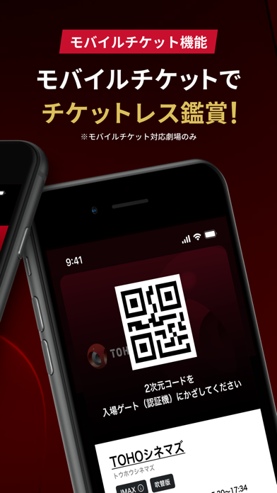
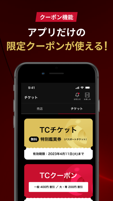
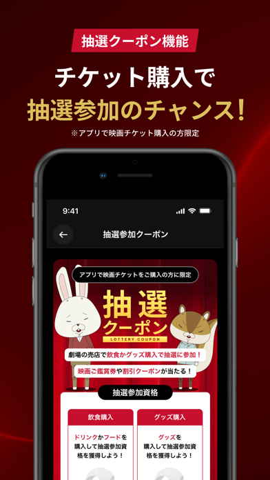
Sampled from 5 of TOHOシネマズ 公式アプリ's App Store screenshots — background, accent and theme, measured by LaunchShots (not something Apple publishes).
#140404 bg
#342727
#CC142C accent
#FFFFFF text
Screenshots


Icon palette
About this app
国内最大級の映画館チェーン「TOHOシネマズ」の公式アプリ! 映画がもっと日常になる情報・機能が満載です! ◆いつでもどこでも簡単チケット購入 個人情報を事前登録することで、チケット購入がさらに簡単・便利になりました。 また、気になる映画をマイリストに登録しておけば、スムーズに作品情報の確認もできます。 ◆お得なクーポン アプリだけのお得なクーポンが満載! ◆チケットを購入して抽選キャンペーンに挑戦! チケットをアプリから購入して劇場で飲食やグッズを購入すると、抽選キャンペーンに挑戦することができます! 映画ご鑑賞券や割引クーポン獲得のチャンス! ◆気になる作品は友達にシェア 気になる作品をシェアした後、シェアされた人が、あなたが送ったURLからチケット購入すれば、おトクなクーポン獲得のチャンス! ※シェアされた人が映画鑑賞後、シェアした人にクーポンが 付与されます。 ※受け取れるクーポンは1作品につき1つまでとなります。 ◆Yahoo!映画作品ユーザーレビューと連携 TOHOシネマズで映画を観た後は、Yahoo!映画…
App details
What you can learn from TOHOシネマズ 公式アプリ
Every shipping app on the App Store has gone through the same decisions you're working through right now: which screenshot goes first, what caption sits over it, which device frame to show, what color the background should be. The 5 screenshots above are TOHOシネマズ 公式アプリ's answers to those questions — they're public, they're real, and they made it through Apple's review.
What the numbers say: TOHOシネマズ 公式アプリ runs a dark set where the background shifts from screenshot to screenshot (first shot #140404) — each image has to stand on its own, so the captions carry more of the story. The accent colour we picked up, #CC142C, is the one to reuse for badges, arrows and highlighted words if you borrow this look. Hit Use this style to open the editor with these exact colours and drop your own screenshot in.
Notice the first screenshot in particular. It's the one users see in search results and on the product page, and it's where most apps spend their best caption and tightest design. Look at the proportion of background to phone, where the text sits, what one thing the image is trying to communicate.
Want to see how other Entertainment apps approach the same problem? Browse more Entertainment apps in the showcase.
Take what works into your own screenshots
Open LaunchShots and design your App Store & Google Play screenshots — pick a device frame, drop captions, ship in minutes. Free, in your browser.
Open the screenshot editor →Apps with a similar look
Closest background + accent colours among the listings we've analysed — useful when you want to see the same palette handled by a different team.