Chart position — tracked daily by LaunchShots
Screenshot style breakdown
Sampled from 6 of ATIS交通情報(アティス)~リアルタイム渋滞情報's App Store screenshots — background, accent and theme, measured by LaunchShots (not something Apple publishes).
#4484E4 bg
#5E95E7
#FCFC04 accent
#FFFFFF text
Screenshots




Icon palette
About this app
【概要】 日本道路交通情報センター(JARTIC)提供の全国道路の渋滞・規制情報を中心に渋滞の通過時間まで詳しく知りたいお客様に役立つ実用アプリです。 ◆最新のお知らせ 【最近の更新内容】 2026年9月 軽微な改修を行いました。 2026年9月 軽微な改修を行いました。地図縮小時の表示範囲を変更し、いままでより広範囲を表示できるようにしました。 2026年4月 SDKの軽微な更新を行いました。 2026年3月 無料会員登録コースの規制情報の提供について軽微な改修を行いました。 規制マークをタップし広告をご覧いただくことで規制情報の詳細を「1回約3分、1日3回までご利用いただくことができます。 2026年2月 旧コースの料金改定を行いました。 2月5日以降更新になる旧コースのお客様の価格を新コースのお客様と同価格とさせていただきます。 2026年1月 SDKの軽微な更新を行いました。 2025年12月 「くるまのニュース」の提供を開始しました。 2025年11月 一部有料会員に復元できない事象に対応しました。 2025年11月 SDKの軽微な更新を…
App details
What you can learn from ATIS交通情報(アティス)~リアルタイム渋滞情報
Every shipping app on the App Store has gone through the same decisions you're working through right now: which screenshot goes first, what caption sits over it, which device frame to show, what color the background should be. The 6 screenshots above are ATIS交通情報(アティス)~リアルタイム渋滞情報's answers to those questions — they're public, they're real, and they made it through Apple's review.
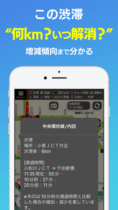
What the numbers say: ATIS交通情報(アティス)~リアルタイム渋滞情報 runs a mixed light-and-dark set where the background shifts from screenshot to screenshot (first shot #4484E4) — each image has to stand on its own, so the captions carry more of the story. The accent colour we picked up, #FCFC04, is the one to reuse for badges, arrows and highlighted words if you borrow this look. Hit Use this style to open the editor with these exact colours and drop your own screenshot in.
Notice the first screenshot in particular. It's the one users see in search results and on the product page, and it's where most apps spend their best caption and tightest design. Look at the proportion of background to phone, where the text sits, what one thing the image is trying to communicate.
Want to see how other Navigation apps approach the same problem? Browse more Navigation apps in the showcase.
Take what works into your own screenshots
Open LaunchShots and design your App Store & Google Play screenshots — pick a device frame, drop captions, ship in minutes. Free, in your browser.
Open the screenshot editor →Apps with a similar look
Closest background + accent colours among the listings we've analysed — useful when you want to see the same palette handled by a different team.