Chart position — tracked daily by LaunchShots
Screenshot changes — detected by LaunchShots
Screenshot style breakdown
Sampled from 5 of Thái Âm - Tử Vi 2026's App Store screenshots — background, accent and theme, measured by LaunchShots (not something Apple publishes).
#340464 bg
#502779
#743CCC accent
#FFFFFF text
Screenshots


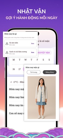
iPad screenshots


Icon palette
About this app
Thái Âm Tử vi 2026 là ứng dụng xem tử vi toàn diện và chính xác, giúp bạn giải mã vận mệnh, định hướng tương lai và ra quyết định sáng suốt mỗi ngày. 1. Xem tử vi trọn đời - Phân tích lá số tử vi cá nhân dựa trên 12 cung khí và cung Thân và các vận quan trọng. - Giải mã vận mệnh, sự nghiệp, tài lộc, tình duyên và sức khỏe trọn đời. - Lời khuyên giúp tận dụng cơ hội và tránh rủi ro. 2. Tử vi năm 2026 (Tiểu Vận) - Dự đoán chi tiết vận hạn, cát hung trong năm mới. - Phân tích công việc, tình cảm, tài chính và sức khỏe - Gợi ý giải pháp ứng phó thông minh để đón năm mới bình an và thịnh vượng. 3. Tử vi tháng (Nguyệt Vận) - Dự đoán các vấn đề theo từng lĩnh vực trong cuộc sống - Gợi ý giải pháp và cách chuẩn bị để phòng tránh 4. Tử vi hàng ngày (Nhật Vận) - Cập nhật dự đoán vận mệnh hằng ngày chính xác. - Gợi ý thời điểm tốt/xấu để đưa ra quyết định quan trọng. - Giúp bạn chủ…
App details
What you can learn from Thái Âm - Tử Vi 2026
Every shipping app on the App Store has gone through the same decisions you're working through right now: which screenshot goes first, what caption sits over it, which device frame to show, what color the background should be. The 10 screenshots above are Thái Âm - Tử Vi 2026's answers to those questions — they're public, they're real, and they made it through Apple's review.
What the numbers say: Thái Âm - Tử Vi 2026 runs a dark set where the background shifts from screenshot to screenshot (first shot #340464) — each image has to stand on its own, so the captions carry more of the story. The accent colour we picked up, #743CCC, is the one to reuse for badges, arrows and highlighted words if you borrow this look. Hit Use this style to open the editor with these exact colours and drop your own screenshot in.
Notice the first screenshot in particular. It's the one users see in search results and on the product page, and it's where most apps spend their best caption and tightest design. Look at the proportion of background to phone, where the text sits, what one thing the image is trying to communicate.
Want to see how other Lifestyle apps approach the same problem? Browse more Lifestyle apps in the showcase.
Take what works into your own screenshots
Open LaunchShots and design your App Store & Google Play screenshots — pick a device frame, drop captions, ship in minutes. Free, in your browser.
Open the screenshot editor →Apps with a similar look
Closest background + accent colours among the listings we've analysed — useful when you want to see the same palette handled by a different team.