Chart position — tracked daily by LaunchShots
Screenshot style breakdown
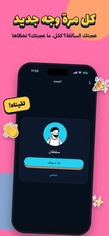
Sampled from 4 of طفش - شات وسواليف's App Store screenshots — background, accent and theme, measured by LaunchShots (not something Apple publishes).
#FCCC3C bg
#DDB334
#24D4EC accent
#111111 text
Reading the caption text from the screenshots in your browser…
Screenshots



Icon palette
About this app
طفش يكسر الملل! ابدأ سالفة جديدة بضغطة وحدة، في تطبيق بسيط وخفيف. كيف يشتغل؟ • اضغط وحدة من الخيارات وتبدأ سالفة جديدة • تشوف الاسم والصورة، وتختار: "يلا نسولف" أو تخطّى • تبدأ المحادثة لما يوافق الطرفين • عجبتك السالفة؟ أضفه صديق وتبقى المحادثة عندك المميزات: • رسائل نصية وصوتية، وصور وفيديو • صور وفيديو تنشاف مرة وحدة • قائمة أصدقاء لمحادثاتك المفضلة • إشعار لما توصلك رسالة جديدة • تصميم بسيط وسريع الخصوصية والأمان: • تختار اسمك وصورتك بنفسك • ما نعرض معلوماتك الشخصية لأحد • حظر وإبلاغ بضغطة، والبلاغ ينهي المحادثة فورًا • نراجع الأسماء والصور والبلاغات عشان تبقى المساحة محترمة الألماس: عناصر اختيارية داخل التطبيق تعطيك خيارات إضافية عند بدء سالفة جديدة. التطبيق مجاني، والألماس ما يضمن رد من الطرف الثاني. سياسة الخصوصية: https://taffash.com/privacy الشروط والأحكام: https://taffash.com/terms
App details
What you can learn from طفش - شات وسواليف
Every shipping app on the App Store has gone through the same decisions you're working through right now: which screenshot goes first, what caption sits over it, which device frame to show, what color the background should be. The 4 screenshots above are طفش - شات وسواليف's answers to those questions — they're public, they're real, and they made it through Apple's review.
What the numbers say: طفش - شات وسواليف runs a mixed light-and-dark set where the background shifts from screenshot to screenshot (first shot #FCCC3C) — each image has to stand on its own, so the captions carry more of the story. The accent colour we picked up, #24D4EC, is the one to reuse for badges, arrows and highlighted words if you borrow this look. Hit Use this style to open the editor with these exact colours and drop your own screenshot in.
Notice the first screenshot in particular. It's the one users see in search results and on the product page, and it's where most apps spend their best caption and tightest design. Look at the proportion of background to phone, where the text sits, what one thing the image is trying to communicate.
Want to see how other Lifestyle apps approach the same problem? Browse more Lifestyle apps in the showcase.
Take what works into your own screenshots
Open LaunchShots and design your App Store & Google Play screenshots — pick a device frame, drop captions, ship in minutes. Free, in your browser.
Open the screenshot editor →Apps with a similar look
Closest background + accent colours among the listings we've analysed — useful when you want to see the same palette handled by a different team.