Chart position — tracked daily by LaunchShots
Screenshot style breakdown
Sampled from 6 of كتبي Kutubee's App Store screenshots — background, accent and theme, measured by LaunchShots (not something Apple publishes).
#BC9CCC bg
#A589B3
#049CD4 accent
#111111 text
Screenshots


iPad screenshots


Icon palette
About this app
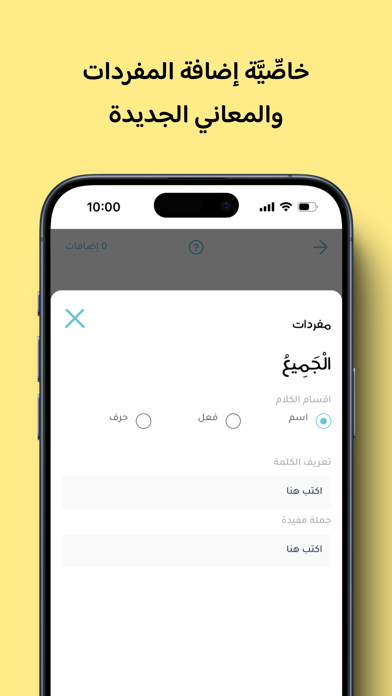
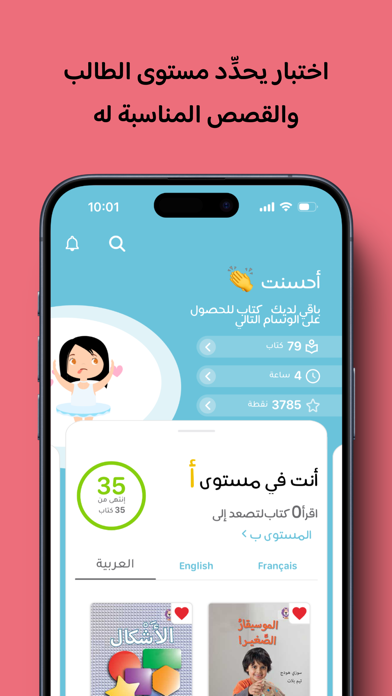
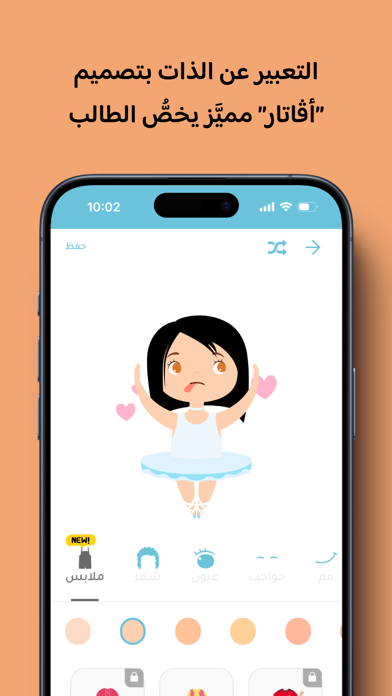
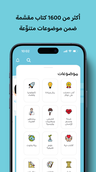
يوفَّر تطبيق ‘‘كتبي’’ تجربة فريدة للأطفال للاستمتاع بقراءة مئات القصص المصوَّرة باللغتين العربيَّة والإنكليزيَّة، والمنتقاة بعناية من قبل تربويِّين مختصِّين. بينما صار إبعاد أطفالنا عن استخدام وسائل التكنولوجيا عمليَّة شبه مستحيلة في عالم اليوم، جاء تطبيق ‘‘كتبي’’ ليوفِّر للأهل والأطفال معًا وسيلةً تتحوَّل فيها التكنولوجيا من وسيلة إلهاء وتسلية، إلى وسيلة بناء وتعليم تحفِّز أبناءنا على القراءة والتعلُّم بطريقة ممتعة وتفاعليَّة. جرى تطوير تطبيق ‘‘كتبي’’ ليُستخدم أيضًا في إطار المدرسة والصفّ، حيث عمل فريقٌ من التربويِّين على تصنيف الكتب بحسب أسس التعليم الحديثة، ووفق نظام ‘‘PYP’’، علاوة على إمكانية ربطه باللوح الذكي ليستخدمَه المعلِّمون في نطاق الغرفة الصفِّيَّة. ميزات كتبي: * أكبر مكتبة رقمية تفاعلية باللغتين العربية والانكليزية. * تصنيف الكتب اعتمادًا على نظام PYP ونظام المكتبات. * أكثر من 1200 قصة منتقاة من أشهر دور النشر. * سهولة البحث بحسب الموضوع أو الفئة العمرية. * ميزة اقرأ لي، فض…
App details
What you can learn from كتبي Kutubee
Every shipping app on the App Store has gone through the same decisions you're working through right now: which screenshot goes first, what caption sits over it, which device frame to show, what color the background should be. The 13 screenshots above are كتبي Kutubee's answers to those questions — they're public, they're real, and they made it through Apple's review.
What the numbers say: كتبي Kutubee runs a mixed light-and-dark set where the background shifts from screenshot to screenshot (first shot #BC9CCC) — each image has to stand on its own, so the captions carry more of the story. The accent colour we picked up, #049CD4, is the one to reuse for badges, arrows and highlighted words if you borrow this look. Hit Use this style to open the editor with these exact colours and drop your own screenshot in.
Notice the first screenshot in particular. It's the one users see in search results and on the product page, and it's where most apps spend their best caption and tightest design. Look at the proportion of background to phone, where the text sits, what one thing the image is trying to communicate.
Want to see how other Education apps approach the same problem? Browse more Education apps in the showcase.
Take what works into your own screenshots
Open LaunchShots and design your App Store & Google Play screenshots — pick a device frame, drop captions, ship in minutes. Free, in your browser.
Open the screenshot editor →Apps with a similar look
Closest background + accent colours among the listings we've analysed — useful when you want to see the same palette handled by a different team.