Chart position — tracked daily by LaunchShots
Screenshot style breakdown
Sampled from 6 of Маленький Котенок: Моя Кошечка's App Store screenshots — background, accent and theme, measured by LaunchShots (not something Apple publishes).
#CCAC84 bg
#B39774
#EC7C34 accent
#111111 text
Screenshots

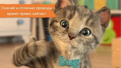
iPad screenshots


Icon palette
About this app
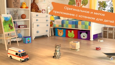
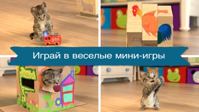
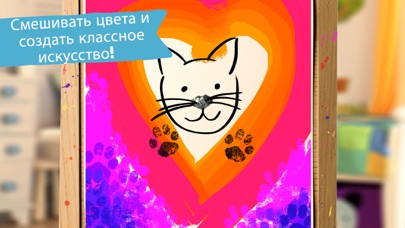
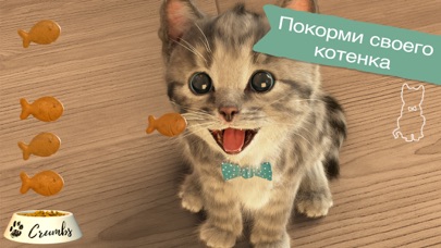
"Маленький Котенок - Моя Кошка" — мечта каждого ребенка, ведь это забавный и умилительный питомец с веселым характером. Полетайте вместе на самолете, побросайте мячик в корзину, поиграйте в прятки, попрыгайте на кровати или порисуйте лапкой — с другом-котенком всегда есть чем заняться! Познакомьтесь с миром котят, открывайте забавные движения, над которыми можно вместе посмеяться, и заботьтесь о своем милом мохнатом друге. Уникальный игровой дизайн позволяет детям ориентироваться в происходящем с минимальным использованием меню и значков. 8 мини-игр предлагают множество способов взаимодействия и будут интересны детям разных возрастов. Их смысл не в том, чтобы выиграть, проиграть или соревноваться, а в том, чтобы ребенку было легко и весело играть, и чтобы он мог учиться, не осознавая этого. Мини-игры придуманы не просто так! Совместимость: Приложение не поддерживает iPad2, IPhone 4S, I…
App details
What you can learn from Маленький Котенок: Моя Кошечка
Every shipping app on the App Store has gone through the same decisions you're working through right now: which screenshot goes first, what caption sits over it, which device frame to show, what color the background should be. The 12 screenshots above are Маленький Котенок: Моя Кошечка's answers to those questions — they're public, they're real, and they made it through Apple's review.
What the numbers say: Маленький Котенок: Моя Кошечка runs a mixed light-and-dark set where the background shifts from screenshot to screenshot (first shot #CCAC84) — each image has to stand on its own, so the captions carry more of the story. The accent colour we picked up, #EC7C34, is the one to reuse for badges, arrows and highlighted words if you borrow this look. Hit Use this style to open the editor with these exact colours and drop your own screenshot in.
Notice the first screenshot in particular. It's the one users see in search results and on the product page, and it's where most apps spend their best caption and tightest design. Look at the proportion of background to phone, where the text sits, what one thing the image is trying to communicate.
Want to see how other Entertainment apps approach the same problem? Browse more Entertainment apps in the showcase.
Take what works into your own screenshots
Open LaunchShots and design your App Store & Google Play screenshots — pick a device frame, drop captions, ship in minutes. Free, in your browser.
Open the screenshot editor →Apps with a similar look
Closest background + accent colours among the listings we've analysed — useful when you want to see the same palette handled by a different team.