Chart position — tracked daily by LaunchShots
Screenshot style breakdown
Sampled from 6 of Aral Fuel & Charge's App Store screenshots — background, accent and theme, measured by LaunchShots (not something Apple publishes).
#FCFCFC bg
#DDDDDD
#0464D4 accent
#111111 text
- #1> Aral Fuel & Charge Volle Energie für Ihre Flotte Finden Sie
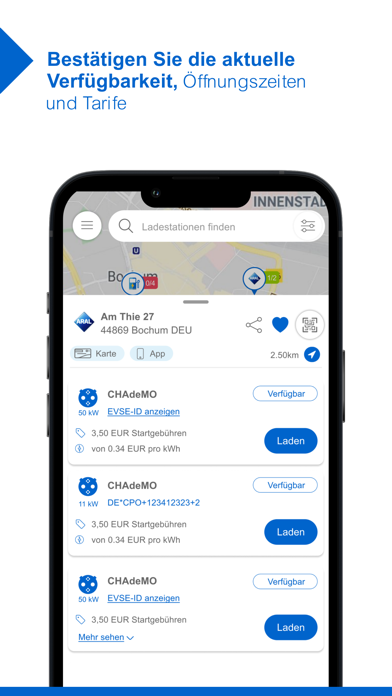
- #2Bestatigen Sie die aktuelle Verfügbarkeit, Öffnungszeiten und Tarife
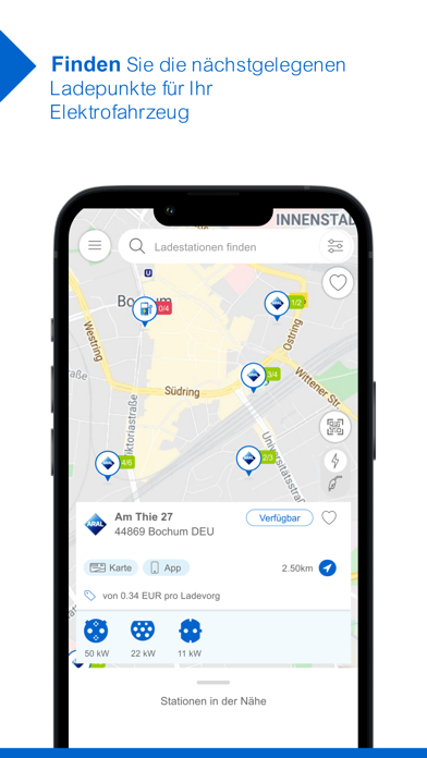
- #3Finden Sie die nachstgelegenen Ladepunkte fur Ihr Elektrofahrzeug
- #4Schließen Sie Ihr Fahrzeug an und starten Sie den Ladevorgang
- #5Kilometerzahler erfassen: Geben Sie die Werte von an Kilometerzahler Ihres Fahrzeugs
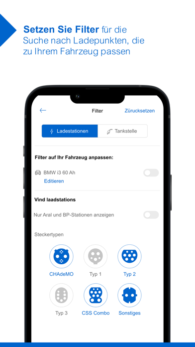
- #6Stellen Sie Ihr Fahrzeug ein, um kompatible Anschlüsse und zusätzliche Informationen
Captions read from the screenshots (OCR, may contain small errors): 6 headlines, 10 words on average (longest 12).
Screenshots




Icon palette
About this app
Aral Fuel & Charge: Die ganze Energie für Ihre Flotte – mit unserer einfachen Komplettlösung. Aral bietet Ihnen grenzenlose Mobilität. Heute, morgen und in Zukunft. Ganz egal, ob Sie für Ihre Fahrzeuge konventionelle Kraftstoffe wie Diesel und Benzin benötigen oder Strom tanken möchten: Mit dem innovativen Aral Fuel & Charge Angebot können Sie Ihre gesamte Flotte mit Energie versorgen – mit nur einer Karte, europaweit, immer und überall! Mit der Aral Fuel & Charge App halten Sie Ihre Flotte dabei ganz einfach in Bewegung und kommen schneller ans Ziel! Die praktische App enthält alle wichtigen Echtzeit-Informationen rund um die nächstgelegene, schnellste und passende Option zum Aufladen Ihres Fahrzeugs. Diese Funktionen beinhalten viele Vorteile für Sie: # Finden Sie Ladepunkte für Elektrofahrzeuge in der Nähe oder an Ihrem Zielort. # Sehen Sie Öffnungszeiten, Preise und Namen …
App details
What you can learn from Aral Fuel & Charge
Every shipping app on the App Store has gone through the same decisions you're working through right now: which screenshot goes first, what caption sits over it, which device frame to show, what color the background should be. The 8 screenshots above are Aral Fuel & Charge's answers to those questions — they're public, they're real, and they made it through Apple's review.
What the numbers say: Aral Fuel & Charge runs a light set with one background colour (#FCFCFC) carried across every screenshot — the listing reads as a single poster when the shots sit side by side in search results. The accent colour we picked up, #0464D4, is the one to reuse for badges, arrows and highlighted words if you borrow this look. Hit Use this style to open the editor with these exact colours and drop your own screenshot in.
Notice the first screenshot in particular. It's the one users see in search results and on the product page, and it's where most apps spend their best caption and tightest design. Look at the proportion of background to phone, where the text sits, what one thing the image is trying to communicate.
Want to see how other Navigation apps approach the same problem? Browse more Navigation apps in the showcase.
Take what works into your own screenshots
Open LaunchShots and design your App Store & Google Play screenshots — pick a device frame, drop captions, ship in minutes. Free, in your browser.
Open the screenshot editor →Apps with a similar look
Closest background + accent colours among the listings we've analysed — useful when you want to see the same palette handled by a different team.