Chart position — tracked daily by LaunchShots
Screenshot style breakdown
Sampled from 4 of ノウン's App Store screenshots — background, accent and theme, measured by LaunchShots (not something Apple publishes).
#1C448C bg
#3B5E9C
#EC4C64 accent
#FFFFFF text
Screenshots
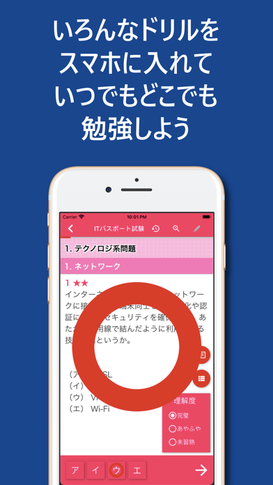
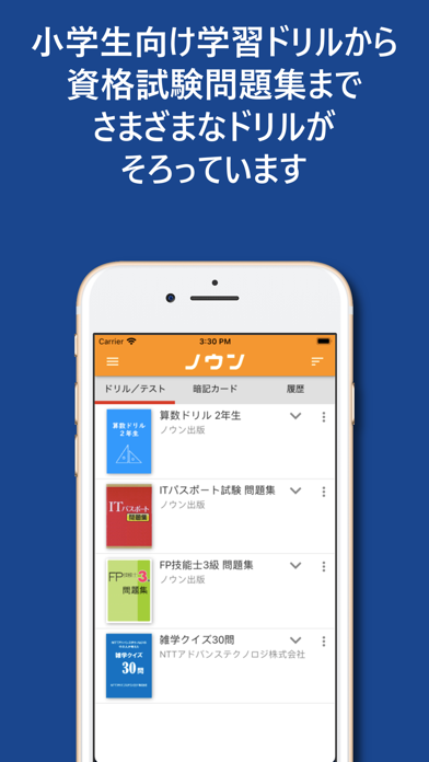


iPad screenshots


Icon palette
About this app
いろんなドリルをスマホに入れていつでもどこでも勉強しよう!ノウンには小学生向け学習ドリルから資格試験問題集までさまざまなドリルがそろっています! デジタルドリルアプリ「ノウン」は、問題上に解答の過程や解法のメモなどを直接書き込めるため、記憶の定着や過去の学習履歴の確認ができ、繰り返し学習の効果を飛躍的に高める、新しいスタイルの学習アプリです。また、自動採点や過去の学習履歴に応じた自動再出題機能、学習結果の蓄積・分析機能など、デジタルならではの機能も備えており、個々のユーザーに合った最適な学習方法を提供します。 ■「ノウン」ではこんなことがができます。 ・アプリ内課金によりコンテンツの購読、購入ができます。(アプリ内課金に対応したコンテンツのみ購読、購入できます。) ・ 日本人の話す英語に特化した英語音声認識エンジンを用いた英語スピーキング学習ができます。(ご利用には英語スピーキング学習機能に対応したコンテンツが必要です。) ・ 問題に書き込みができ、書き込んだ内容は保存され、後で見返すことが…
App details
What you can learn from ノウン
Every shipping app on the App Store has gone through the same decisions you're working through right now: which screenshot goes first, what caption sits over it, which device frame to show, what color the background should be. The 8 screenshots above are ノウン's answers to those questions — they're public, they're real, and they made it through Apple's review.
What the numbers say: ノウン runs a dark set with one background colour (#1C448C) carried across every screenshot — the listing reads as a single poster when the shots sit side by side in search results. The accent colour we picked up, #EC4C64, is the one to reuse for badges, arrows and highlighted words if you borrow this look. Hit Use this style to open the editor with these exact colours and drop your own screenshot in.
Notice the first screenshot in particular. It's the one users see in search results and on the product page, and it's where most apps spend their best caption and tightest design. Look at the proportion of background to phone, where the text sits, what one thing the image is trying to communicate.
Want to see how other Education apps approach the same problem? Browse more Education apps in the showcase.
Take what works into your own screenshots
Open LaunchShots and design your App Store & Google Play screenshots — pick a device frame, drop captions, ship in minutes. Free, in your browser.
Open the screenshot editor →Apps with a similar look
Closest background + accent colours among the listings we've analysed — useful when you want to see the same palette handled by a different team.