Chart position — tracked daily by LaunchShots
Screenshot style breakdown
Sampled from 5 of パートナー探しはmix(ミックス)支え合い助け合うマッチング's App Store screenshots — background, accent and theme, measured by LaunchShots (not something Apple publishes).
#FCFCFC bg
#DDDDDD
#EC5C6C accent
#111111 text
Screenshots



Icon palette
About this app
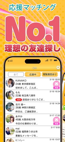
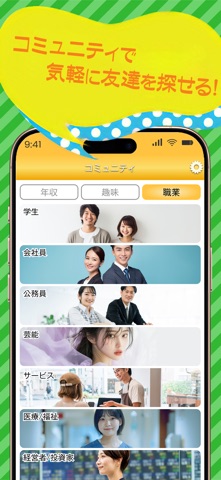
今日「mix」でお気に入りの相手を見つませんか? スキマ時間に気軽に利用できるマッチングアプリだから、忙しい毎日でもサクッとつながりたい方にオススメ! 無料登録&簡単なプロフィール入力で、すぐにマッチング開始! 推しのパートナーとマッチングしたら応援して、仲良くなって、大人のつながりを作ろう! 匿名OKの安心設計があなたの本当のパートナー探しを後押し! ■こんな方におすすめ ・お気に入りの相手(推し)を見つけたい! ・お気に入りの相手(推し)の心の支えになってあげたい! ・お気に入りの相手(推し)の悩みを聞いてあげたい! ・お気に入りの相手(推し)と他愛ない話をしたい! ・お気に入りの相手(推し)と仲良くなりたい! ・自分も誰かに推してもらいたい! ・自分を推してくれる誰かに必要とされたい! ・忙しい毎日をちょっとでも楽しくしたい! お気に入りの相手(推し)との出会いを楽しみませんか? ■mixでできること ・応援 メッセージや専用コンテンツで相手を応援し、パートナーと心のつながりを深められる! 「今日も頑張ろうね!」 …
App details
What you can learn from パートナー探しはmix(ミックス)支え合い助け合うマッチング
Every shipping app on the App Store has gone through the same decisions you're working through right now: which screenshot goes first, what caption sits over it, which device frame to show, what color the background should be. The 5 screenshots above are パートナー探しはmix(ミックス)支え合い助け合うマッチング's answers to those questions — they're public, they're real, and they made it through Apple's review.
What the numbers say: パートナー探しはmix(ミックス)支え合い助け合うマッチング runs a light set where the background shifts from screenshot to screenshot (first shot #FCFCFC) — each image has to stand on its own, so the captions carry more of the story. The accent colour we picked up, #EC5C6C, is the one to reuse for badges, arrows and highlighted words if you borrow this look. Hit Use this style to open the editor with these exact colours and drop your own screenshot in.
Notice the first screenshot in particular. It's the one users see in search results and on the product page, and it's where most apps spend their best caption and tightest design. Look at the proportion of background to phone, where the text sits, what one thing the image is trying to communicate.
Want to see how other Social Networking apps approach the same problem? Browse more Social Networking apps in the showcase.
Take what works into your own screenshots
Open LaunchShots and design your App Store & Google Play screenshots — pick a device frame, drop captions, ship in minutes. Free, in your browser.
Open the screenshot editor →Apps with a similar look
Closest background + accent colours among the listings we've analysed — useful when you want to see the same palette handled by a different team.