Chart position — tracked daily by LaunchShots
Screenshot style breakdown
Sampled from 5 of ねずみタイマー's App Store screenshots — background, accent and theme, measured by LaunchShots (not something Apple publishes).
#AC8C6C bg
#977B5F
#E43C2C accent
#111111 text
Screenshots
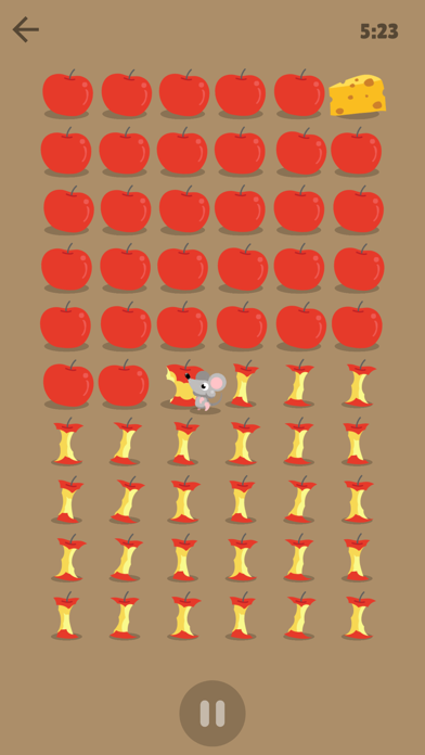
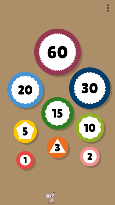
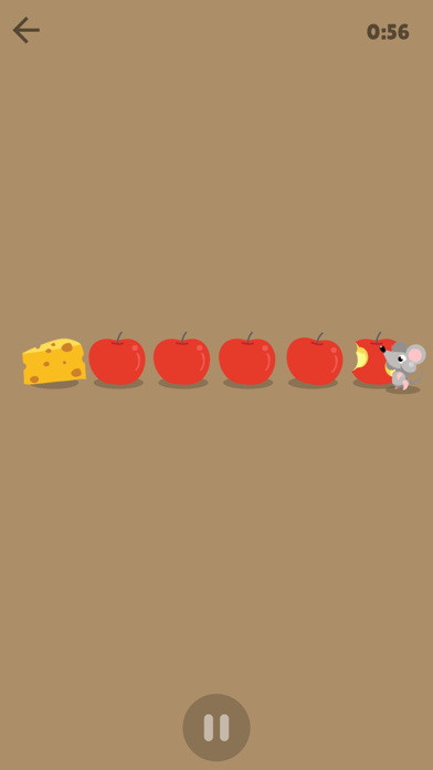
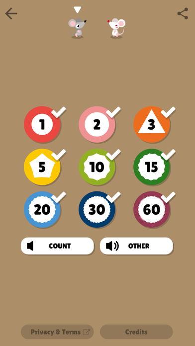

iPad screenshots



Icon palette
About this app
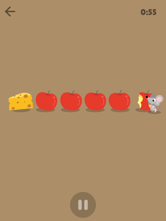
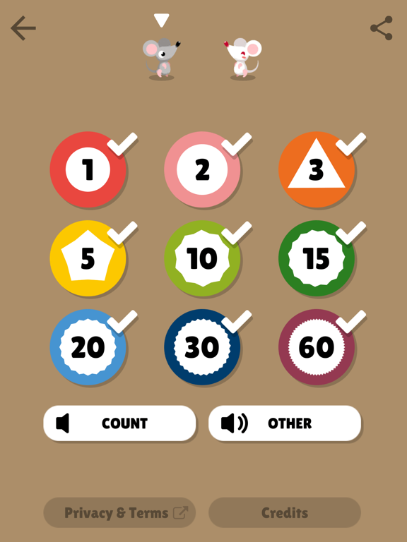
食いしんぼうねずみが主役! 時間の長さが見えるタイマー。 時間の長さの理解が難しいお子さんには、時間を「見える」ようにしてイメージしてもらいましょう。このアプリでは、食いしん坊のねずみがリンゴをかじっていく表現で、時間の長さを伝えます。 LITALICOの先生や、教室に通う保護者さまの声で開発された、ご家庭でも気軽に使えるタイマーです。学習用のツールとしてだけでなく、生活場面で通常のタイマーとしてもご活用いただけます。 広告表示は一切ありませんので、お子様のご利用でも安心です。 アプリの特徴 - 時間を選ぶだけで簡単にアラームがセットできます。 - 時間の選択肢を減らすことができます。 - タイマーは一時停止、再開ができます。 - アプリがバックグラウンドになっても時間がきたら通知でお知らせします。 - 課金で白いねずみが選べるようになります。
App details
What you can learn from ねずみタイマー
Every shipping app on the App Store has gone through the same decisions you're working through right now: which screenshot goes first, what caption sits over it, which device frame to show, what color the background should be. The 10 screenshots above are ねずみタイマー's answers to those questions — they're public, they're real, and they made it through Apple's review.
What the numbers say: ねずみタイマー runs a light set with one background colour (#AC8C6C) carried across every screenshot — the listing reads as a single poster when the shots sit side by side in search results. The accent colour we picked up, #E43C2C, is the one to reuse for badges, arrows and highlighted words if you borrow this look. Hit Use this style to open the editor with these exact colours and drop your own screenshot in.
Notice the first screenshot in particular. It's the one users see in search results and on the product page, and it's where most apps spend their best caption and tightest design. Look at the proportion of background to phone, where the text sits, what one thing the image is trying to communicate.
Want to see how other Education apps approach the same problem? Browse more Education apps in the showcase.
Take what works into your own screenshots
Open LaunchShots and design your App Store & Google Play screenshots — pick a device frame, drop captions, ship in minutes. Free, in your browser.
Open the screenshot editor →Apps with a similar look
Closest background + accent colours among the listings we've analysed — useful when you want to see the same palette handled by a different team.