Chart position — tracked daily by LaunchShots
Screenshot changes — detected by LaunchShots
Screenshot style breakdown
Sampled from 6 of atone (アトネ) - カードがいらない後払い's App Store screenshots — background, accent and theme, measured by LaunchShots (not something Apple publishes).
#F4FCF4 bg
#D6DDD6
#2C94CC accent
#111111 text
Reading the caption text from the screenshots in your browser…
Screenshots


Icon palette
About this app
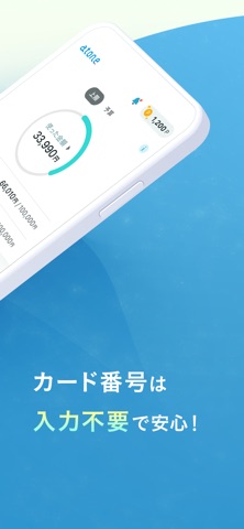
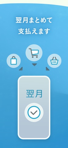
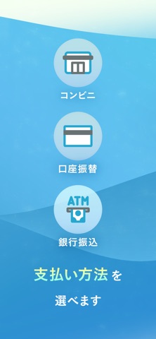
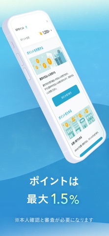
atone (アトネ) - カードがいらない後払い カードがいらない後払いサービスです。 注文が確定した翌月にお支払い。 欲しい時にすぐにお買い物! 【atoneの特徴】 ・カードの登録やチャージは不要 ・ご利用代金をまとめて翌月にお支払い ・コンビニ払い、銀行振込、口座振替を選べる ・ご利用金額、明細はすぐにアプリで確認 ・ポイントが貯まり、1ポイント1円として使える ・お得なキャンペーンも毎月実施 ・業界No.1カンパニーのネットプロテクションズが提供 【atoneが使えるお店】 200万以上のお店で使えて便利! ご利用条件を満たすと、オンラインストア だけでなく実店舗でのご利用も可能! https://nppoint.jp/shops/ 【atoneプラスでもっと便利に】 本人確認と申込だけで、通常会員よりおトクな特典が使えます ネットショップ利用分のポイント還元率が1.5%にアップ(一部0.5%となる場合があります) 分割払いが使えて、毎月の支払いを調整できる(一部のお店が対象) atoneプラスの詳細・お申し込みはこちら https://atone.be/lp/personal/atone-plus/ …
App details
What you can learn from atone (アトネ) - カードがいらない後払い
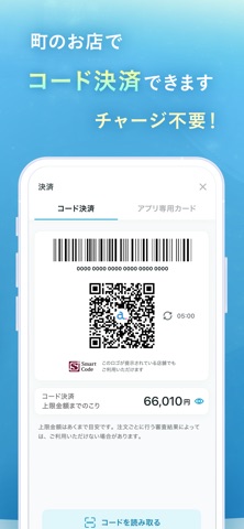
Every shipping app on the App Store has gone through the same decisions you're working through right now: which screenshot goes first, what caption sits over it, which device frame to show, what color the background should be. The 7 screenshots above are atone (アトネ) - カードがいらない後払い's answers to those questions — they're public, they're real, and they made it through Apple's review.
What the numbers say: atone (アトネ) - カードがいらない後払い runs a mixed light-and-dark set where the background shifts from screenshot to screenshot (first shot #F4FCF4) — each image has to stand on its own, so the captions carry more of the story. The accent colour we picked up, #2C94CC, is the one to reuse for badges, arrows and highlighted words if you borrow this look. Hit Use this style to open the editor with these exact colours and drop your own screenshot in.
Notice the first screenshot in particular. It's the one users see in search results and on the product page, and it's where most apps spend their best caption and tightest design. Look at the proportion of background to phone, where the text sits, what one thing the image is trying to communicate.
Want to see how other Finance apps approach the same problem? Browse more Finance apps in the showcase.
Take what works into your own screenshots
Open LaunchShots and design your App Store & Google Play screenshots — pick a device frame, drop captions, ship in minutes. Free, in your browser.
Open the screenshot editor →Apps with a similar look
Closest background + accent colours among the listings we've analysed — useful when you want to see the same palette handled by a different team.