Chart position — tracked daily by LaunchShots
Screenshot style breakdown
Sampled from 6 of Apa Doanya: Doa & Dzikir's App Store screenshots — background, accent and theme, measured by LaunchShots (not something Apple publishes).
#BCDCFC bg
#A5C1DD
#348CCC accent
#111111 text
Screenshots
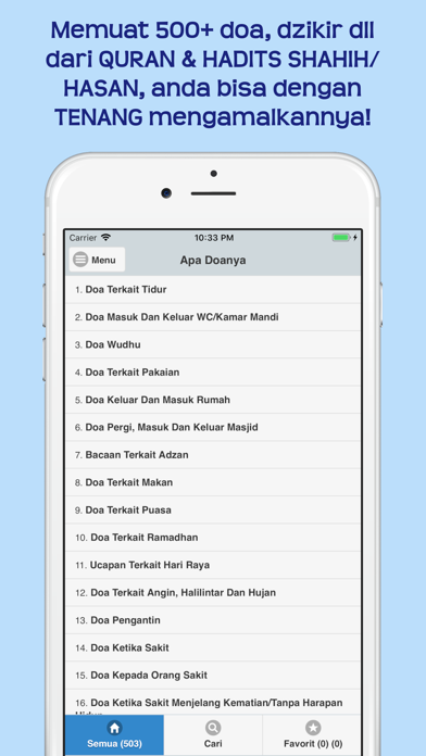
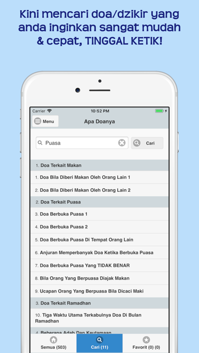
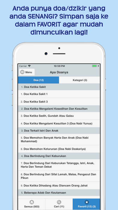
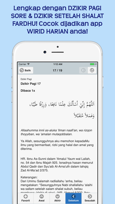
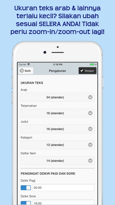
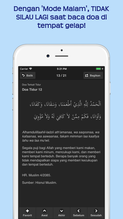
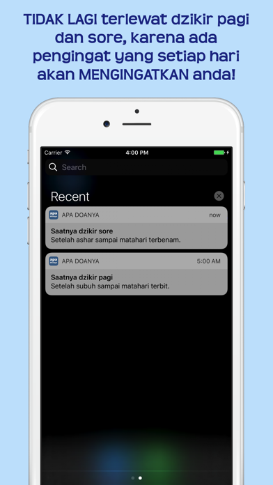
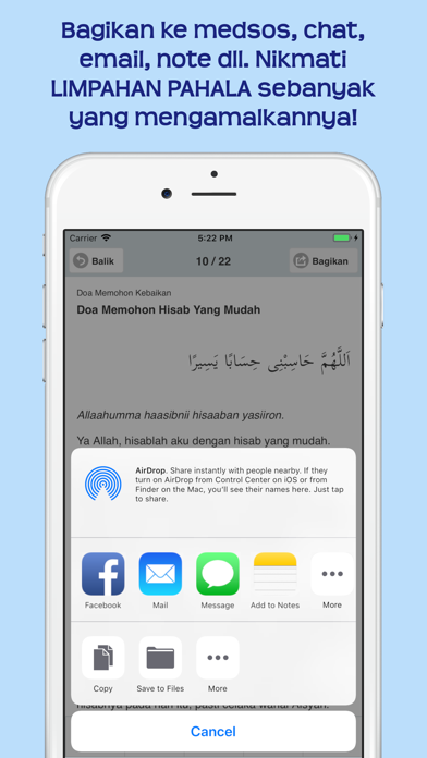
iPad screenshots

Icon palette
About this app
Assalamualaikum, Kaum muslimin, apakah anda pernah mengalami: •Anda ingin memulai suatu aktivitas, ingin berdoa seperti yg diajarkan Nabi, namun anda tidak tahu apa doanya? •Anda mengalami kejadian yg menyenangkan/menyusahkan, ingin berdoa sesuai yg dicontohkan Nabi, namun tidak hafal lafalnya? •Anda sering lupa lafal doa/dzikir yg anda baca? Tercampur satu dgn yg lain? •Anda punya buku kumpulan doa/dzikir lengkap, tapi malas membukanya, harus mencari di daftar isi, tidak selalu dibawa karena tebal/berat, dll? •Anda sudah mencatatnya di gadget, tapi kemudian bingung mencarinya, lupa dimana menyimpannya, menghabiskan waktu, dll? •Semua hal di atas membuat anda merasa berat, sehingga anda malah jadi jarang berdoa/berdzikir?? Bila ya, maka semoga hal berikut bisa sedikit meringankan beban anda. Alhamdulillah, kini telah hadir app "Apa Doanya"! Keutamaan: •Memuat 500+ doa, dzikir, adab d…
App details
What you can learn from Apa Doanya: Doa & Dzikir
Every shipping app on the App Store has gone through the same decisions you're working through right now: which screenshot goes first, what caption sits over it, which device frame to show, what color the background should be. The 9 screenshots above are Apa Doanya: Doa & Dzikir's answers to those questions — they're public, they're real, and they made it through Apple's review.
What the numbers say: Apa Doanya: Doa & Dzikir runs a light set with one background colour (#BCDCFC) carried across every screenshot — the listing reads as a single poster when the shots sit side by side in search results. The accent colour we picked up, #348CCC, is the one to reuse for badges, arrows and highlighted words if you borrow this look. Hit Use this style to open the editor with these exact colours and drop your own screenshot in.
Notice the first screenshot in particular. It's the one users see in search results and on the product page, and it's where most apps spend their best caption and tightest design. Look at the proportion of background to phone, where the text sits, what one thing the image is trying to communicate.
Want to see how other Reference apps approach the same problem? Browse more Reference apps in the showcase.
Take what works into your own screenshots
Open LaunchShots and design your App Store & Google Play screenshots — pick a device frame, drop captions, ship in minutes. Free, in your browser.
Open the screenshot editor →Apps with a similar look
Closest background + accent colours among the listings we've analysed — useful when you want to see the same palette handled by a different team.