Screenshot style breakdown
Sampled from 4 of デジタル身分証アプリ - MyiD's App Store screenshots — background, accent and theme, measured by LaunchShots (not something Apple publishes).
#FCFCFC bg
#DDDDDD
#54B44C accent
#111111 text
Screenshots
iPad screenshots

Icon palette
About this app
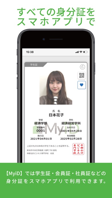
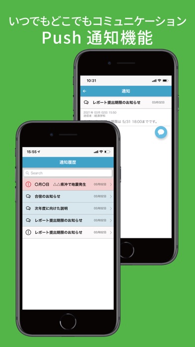
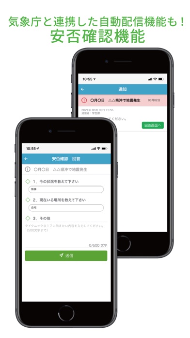
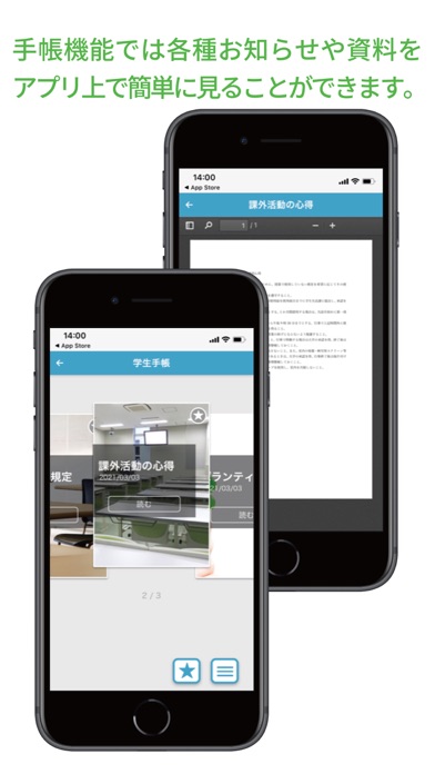
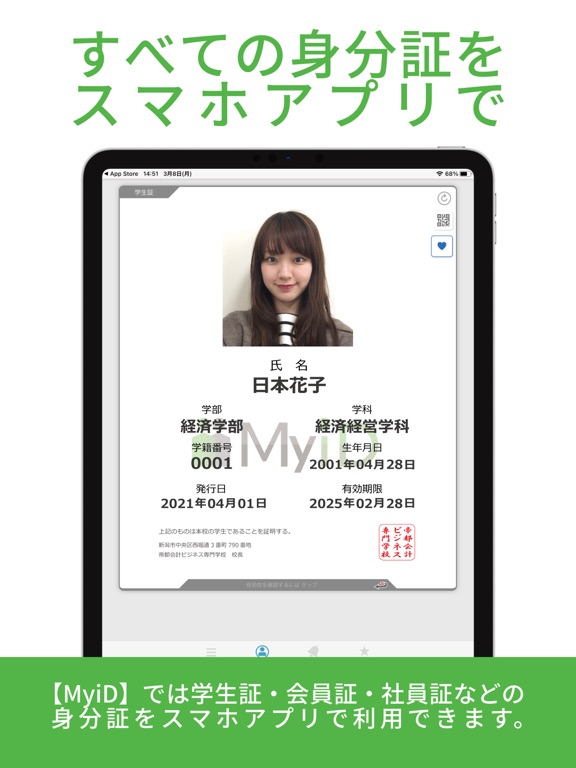
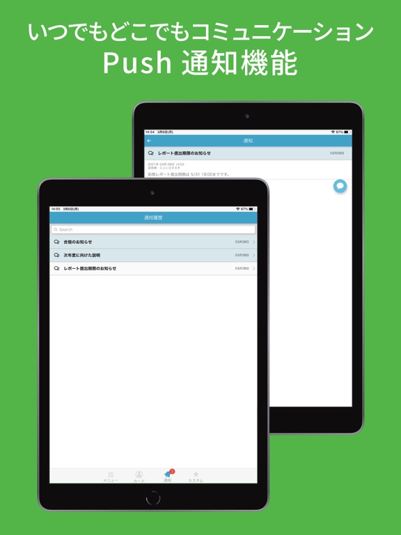
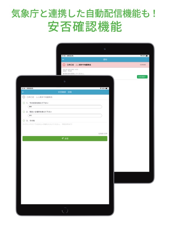
学生証、会員証、社員証など、 デジタル身分証明書をひとつにまとめたアプリです。 身分証明書の複数枚持ちも可能であり、 複数校・複数スクールに所属していても1つのアプリで管理ができます。 身分証明書がスマートフォンに入っていれば、もう忘れることはありません。 持ち運びが便利なだけでなく、様々なサポート機能を提供いたします。 【ご利用上の注意】 ※本アプリを利用するためには、所属する組織における許可・パスワードが必要です。 ※身分証明は表示日時が現在時刻のものが有効です。スクリーンショットでは証明ができません。 【主な機能】 ■デジタル身分証明書 学生証、会員証、社員証としてお使いいただけます。 ■Push通知機能 学校、スクール、会社など所属組織からの連絡がPush通知で受け取れます。 ■施設予約 コートや会議室の予約をスマートフォンから行えます。 ■受講振替 授業・レッスンの振替がいつでも簡単にできます。 ■出席登録 授業やレッスンの出席確認が簡単になります。 ■時間割 …
App details
What you can learn from デジタル身分証アプリ - MyiD
Every shipping app on the App Store has gone through the same decisions you're working through right now: which screenshot goes first, what caption sits over it, which device frame to show, what color the background should be. The 8 screenshots above are デジタル身分証アプリ - MyiD's answers to those questions — they're public, they're real, and they made it through Apple's review.
What the numbers say: デジタル身分証アプリ - MyiD runs a light set where the background shifts from screenshot to screenshot (first shot #FCFCFC) — each image has to stand on its own, so the captions carry more of the story. The accent colour we picked up, #54B44C, is the one to reuse for badges, arrows and highlighted words if you borrow this look. Hit Use this style to open the editor with these exact colours and drop your own screenshot in.
Notice the first screenshot in particular. It's the one users see in search results and on the product page, and it's where most apps spend their best caption and tightest design. Look at the proportion of background to phone, where the text sits, what one thing the image is trying to communicate.
Want to see how other Education apps approach the same problem? Browse more Education apps in the showcase.
Take what works into your own screenshots
Open LaunchShots and design your App Store & Google Play screenshots — pick a device frame, drop captions, ship in minutes. Free, in your browser.
Open the screenshot editor →Apps with a similar look
Closest background + accent colours among the listings we've analysed — useful when you want to see the same palette handled by a different team.