Chart position — tracked daily by LaunchShots
Screenshot style breakdown
Sampled from 6 of أطلب مياه تانيا Tania's App Store screenshots — background, accent and theme, measured by LaunchShots (not something Apple publishes).
#84A4B4 bg
#74909E
#344C6C accent
#111111 text
Screenshots
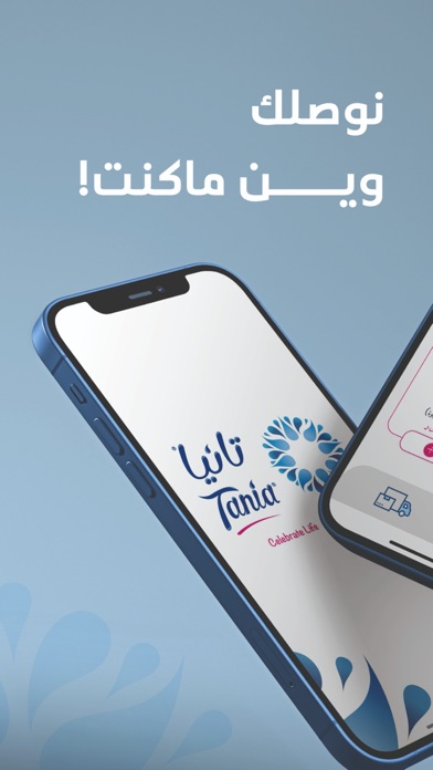
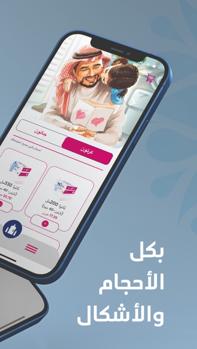

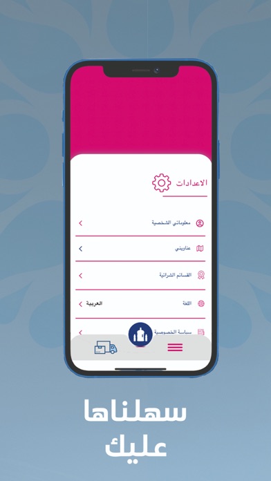
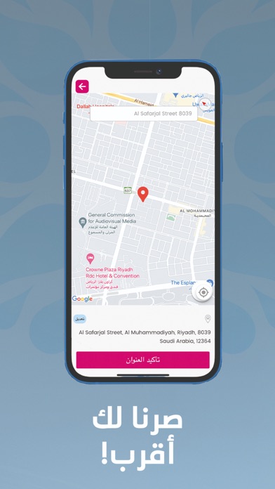
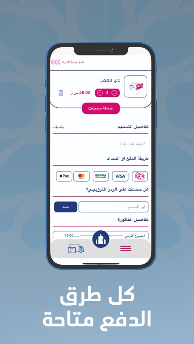
iPad screenshots


Icon palette
About this app
في تانيا الجودة ليست فقط طريقة عملنا أو أسلوب نتبعه بل هي إيمان داخلنا بأساس كل عملية نقوم بها. إنها المبدأ الجامع الذي ننتهجه في كل مجالاتنا من التعبأة، التغليف، الزجاجات، النقل، التوزيع وخدمة احتياجات عملائنا. تهدف تانيا للمياه أن تكون «الخيار الأول» في فئة المياه المعبأة في السعودية. لا تنتهي القصة هنا فقد قمنا بتطوير تطبيق الجوال والذي يقدم لكم المميزات التالية: امكانية طلب عبوات المياه المختلفة المقدمة من تانيا لتصلك في الوقت والمكان المناسبين لك في ثلاث خطوات بسيطة: اختر طلبك، حدد تفاصيل الطلب، ثم تابع تقدُّم الطلب حتى يصلك! امكانية اضافة عناوين مفضلة لتوصيل المياه إليك عند الطلب عرض قائمة بالطلبات السابقة ومتابعة الطلبات الحالية استلام تنبيهات عند تغيّر حالة الطلب يوفر التطبيق طرق دفع سلسة ومريحة لتناسب الجميع: كاش، سداد أو البطاقة الائتمانية. وكذلك من خلال رصيد تانيا! إمكانية الحصول على نقاط رصيد من تانيا ليتم استخدامها لاحقاً كطريقة للدفع إمكانية التواصل المباشر مع خدمة العملا…
App details
What you can learn from أطلب مياه تانيا Tania
Every shipping app on the App Store has gone through the same decisions you're working through right now: which screenshot goes first, what caption sits over it, which device frame to show, what color the background should be. The 12 screenshots above are أطلب مياه تانيا Tania's answers to those questions — they're public, they're real, and they made it through Apple's review.
What the numbers say: أطلب مياه تانيا Tania runs a light set with one background colour (#84A4B4) carried across every screenshot — the listing reads as a single poster when the shots sit side by side in search results. The accent colour we picked up, #344C6C, is the one to reuse for badges, arrows and highlighted words if you borrow this look. Hit Use this style to open the editor with these exact colours and drop your own screenshot in.
Notice the first screenshot in particular. It's the one users see in search results and on the product page, and it's where most apps spend their best caption and tightest design. Look at the proportion of background to phone, where the text sits, what one thing the image is trying to communicate.
Want to see how other Food & Drink apps approach the same problem? Browse more Food & Drink apps in the showcase.
Take what works into your own screenshots
Open LaunchShots and design your App Store & Google Play screenshots — pick a device frame, drop captions, ship in minutes. Free, in your browser.
Open the screenshot editor →Apps with a similar look
Closest background + accent colours among the listings we've analysed — useful when you want to see the same palette handled by a different team.