Chart position — tracked daily by LaunchShots
Screenshot changes — detected by LaunchShots
Screenshot style breakdown
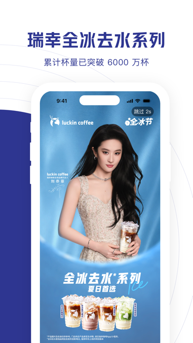
Sampled from 4 of 瑞幸咖啡's App Store screenshots — background, accent and theme, measured by LaunchShots (not something Apple publishes).
#FCFCFC bg
#DDDDDD
#2C3494 accent
#111111 text
Screenshots



Icon palette
About this app
秋日重磅泰奶系列上新! 更多产品,更多选择!不知道喝什么?有瑞幸就够了 还有更多新品,即将解锁 【品牌理念】 瑞幸咖啡作为中国知名连锁咖啡品牌,坚持为顾客提供高品质、高性价比、高便利性的产品和服务。 【活动推荐】 -新人专享:新用户下载 APP,首杯仅需9.9元,自提外送渠道均可使用 -福利中心:APP首页福利中心,周周都有券! -瑞幸会员:喝咖啡,得积分,换好礼 -瑞幸自由卡:每期8杯特价,封顶可省160元 -邀新有礼:邀请好友成为新用户,奖励多多 【产品信息】 -产品新选择:提神的?休闲的?浓郁的?清爽的?超多产品选择,有瑞幸就够了! -健康承诺:瑞幸咖啡全线饮品均达到4个0标准:0植脂末、0阿斯巴甜、0氢化植物油、0反式脂肪酸 -精选好豆:100% 使用阿拉比卡咖啡豆,瑞幸咖啡连续8年荣获IIAC国际咖啡品鉴大赛金奖。 -特调配方:来自澳大利亚、意大利、日本、波兰、巴西、中国的WBC冠军大师团队,精心拼配特调配方。 下载APP,在线点单,进店立取 这一杯,幸运在握!
App details
What you can learn from 瑞幸咖啡
Every shipping app on the App Store has gone through the same decisions you're working through right now: which screenshot goes first, what caption sits over it, which device frame to show, what color the background should be. The 4 screenshots above are 瑞幸咖啡's answers to those questions — they're public, they're real, and they made it through Apple's review.
What the numbers say: 瑞幸咖啡 runs a light set with one background colour (#FCFCFC) carried across every screenshot — the listing reads as a single poster when the shots sit side by side in search results. The accent colour we picked up, #2C3494, is the one to reuse for badges, arrows and highlighted words if you borrow this look. Hit Use this style to open the editor with these exact colours and drop your own screenshot in.
Notice the first screenshot in particular. It's the one users see in search results and on the product page, and it's where most apps spend their best caption and tightest design. Look at the proportion of background to phone, where the text sits, what one thing the image is trying to communicate.
Want to see how other Food & Drink apps approach the same problem? Browse more Food & Drink apps in the showcase.
Take what works into your own screenshots
Open LaunchShots and design your App Store & Google Play screenshots — pick a device frame, drop captions, ship in minutes. Free, in your browser.
Open the screenshot editor →Apps with a similar look
Closest background + accent colours among the listings we've analysed — useful when you want to see the same palette handled by a different team.