Chart position — tracked daily by LaunchShots
Screenshot style breakdown
Sampled from 5 of 运动世界管理's App Store screenshots — background, accent and theme, measured by LaunchShots (not something Apple publishes).
#44C4FC bg
#3BACDD
#3C7494 accent
#111111 text
Screenshots

Icon palette
About this app
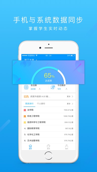
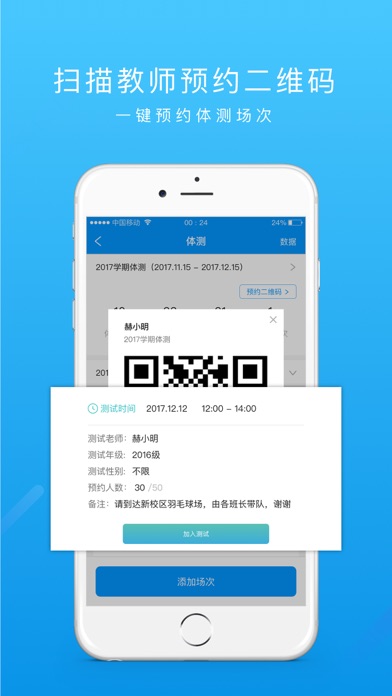
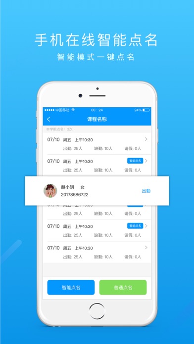
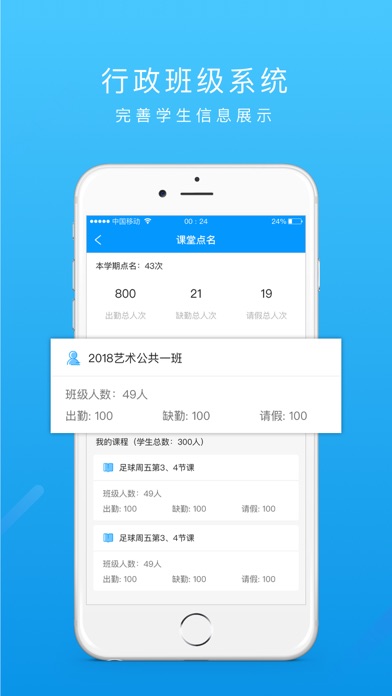
软件介绍: 运动世界管理是一款帮助老师更快捷的查看学生运动情况以及管理学校的软件。 让老师不再局限于在后台进行学校管理,随时随地进行管理操作。 产品特色: @结合运动世界高校体育后台,更方便的对学生进行管理。 @随时查看学校整体运动情况,接收学校讯息。 @使用工具里的功能,让学校管理更快速。
App details
What you can learn from 运动世界管理
Every shipping app on the App Store has gone through the same decisions you're working through right now: which screenshot goes first, what caption sits over it, which device frame to show, what color the background should be. The 5 screenshots above are 运动世界管理's answers to those questions — they're public, they're real, and they made it through Apple's review.
What the numbers say: 运动世界管理 runs a light set with one background colour (#44C4FC) carried across every screenshot — the listing reads as a single poster when the shots sit side by side in search results. The accent colour we picked up, #3C7494, is the one to reuse for badges, arrows and highlighted words if you borrow this look. Hit Use this style to open the editor with these exact colours and drop your own screenshot in.
Notice the first screenshot in particular. It's the one users see in search results and on the product page, and it's where most apps spend their best caption and tightest design. Look at the proportion of background to phone, where the text sits, what one thing the image is trying to communicate.
Want to see how other Sports apps approach the same problem? Browse more Sports apps in the showcase.
Take what works into your own screenshots
Open LaunchShots and design your App Store & Google Play screenshots — pick a device frame, drop captions, ship in minutes. Free, in your browser.
Open the screenshot editor →Apps with a similar look
Closest background + accent colours among the listings we've analysed — useful when you want to see the same palette handled by a different team.