Screenshot style breakdown
Sampled from 5 of هام haam - اخبار العالم ، عاجل's App Store screenshots — background, accent and theme, measured by LaunchShots (not something Apple publishes).
#FCFCFC bg
#DDDDDD
#BC1C4C accent
#111111 text
Screenshots
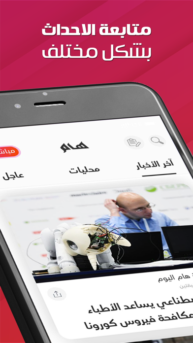
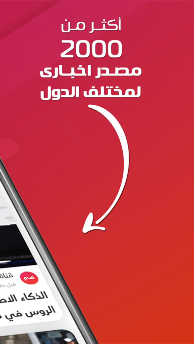
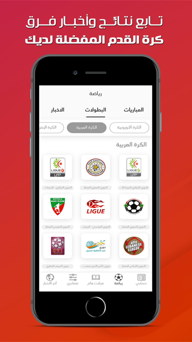
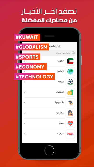

Icon palette
About this app
هام التطبيق المجاني الأفضل لاختيار المصادر الإخبارية المحلية والعالمية كل الاخبار السياسة، الاقتصادية، الرياضة، التقنية، اخبار السيارات، وأكثر.. يجعلك التطبيق على علم واطلاع بكل ما يدور من حولك من اخبار واحداث في كل ثانية في هذا العالم تطبيق هام يأتيك بمصادر إخبارية من السعودية، مصر، الكويت، قطر، الإمارات، البحرين، فلسطين، الأردن، المغرب، تونس، ليبيا، اليمن، لبنان، سوريا، عمان، العراق، السودان ومصادر عربية وعالمية أخرى يوفر تطبيق هام بشكل اختياري خاصية الاشعارات للأخبار العاجلة بشكل مجاني وفوري هام يقدم اخر الاحداث المهمة من حولك بفيديوهات قصيرة يتيح لك التطبيق ايضا مشاركة الاخبار والاحداث مع اصدقائك على شبكات التواصل الاجتماعي توتير فيسبوك انستقرام واتس اب ومسجات ايميل بعض مصادر هام: الراي الوطن الكويتية القبس السياسة الجريدة الانباء البيان الخليج الاتحاد الامارات اليوم الرؤية عكاظ الوطن السعودية الجزيرة الرياض الاقتصادية الاهرام اليوم السابع المصري اليوم شروق الدستور الوطن الب…
App details
What you can learn from هام haam - اخبار العالم ، عاجل
Every shipping app on the App Store has gone through the same decisions you're working through right now: which screenshot goes first, what caption sits over it, which device frame to show, what color the background should be. The 5 screenshots above are هام haam - اخبار العالم ، عاجل's answers to those questions — they're public, they're real, and they made it through Apple's review.
What the numbers say: هام haam - اخبار العالم ، عاجل runs a mixed light-and-dark set where the background shifts from screenshot to screenshot (first shot #FCFCFC) — each image has to stand on its own, so the captions carry more of the story. The accent colour we picked up, #BC1C4C, is the one to reuse for badges, arrows and highlighted words if you borrow this look. Hit Use this style to open the editor with these exact colours and drop your own screenshot in.
Notice the first screenshot in particular. It's the one users see in search results and on the product page, and it's where most apps spend their best caption and tightest design. Look at the proportion of background to phone, where the text sits, what one thing the image is trying to communicate.
Want to see how other News apps approach the same problem? Browse more News apps in the showcase.
Take what works into your own screenshots
Open LaunchShots and design your App Store & Google Play screenshots — pick a device frame, drop captions, ship in minutes. Free, in your browser.
Open the screenshot editor →Apps with a similar look
Closest background + accent colours among the listings we've analysed — useful when you want to see the same palette handled by a different team.