Chart position — tracked daily by LaunchShots
Screenshot style breakdown
Sampled from 5 of 国土マップR's App Store screenshots — background, accent and theme, measured by LaunchShots (not something Apple publishes).
#FCFCFC bg
#DDDDDD
#E4AC24 accent
#111111 text
Screenshots


iPad screenshots
Icon palette
About this app
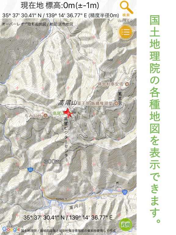
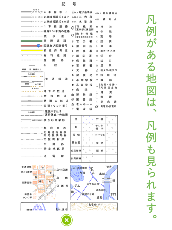
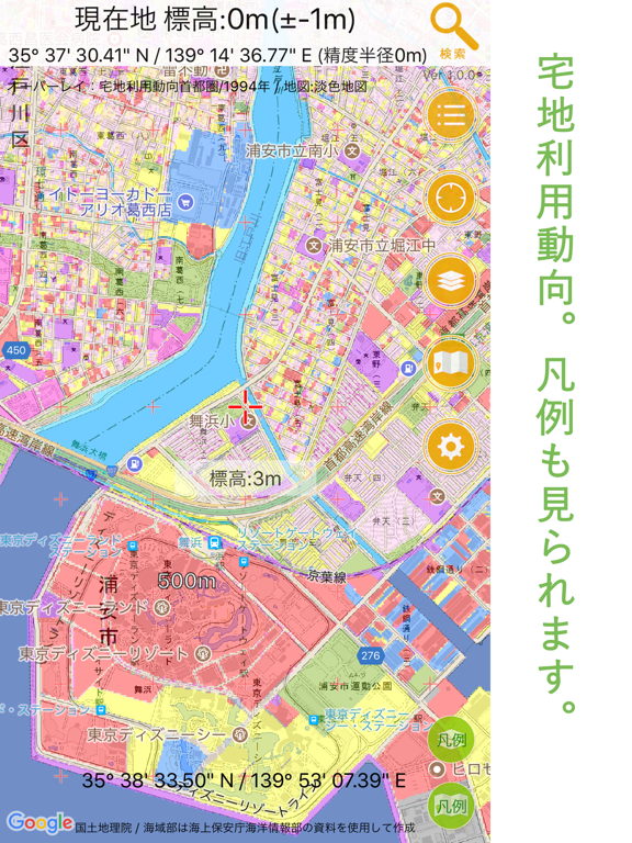
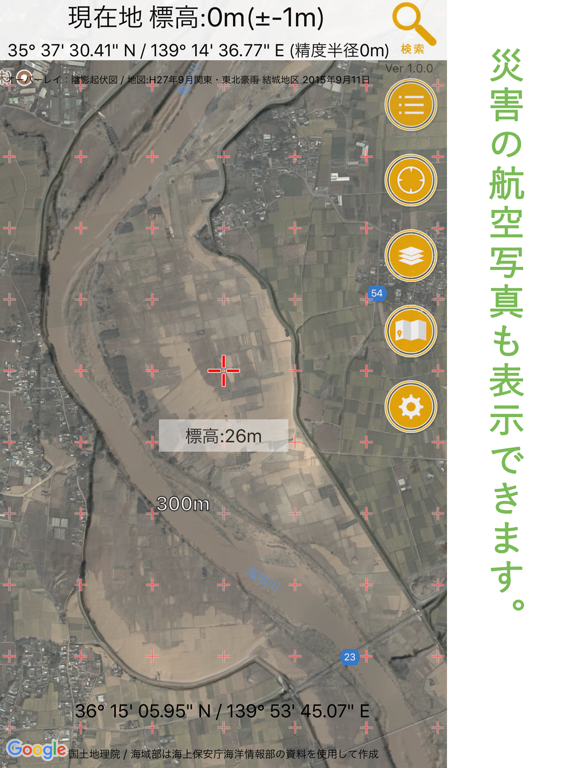
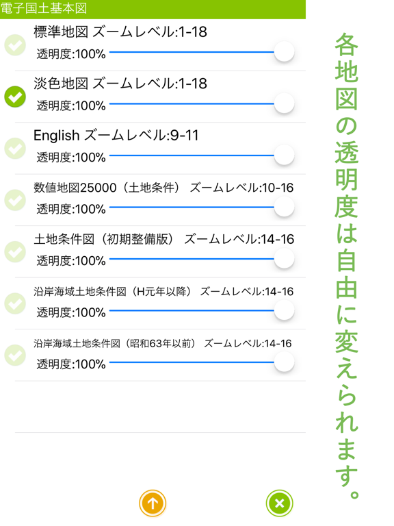
国土地理院が提供する各種地図を表示できるアプリです。日本国内で使用できます。 標準的な地形図、全国の航空写真、宅地利用動向調査、災害時の航空写真、火山基本図、湖沼図など各種地図(160種類以上!)を表示出来ます。 オーバーレイ、ベースマップ、GoogleMapの3枚の地図を重ねて表示できます。 オーバーレイとベースマップは自由に透明度を設定できます。 凡例がある地図についてはボタン一つで凡例を表示出来ます。 画面に表示した地図は200MBまで自動でキャッシュされるので(※)、携帯圏外の山奥や機内モードでの使用も可能です。登山での簡易GPSアプリとしても使えます。 現在地を表示する最低限のGPS機能だけ搭載しました。誰でも簡単に使えます。 画面中央地点の標高を簡単に確認できます。災害対策などに利用してください。 ※…オーバーした分はアプリ起動時に古い順で自動削除されます。スマホのストレージを食いつぶす心配はありません。 ■注意 ・アプリの使用については自己責任となります。 ・情報の正確性、安全性になどについて当方は一切…
App details
What you can learn from 国土マップR
Every shipping app on the App Store has gone through the same decisions you're working through right now: which screenshot goes first, what caption sits over it, which device frame to show, what color the background should be. The 10 screenshots above are 国土マップR's answers to those questions — they're public, they're real, and they made it through Apple's review.
What the numbers say: 国土マップR runs a mixed light-and-dark set where the background shifts from screenshot to screenshot (first shot #FCFCFC) — each image has to stand on its own, so the captions carry more of the story. The accent colour we picked up, #E4AC24, is the one to reuse for badges, arrows and highlighted words if you borrow this look. Hit Use this style to open the editor with these exact colours and drop your own screenshot in.
Notice the first screenshot in particular. It's the one users see in search results and on the product page, and it's where most apps spend their best caption and tightest design. Look at the proportion of background to phone, where the text sits, what one thing the image is trying to communicate.
Want to see how other Navigation apps approach the same problem? Browse more Navigation apps in the showcase.
Take what works into your own screenshots
Open LaunchShots and design your App Store & Google Play screenshots — pick a device frame, drop captions, ship in minutes. Free, in your browser.
Open the screenshot editor →Apps with a similar look
Closest background + accent colours among the listings we've analysed — useful when you want to see the same palette handled by a different team.