Chart position — tracked daily by LaunchShots
Screenshot style breakdown
Sampled from 6 of Английский язык. Учить слова's App Store screenshots — background, accent and theme, measured by LaunchShots (not something Apple publishes).
#5C84EC bg
#7295EE
#44547C accent
#FFFFFF text
Screenshots
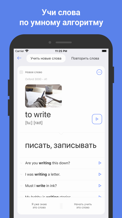
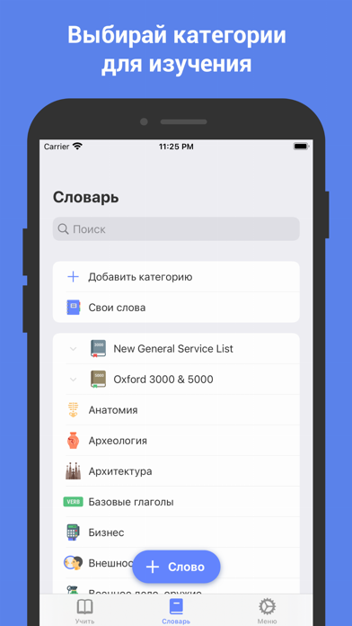
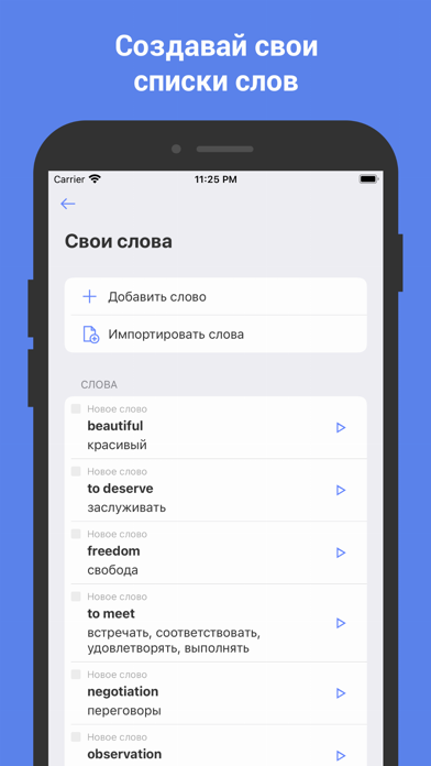
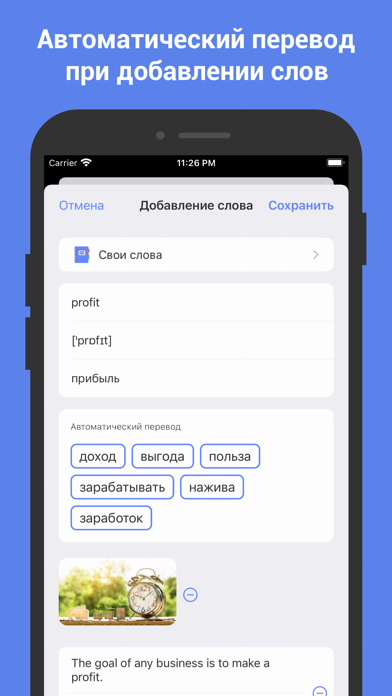
iPad screenshots


Icon palette
About this app
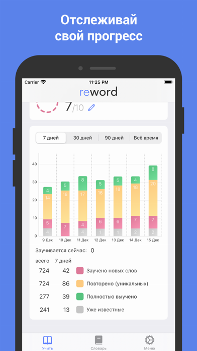
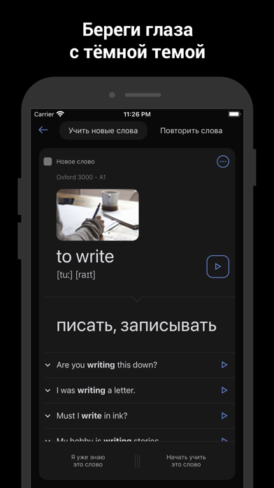
Лучшее приложение для запоминания английских слов. Изучаете английский язык? Запоминайте английские слова эффективно! • Тысячи английских слов и словосочетаний, разбитых по категориям. • Имеются списки слов "New General Service List", "Oxford 3000" и "Oxford 5000" - самые важные списки слов для людей, изучающих английский язык. Выучив их, Вы гарантированно будете понимать 92% английских текстов общей тематики. • Возможность добавлять свои собственные слова и категории слов. • Заучивание и повторение слов по умному алгоритму, основанному на кривой забывания Эббингауза. • Статистика: отслеживайте, как вы учили английские слова последнюю неделю, месяц, три месяца и год. • Оффлайн режим работы. • Простой интерфейс с подсказками. Рекомендуется использовать приложение два-три раза в день с интервалом в несколько часов. Изучая английские слова хотя бы по 5 в день, за год вы пополните свой с…
App details
What you can learn from Английский язык. Учить слова
Every shipping app on the App Store has gone through the same decisions you're working through right now: which screenshot goes first, what caption sits over it, which device frame to show, what color the background should be. The 12 screenshots above are Английский язык. Учить слова's answers to those questions — they're public, they're real, and they made it through Apple's review.
What the numbers say: Английский язык. Учить слова runs a dark set where the background shifts from screenshot to screenshot (first shot #5C84EC) — each image has to stand on its own, so the captions carry more of the story. The accent colour we picked up, #44547C, is the one to reuse for badges, arrows and highlighted words if you borrow this look. Hit Use this style to open the editor with these exact colours and drop your own screenshot in.
Notice the first screenshot in particular. It's the one users see in search results and on the product page, and it's where most apps spend their best caption and tightest design. Look at the proportion of background to phone, where the text sits, what one thing the image is trying to communicate.
Want to see how other Education apps approach the same problem? Browse more Education apps in the showcase.
Take what works into your own screenshots
Open LaunchShots and design your App Store & Google Play screenshots — pick a device frame, drop captions, ship in minutes. Free, in your browser.
Open the screenshot editor →Apps with a similar look
Closest background + accent colours among the listings we've analysed — useful when you want to see the same palette handled by a different team.