Chart position — tracked daily by LaunchShots
Screenshot style breakdown
Sampled from 4 of Regionalny System Ostrzegania's App Store screenshots — background, accent and theme, measured by LaunchShots (not something Apple publishes).
#FCFCFC bg
#DDDDDD
#CC1C2C accent
#111111 text
Screenshots
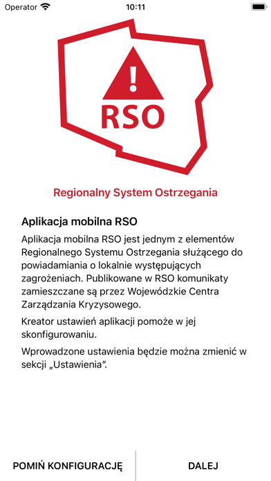
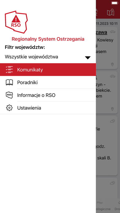
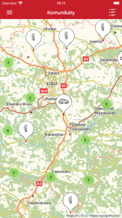
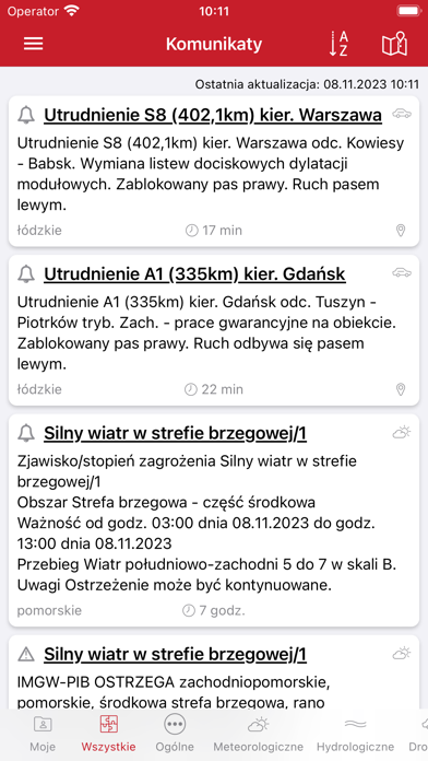
iPad screenshots


Icon palette
About this app
RSO – Regionalny System Ostrzegania (RSO) to bezpłatna aplikacja mobilna powstała przy współpracy Ministerstwa Spraw Wewnętrznych i Administracji z Telewizją Polską S.A. Aplikacja ta jest elementem szerszej usługi informowania społeczeństwa o zagrożeniach na terenie Polski za pośrednictwem różnych kanałów informacyjnych: strony internetowe wojewodów, paski informacyjne i telegazeta w telewizorach odbierających sygnał naziemny DVB oraz internetowa telewizja hybrydowa hbbtv. Poprzez RSO Wojewódzkie Centra Zarządzania Kryzysowego (WCZK) podległe wojewodom przekazują użytkownikom aplikacji mobilnej komunikaty o zagrożeniach różnych typów. W zależności od ich ważności dzielą się one na: • Powiadomienia – mają charakter informacyjny, • Ostrzeżenia – oznaczają ewentualne zagrożenie, znaczące lokalne problemy, a także dotyczą ostrzeżeń wydawanych przez IMGW. Treści takie ukażą się na paskach…
App details
What you can learn from Regionalny System Ostrzegania
Every shipping app on the App Store has gone through the same decisions you're working through right now: which screenshot goes first, what caption sits over it, which device frame to show, what color the background should be. The 8 screenshots above are Regionalny System Ostrzegania's answers to those questions — they're public, they're real, and they made it through Apple's review.
What the numbers say: Regionalny System Ostrzegania runs a mixed light-and-dark set where the background shifts from screenshot to screenshot (first shot #FCFCFC) — each image has to stand on its own, so the captions carry more of the story. The accent colour we picked up, #CC1C2C, is the one to reuse for badges, arrows and highlighted words if you borrow this look. Hit Use this style to open the editor with these exact colours and drop your own screenshot in.
Notice the first screenshot in particular. It's the one users see in search results and on the product page, and it's where most apps spend their best caption and tightest design. Look at the proportion of background to phone, where the text sits, what one thing the image is trying to communicate.
Want to see how other News apps approach the same problem? Browse more News apps in the showcase.
Take what works into your own screenshots
Open LaunchShots and design your App Store & Google Play screenshots — pick a device frame, drop captions, ship in minutes. Free, in your browser.
Open the screenshot editor →Apps with a similar look
Closest background + accent colours among the listings we've analysed — useful when you want to see the same palette handled by a different team.