Chart position — tracked daily by LaunchShots
Screenshot style breakdown
Sampled from 3 of 高知新聞電子版's App Store screenshots — background, accent and theme, measured by LaunchShots (not something Apple publishes).
#046CBC bg
#2780C5
#94BCEC accent
#FFFFFF text
Reading the caption text from the screenshots in your browser…
Screenshots
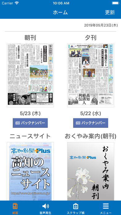
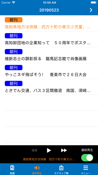

iPad screenshots


Icon palette
About this app
高知新聞のニュース、速報、フリーペーパーや紙面をiPhone/iPadでご覧いただける公式アプリです。紙面イメージを高精細な表示で閲覧できます。 ・毎日午前6時に配信。バックナンバーは過去1ヵ月分が閲覧可能です。 ・データをアプリ側にダウンロードすることで飛行機の中など電波のつながらない場所でも読むことができます ・小さな文字も拡大して表示することができます。 ・気になる記事を簡単操作で「スクラップ帳」に保存し、後から読み返すことができます・紙面からセレクトされた地元ニュースを音声で聞くことができます 【ご注意】 ・パケット通信料が高額になる可能性があるため、パケット定額サービスをご利用になるか、Wi-Fi環境でのご利用をお勧めします ・新聞休刊日は更新されません。
App details
What you can learn from 高知新聞電子版
Every shipping app on the App Store has gone through the same decisions you're working through right now: which screenshot goes first, what caption sits over it, which device frame to show, what color the background should be. The 6 screenshots above are 高知新聞電子版's answers to those questions — they're public, they're real, and they made it through Apple's review.
What the numbers say: 高知新聞電子版 runs a dark set with one background colour (#046CBC) carried across every screenshot — the listing reads as a single poster when the shots sit side by side in search results. The accent colour we picked up, #94BCEC, is the one to reuse for badges, arrows and highlighted words if you borrow this look. Hit Use this style to open the editor with these exact colours and drop your own screenshot in.
Notice the first screenshot in particular. It's the one users see in search results and on the product page, and it's where most apps spend their best caption and tightest design. Look at the proportion of background to phone, where the text sits, what one thing the image is trying to communicate.
Want to see how other News apps approach the same problem? Browse more News apps in the showcase.
Take what works into your own screenshots
Open LaunchShots and design your App Store & Google Play screenshots — pick a device frame, drop captions, ship in minutes. Free, in your browser.
Open the screenshot editor →Apps with a similar look
Closest background + accent colours among the listings we've analysed — useful when you want to see the same palette handled by a different team.