Chart position — tracked daily by LaunchShots
Screenshot style breakdown
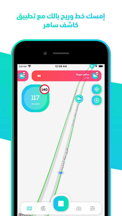
Sampled from 6 of كاشف ساهر - رادار وعداد سرعة's App Store screenshots — background, accent and theme, measured by LaunchShots (not something Apple publishes).
#FCFCFC bg
#DDDDDD
#14D4D4 accent
#111111 text
Screenshots

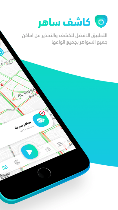
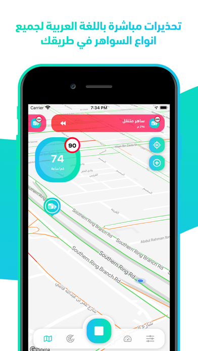
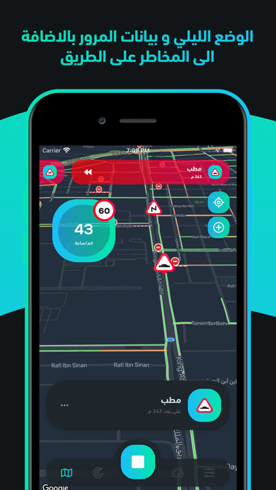
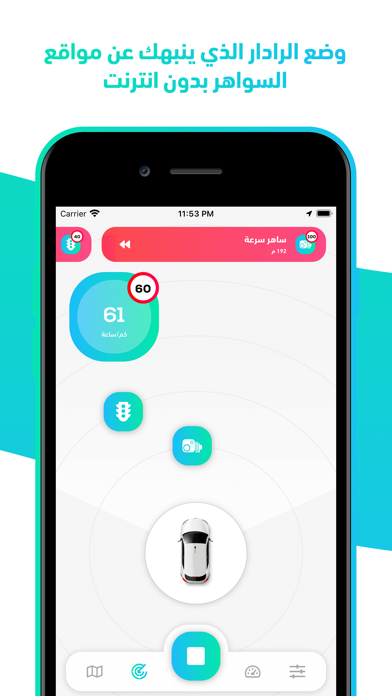


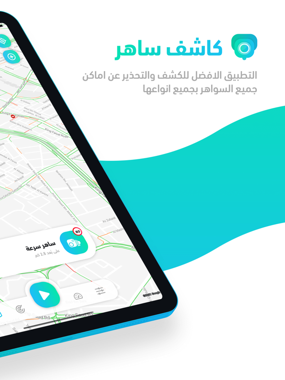
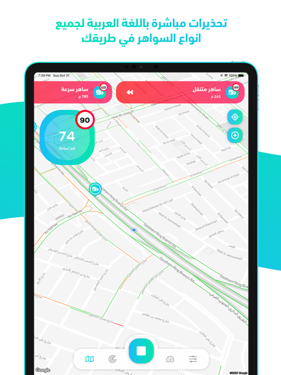
iPad screenshots



Icon palette
About this app
خلّك مطمئن طول الطريق: كاشف ساهر ينبّهك صوتياً قبل كل رادار وكاميرا ساهر بمسافة كافية — فتتفادى المخالفات وتقود براحة بال. يستخدمه سائقون في 8 دول عربية بأكثر من مليون تحميل، ويعمل حتى بدون إنترنت. — ليش كاشف ساهر؟ — • تنبيه صوتي باللهجة قبل الرادار (ثابت أو متحرك) بوقتٍ كافٍ للتخفيف. • يكشف كمان المطبات والكمائن وسواهر الإشارات — مو بس السرعة. • عدّاد سرعة دقيق + الحد الأقصى للطريق، ويشتغل بدون إنترنت. • تغطية 8 دول: السعودية والإمارات والكويت وقطر والبحرين وعُمان ومصر والعراق. • شغّله جنب خرائط جوجل وأنت تسوق — ينبّهك من دون ما توقف الخريطة. — كل المزايا — • تنبيهات مستمرة على الخريطة وفي الخلفية، حتى عند إقفال الشاشة. • تحذيرات صوتية واضحة باللغة العربية. • عرض السرعة الحالية والحد الأقصى للطريق لحظياً. • معلومات المرور والمناطق المزدحمة. • وضع القيادة الليلية المريح للعين. • إعدادات مخصّصة كثيرة للتحكم في التنبيهات كما يناسبك. • استهلاك منخفض جداً للبطارية. • قاعدة بيانات ضخمة لآل…
App details
What you can learn from كاشف ساهر - رادار وعداد سرعة
Every shipping app on the App Store has gone through the same decisions you're working through right now: which screenshot goes first, what caption sits over it, which device frame to show, what color the background should be. The 16 screenshots above are كاشف ساهر - رادار وعداد سرعة's answers to those questions — they're public, they're real, and they made it through Apple's review.
What the numbers say: كاشف ساهر - رادار وعداد سرعة runs a mixed light-and-dark set where the background shifts from screenshot to screenshot (first shot #FCFCFC) — each image has to stand on its own, so the captions carry more of the story. The accent colour we picked up, #14D4D4, is the one to reuse for badges, arrows and highlighted words if you borrow this look. Hit Use this style to open the editor with these exact colours and drop your own screenshot in.
Notice the first screenshot in particular. It's the one users see in search results and on the product page, and it's where most apps spend their best caption and tightest design. Look at the proportion of background to phone, where the text sits, what one thing the image is trying to communicate.
Want to see how other Navigation apps approach the same problem? Browse more Navigation apps in the showcase.
Take what works into your own screenshots
Open LaunchShots and design your App Store & Google Play screenshots — pick a device frame, drop captions, ship in minutes. Free, in your browser.
Open the screenshot editor →Apps with a similar look
Closest background + accent colours among the listings we've analysed — useful when you want to see the same palette handled by a different team.