Screenshot changes — detected by LaunchShots
Screenshot style breakdown
Sampled from 4 of ライズアップ! バルーンを守ろう's App Store screenshots — background, accent and theme, measured by LaunchShots (not something Apple publishes).
#FCBC6C bg
#DDA55F
#D44C2C accent
#111111 text
Reading the caption text from the screenshots in your browser…
Screenshots
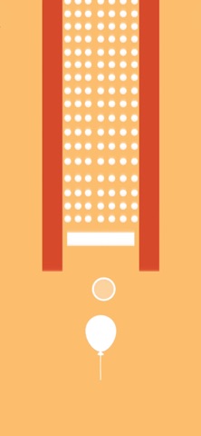

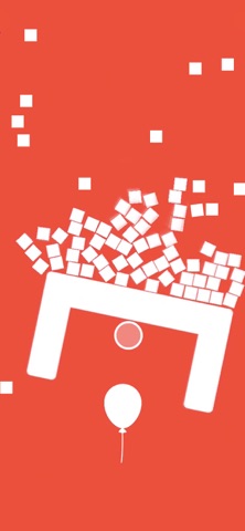

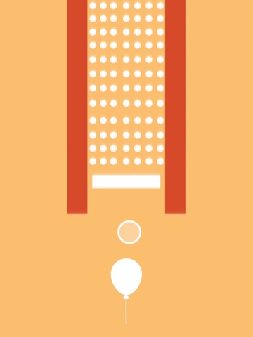
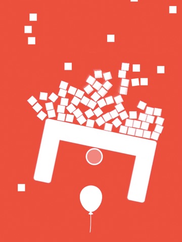
iPad screenshots

Icon palette
About this app
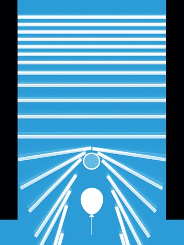
「ライズアップ」へようこそ!興奮のモバイルゲームです。小さなバルーンを守りながらどんどん高く上昇させる挑戦が待っています。 この素晴らしいゲームであなたのスキルを究極の試練に臨んでください。目が離せませんよ。あなたの守るべきは小さなバルーン。バルーンの上昇を妨げる尖った重い物をすべて避けなければなりません。でもそれは簡単ではありません。空はブロック、梁、三角形など奇妙なものでいっぱいです。バルーンがこれらの物に触れてしまえば、ゲームオーバーです。刺激的でしょう? でももっと面白くなります!バルーンが上昇するほど、ゲームは難しくなります。障害物はよりトリッキーで避けるのが難しくなります。すべてを押しのけることができますが、気をつけてください!ブロックが飛び散るとバルーンを守るのが難しくなります。 なぜ「ライズアップ」を遊ぶ時間を惜しむのでしょうか: - 数多くの挑戦的なレベル - 反射神経とクイック思考の究極のテスト - 移動中のゲームに最適 - エキサイティングなゲームセッション - 魅力的な…
App details
What you can learn from ライズアップ! バルーンを守ろう
Every shipping app on the App Store has gone through the same decisions you're working through right now: which screenshot goes first, what caption sits over it, which device frame to show, what color the background should be. The 8 screenshots above are ライズアップ! バルーンを守ろう's answers to those questions — they're public, they're real, and they made it through Apple's review.
What the numbers say: ライズアップ! バルーンを守ろう runs a mixed light-and-dark set where the background shifts from screenshot to screenshot (first shot #FCBC6C) — each image has to stand on its own, so the captions carry more of the story. The accent colour we picked up, #D44C2C, is the one to reuse for badges, arrows and highlighted words if you borrow this look. Hit Use this style to open the editor with these exact colours and drop your own screenshot in.
Notice the first screenshot in particular. It's the one users see in search results and on the product page, and it's where most apps spend their best caption and tightest design. Look at the proportion of background to phone, where the text sits, what one thing the image is trying to communicate.
Want to see how other Games apps approach the same problem? Browse more Games apps in the showcase.
Take what works into your own screenshots
Open LaunchShots and design your App Store & Google Play screenshots — pick a device frame, drop captions, ship in minutes. Free, in your browser.
Open the screenshot editor →Apps with a similar look
Closest background + accent colours among the listings we've analysed — useful when you want to see the same palette handled by a different team.