Screenshot changes — detected by LaunchShots
Screenshot style breakdown
Sampled from 6 of いこストック's App Store screenshots — background, accent and theme, measured by LaunchShots (not something Apple publishes).
#ECF4EC bg
#CFD6CF
#FCE484 accent
#111111 text
Reading the caption text from the screenshots in your browser…
Screenshots



Icon palette
About this app
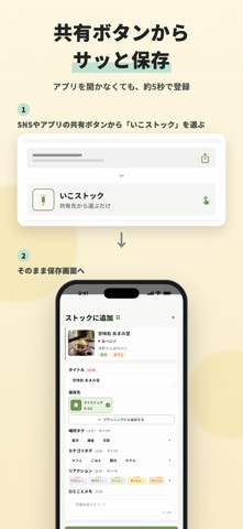
いこストックは、行きたいお店や旅先を保存して、地図でまとめて見返せるアプリです。SNSやWebで見つけた「ここ行きたい!」を、ひとりでもみんなでも、次のおでかけプランにつなげられます。 ■ 見つけたら、共有ボタンからサッと保存 Instagram・Tiktok・食べログ・Googleマップで見つけたページを、各種SNSやアプリの共有ボタンから「いこストックに保存」するだけ。URLは自動で読み込まれ、あとはひとことメモを添えるだけ。住所を登録しておけば、マップで確認できます。 ■ たまった「行きたい」を地図で一望 保存した場所は地図にピンで表示。いまいる場所の近くにある「行きたい」がひと目でわかります。あとから地図で探す手間もありません。 ■ タグで自分だけのリストに整理 「東京」「カフェ」など、場所やカテゴリのタグで整理。絞り込みは一瞬です。 ■ みんなで計画、いこボード 気になる場所を友だちと共有して、日程ボードに並べれば旅行やデートの計画に。誰が追加したかもわかります。 「行きたい」を、なくさない。いこストックで次のおでかけを…
App details
What you can learn from いこストック
Every shipping app on the App Store has gone through the same decisions you're working through right now: which screenshot goes first, what caption sits over it, which device frame to show, what color the background should be. The 6 screenshots above are いこストック's answers to those questions — they're public, they're real, and they made it through Apple's review.
What the numbers say: いこストック runs a light set with one background colour (#ECF4EC) carried across every screenshot — the listing reads as a single poster when the shots sit side by side in search results. The accent colour we picked up, #FCE484, is the one to reuse for badges, arrows and highlighted words if you borrow this look. Hit Use this style to open the editor with these exact colours and drop your own screenshot in.
Notice the first screenshot in particular. It's the one users see in search results and on the product page, and it's where most apps spend their best caption and tightest design. Look at the proportion of background to phone, where the text sits, what one thing the image is trying to communicate.
Want to see how other Travel apps approach the same problem? Browse more Travel apps in the showcase.
Take what works into your own screenshots
Open LaunchShots and design your App Store & Google Play screenshots — pick a device frame, drop captions, ship in minutes. Free, in your browser.
Open the screenshot editor →Apps with a similar look
Closest background + accent colours among the listings we've analysed — useful when you want to see the same palette handled by a different team.