Chart position — tracked daily by LaunchShots
Screenshot changes — detected by LaunchShots
Screenshot style breakdown
Sampled from 5 of Hazardon's App Store screenshots — background, accent and theme, measured by LaunchShots (not something Apple publishes).
#04ACF4 bg
#0397D6
#94ECFC accent
#111111 text
Reading the caption text from the screenshots in your browser…
Screenshots
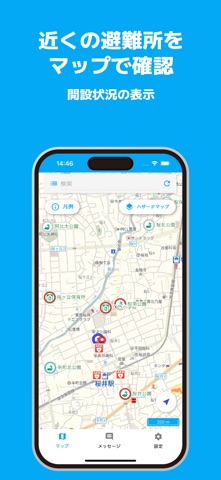

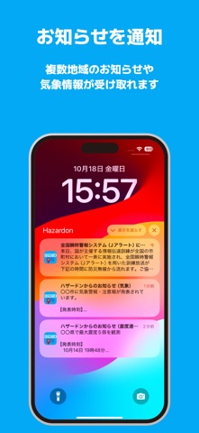

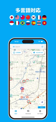
iPad screenshots


Icon palette
About this app
■ 説明 「Hazardon(ハザードン)」は、全国の避難所・避難場所を表示した地図、ハザードマップの表示、自治体からの情報の通知を受け取る防災アプリです。 「土砂災害・洪水・浸水害危険度分布におけるプッシュ通知」は、北九州市との共同研究により機能を提供しています。 ■ ご利用の注意 Hazardonの地図情報・避難所の詳細情報、またプッシュ通知を受け取るにはインターネット接続環境が必要となります。 ■ 主な機能 - マップ操作 ・現在地付近の地図を表示 ・全国の避難所・避難場所の情報の表示 ・避難所の開設状況の表示 ・通行止めなどの地点情報の表示 ・9種類(土砂災害警戒情報・津波浸水等)のハザードマップの表示 ・雨雲レーダー/3種(浸水害・土砂災害・洪水警報)の危険度分布の表示 ・中部電力の停電表示 ・13言語対応(英語、中国語(繁体字/簡体字)、韓国語、タイ語、インドネシア語、フランス語、ドイツ語、ベトナム語、スペイン語、イタリア語、ロシア語、ポルトガル語) ・避難所の受付 ・自治体からのお知らせ連携 - プッシ…
App details
What you can learn from Hazardon
Every shipping app on the App Store has gone through the same decisions you're working through right now: which screenshot goes first, what caption sits over it, which device frame to show, what color the background should be. The 10 screenshots above are Hazardon's answers to those questions — they're public, they're real, and they made it through Apple's review.
What the numbers say: Hazardon runs a light set with one background colour (#04ACF4) carried across every screenshot — the listing reads as a single poster when the shots sit side by side in search results. The accent colour we picked up, #94ECFC, is the one to reuse for badges, arrows and highlighted words if you borrow this look. Hit Use this style to open the editor with these exact colours and drop your own screenshot in.
Notice the first screenshot in particular. It's the one users see in search results and on the product page, and it's where most apps spend their best caption and tightest design. Look at the proportion of background to phone, where the text sits, what one thing the image is trying to communicate.
Want to see how other Weather apps approach the same problem? Browse more Weather apps in the showcase.
Take what works into your own screenshots
Open LaunchShots and design your App Store & Google Play screenshots — pick a device frame, drop captions, ship in minutes. Free, in your browser.
Open the screenshot editor →Apps with a similar look
Closest background + accent colours among the listings we've analysed — useful when you want to see the same palette handled by a different team.