Chart position — tracked daily by LaunchShots
Screenshot changes — detected by LaunchShots
Screenshot style breakdown
Sampled from 4 of ジャンプルーキー!'s App Store screenshots — background, accent and theme, measured by LaunchShots (not something Apple publishes).
#1C8CDC bg
#3B9CE0
#245C8C accent
#FFFFFF text
Screenshots



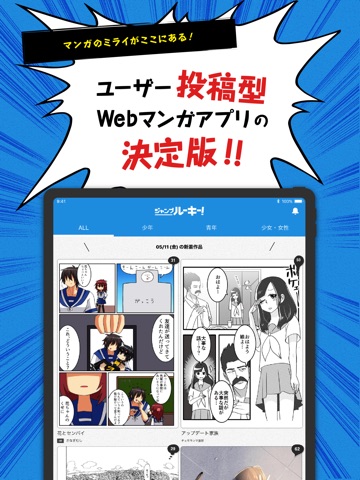
iPad screenshots


Icon palette
About this app
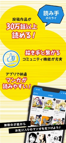
マンガのミライがここにある。 ユーザー投稿型WEBマンガアプリ「ジャンプルーキー!」 描き手と読み手だけの完全自由&オープンな投稿WEBマンガアプリが誕生! 【描き手のミライ!】 ◆広告収益は100%投稿者に還元! ◆ジャンル完全自由のオープンな広場! ◆面白かったら少年ジャンプに掲載! *連載して人気No.1WEBマンガを目指そう!!! 【読み手のミライ!】 ◆可能性溢れるインディーズ作品を40000話以上読める! ◆スマホで読みやすい縦ヨミ専用! ◆描き手と繋がれるコミュニティ機能が充実! *無数の才能からお気に入りのマンガを見つけよう!!! 次世代のWEBマンガはココから生まれる!!! その瞬間を見逃すな!!! ※投稿は、WEBサイトから行ってください。 https://rookie.shonenjump.com/ ※広告収益の還元は、登録した時点からのお支払いになります。また18歳以下の方は、保護者のアカウントで保護者と一緒に登録してください。
App details
What you can learn from ジャンプルーキー!
Every shipping app on the App Store has gone through the same decisions you're working through right now: which screenshot goes first, what caption sits over it, which device frame to show, what color the background should be. The 8 screenshots above are ジャンプルーキー!'s answers to those questions — they're public, they're real, and they made it through Apple's review.
What the numbers say: ジャンプルーキー! runs a mixed light-and-dark set where the background shifts from screenshot to screenshot (first shot #1C8CDC) — each image has to stand on its own, so the captions carry more of the story. The accent colour we picked up, #245C8C, is the one to reuse for badges, arrows and highlighted words if you borrow this look. Hit Use this style to open the editor with these exact colours and drop your own screenshot in.
Notice the first screenshot in particular. It's the one users see in search results and on the product page, and it's where most apps spend their best caption and tightest design. Look at the proportion of background to phone, where the text sits, what one thing the image is trying to communicate.
Want to see how other Book apps approach the same problem? Browse more Book apps in the showcase.
Take what works into your own screenshots
Open LaunchShots and design your App Store & Google Play screenshots — pick a device frame, drop captions, ship in minutes. Free, in your browser.
Open the screenshot editor →Apps with a similar look
Closest background + accent colours among the listings we've analysed — useful when you want to see the same palette handled by a different team.