Chart position — tracked daily by LaunchShots
Screenshot style breakdown
Sampled from 4 of Elika: Gebelik Takvimi's App Store screenshots — background, accent and theme, measured by LaunchShots (not something Apple publishes).
#F4FCFC bg
#D6DDDD
#F48C84 accent
#111111 text
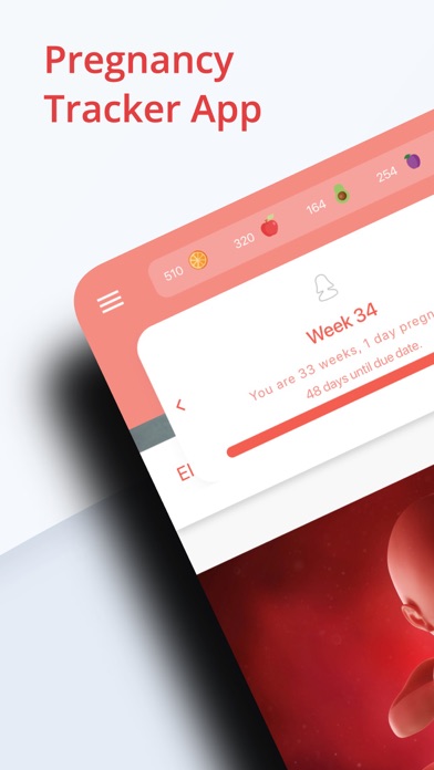
- #1Pregnancy Tracker App 3g
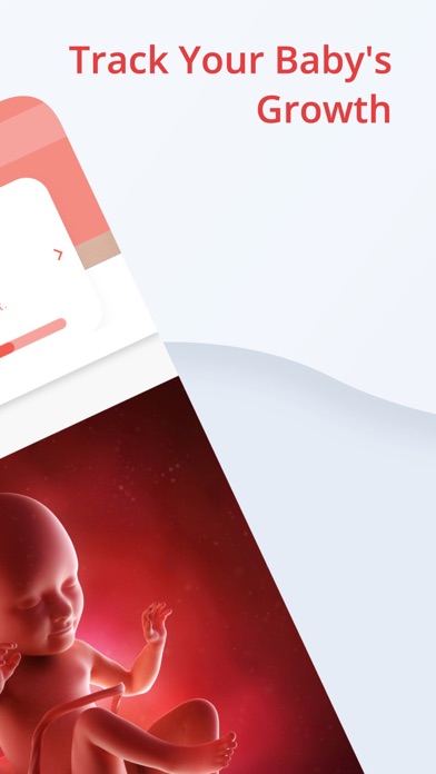
- #2Track Your Baby's A Growth
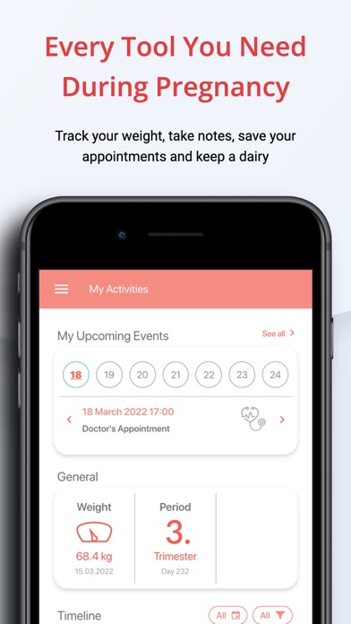
- #3Every Tool You Need During Pregnancy Track your weight, take notes, save your
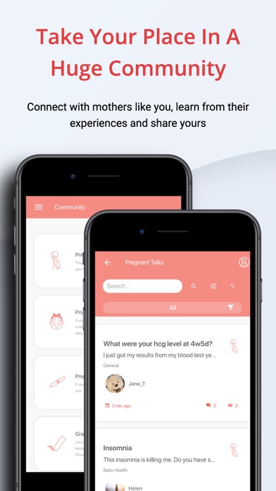
- #4Take Your Place In A Huge Community Connect with mothers like you, learn from their
Captions read from the screenshots (OCR, may contain small errors): 4 headlines, 9.3 words on average (longest 15), 75% speak to "you".
Screenshots
iPad screenshots


Icon palette
About this app
Elika Hamilelik – Gebelik Takip ve Anne Rehberi Elika Hamilelik, anne adaylarının gebelik sürecini bilinçli, keyifli ve güvenli bir şekilde geçirmesine yardımcı olan kapsamlı bir hamilelik takip uygulamasıdır. Hafta hafta gebelik takvimiyle bebeğinizin gelişimini izleyebilir, sağlık durumunuzu kaydedebilir ve doktor kontrollerinizi düzenli biçimde planlayabilirsiniz. Beslenme, egzersiz ve doğum hazırlığına dair tüm bilgileri tek bir uygulamada buluşturan Elika, bu özel dönemde size hem rehber hem de destekçi olur. Neden Elika? Elika, Türkiye’deki anne adayları için özel olarak geliştirilmiş, yerli ve tamamen Türkçe içeriklere sahip bir gebelik asistanıdır. Uygulamanın sade arayüzü sayesinde haftalık gelişim takibini kolayca yapabilir, her hafta bebeğinizin büyümesini görsellerle gözlemleyebilirsiniz. Uzmanlar tarafından hazırlanan içerikler; vitamin ihtiyaçlarından egzersiz önerilerine…
App details
What you can learn from Elika: Gebelik Takvimi
Every shipping app on the App Store has gone through the same decisions you're working through right now: which screenshot goes first, what caption sits over it, which device frame to show, what color the background should be. The 8 screenshots above are Elika: Gebelik Takvimi's answers to those questions — they're public, they're real, and they made it through Apple's review.
What the numbers say: Elika: Gebelik Takvimi runs a light set with one background colour (#F4FCFC) carried across every screenshot — the listing reads as a single poster when the shots sit side by side in search results. The accent colour we picked up, #F48C84, is the one to reuse for badges, arrows and highlighted words if you borrow this look. Hit Use this style to open the editor with these exact colours and drop your own screenshot in.
Notice the first screenshot in particular. It's the one users see in search results and on the product page, and it's where most apps spend their best caption and tightest design. Look at the proportion of background to phone, where the text sits, what one thing the image is trying to communicate.
Want to see how other Medical apps approach the same problem? Browse more Medical apps in the showcase.
Take what works into your own screenshots
Open LaunchShots and design your App Store & Google Play screenshots — pick a device frame, drop captions, ship in minutes. Free, in your browser.
Open the screenshot editor →Apps with a similar look
Closest background + accent colours among the listings we've analysed — useful when you want to see the same palette handled by a different team.