Screenshot style breakdown
Sampled from 5 of Parookaville's App Store screenshots — background, accent and theme, measured by LaunchShots (not something Apple publishes).
#747474 bg
#878787
#4C241C accent
#FFFFFF text
Screenshots
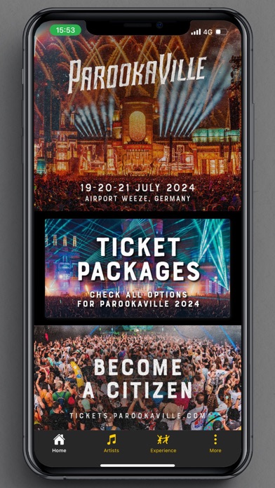
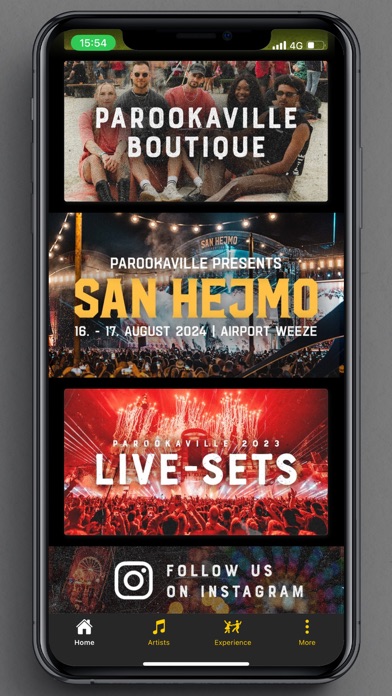
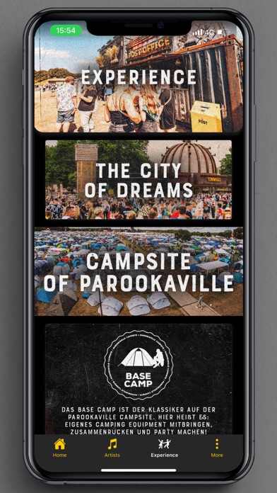

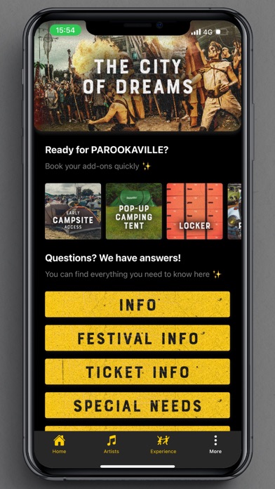
Icon palette
About this app
PAROOKAVILLE Entdecke die offizielle App des größten elektronischen Musikfestivals in Deutschland (Airport Weeze). Parookaville ist weit mehr als ein Musikfestival. Die „City of Dreams" vereint Wahnsinn, Liebe und pure Glückseligkeit und bietet einen Raum ohne Grenzen für Freiheit und Kreativität. In der App ist alles zu finden, was ein Parookaville Citizen wissen muss: Line-up, Timetable, die coolsten Places-to-be und vieles mehr. Wähle deine Lieblingskünstler aus und verpasse durch die Erinnerungsfunktion keine Show! Entdecke die Stadt mit der interaktiven GPS-Festivalkarte und bleib durch die Push-Notifications immer auf dem neuesten Stand! SPECIAL FEATURES: Detaillierter Timetable Künstlerübersicht Übersicht Food & Beverage Angebot Push-Benachrichtigungen Festival- und Camping-Informationen Ticketshop Merchandise Shop Cashless Payment Stay tuned mit der Parookaville App!
App details
What you can learn from Parookaville
Every shipping app on the App Store has gone through the same decisions you're working through right now: which screenshot goes first, what caption sits over it, which device frame to show, what color the background should be. The 5 screenshots above are Parookaville's answers to those questions — they're public, they're real, and they made it through Apple's review.
What the numbers say: Parookaville runs a dark set with one background colour (#747474) carried across every screenshot — the listing reads as a single poster when the shots sit side by side in search results. The accent colour we picked up, #4C241C, is the one to reuse for badges, arrows and highlighted words if you borrow this look. Hit Use this style to open the editor with these exact colours and drop your own screenshot in.
Notice the first screenshot in particular. It's the one users see in search results and on the product page, and it's where most apps spend their best caption and tightest design. Look at the proportion of background to phone, where the text sits, what one thing the image is trying to communicate.
Want to see how other Music apps approach the same problem? Browse more Music apps in the showcase.
Take what works into your own screenshots
Open LaunchShots and design your App Store & Google Play screenshots — pick a device frame, drop captions, ship in minutes. Free, in your browser.
Open the screenshot editor →Apps with a similar look
Closest background + accent colours among the listings we've analysed — useful when you want to see the same palette handled by a different team.