Chart position — tracked daily by LaunchShots
Screenshot changes — detected by LaunchShots
Screenshot style breakdown
Sampled from 6 of Грибы: Определитель по Фото's App Store screenshots — background, accent and theme, measured by LaunchShots (not something Apple publishes).
#1C1C2C bg
#3B3B49
#BC9C74 accent
#FFFFFF text
Screenshots


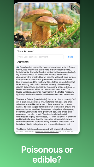


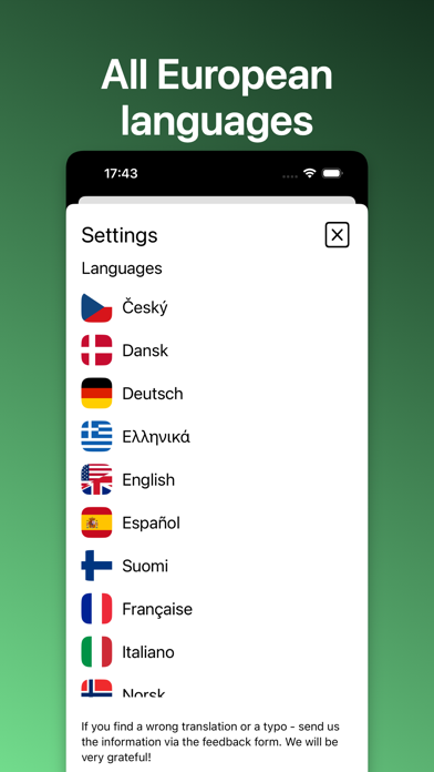
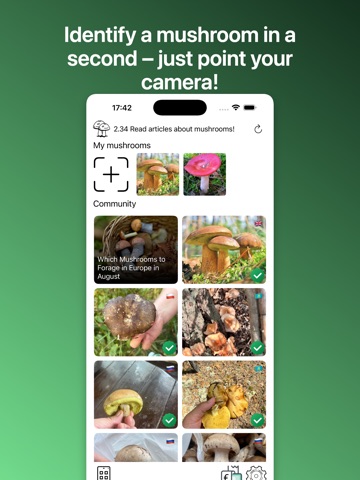
iPad screenshots



Icon palette
About this app
"Определитель грибов" - первый полевой определитель и атлас-энциклопедия грибов, с помощью которого можно определить название гриба по фотографии, морфологическим и экологическим признакам! Возьми с собой на грибную охоту, в поход, в экспедицию, на дачу, в летний лагерь – определяй грибы по внешнему виду, морфологическим и экологическим признакам – прямо в природе или дома по собранным экземплярам! Незаменимый справочный и образовательный ресурс для грибников, путешественников, учащихся, преподавателей, для всех любителей природы! Определитель грибов работает за два простых шага: + - нажми плюс и добавь фотографию * - дождись появления зеленой метки и прочитай подробное описание Хочешь какую-то новую функцию? Напиши в комментариях и мы обязательно ее реализуем. Подписка после первой бесплатной недели стоит 49 ₽. Сайт: https://mushroomid.ru Политика конфиденциальности приложения: …
App details
What you can learn from Грибы: Определитель по Фото
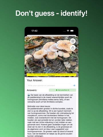
Every shipping app on the App Store has gone through the same decisions you're working through right now: which screenshot goes first, what caption sits over it, which device frame to show, what color the background should be. The 12 screenshots above are Грибы: Определитель по Фото's answers to those questions — they're public, they're real, and they made it through Apple's review.
What the numbers say: Грибы: Определитель по Фото runs a mixed light-and-dark set where the background shifts from screenshot to screenshot (first shot #1C1C2C) — each image has to stand on its own, so the captions carry more of the story. The accent colour we picked up, #BC9C74, is the one to reuse for badges, arrows and highlighted words if you borrow this look. Hit Use this style to open the editor with these exact colours and drop your own screenshot in.
Notice the first screenshot in particular. It's the one users see in search results and on the product page, and it's where most apps spend their best caption and tightest design. Look at the proportion of background to phone, where the text sits, what one thing the image is trying to communicate.
Want to see how other Reference apps approach the same problem? Browse more Reference apps in the showcase.
Take what works into your own screenshots
Open LaunchShots and design your App Store & Google Play screenshots — pick a device frame, drop captions, ship in minutes. Free, in your browser.
Open the screenshot editor →Apps with a similar look
Closest background + accent colours among the listings we've analysed — useful when you want to see the same palette handled by a different team.