Chart position — tracked daily by LaunchShots
Screenshot changes — detected by LaunchShots
Screenshot style breakdown
Sampled from 6 of 弹琴吧-钢琴谱吉他谱分享平台's App Store screenshots — background, accent and theme, measured by LaunchShots (not something Apple publishes).
#E45CA4 bg
#E772B0
#4C0C04 accent
#FFFFFF text
Screenshots


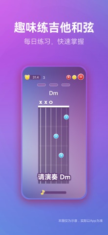
iPad screenshots


Icon palette
About this app
找钢琴谱/吉他谱/尤克里里谱/电子琴谱/小提琴谱 ——就来【弹琴吧】,亿万琴友的共同选择! 智能动态播放器,练琴更顺手 全品类(钢琴谱,吉他谱,尤克里里谱,电子琴谱,小提琴谱)乐谱支持动态光标播放,按键提示,自由调速、分段循环、精细化适配你的练习节奏,读谱演奏一目了然。 专业钢琴谱智能陪练,攻克难点更高效 专属钢琴谱陪练功能,支持自定义划分乐句、节奏评价、分手练习、分段反复打磨,零基础、进阶学习者都能针对性提升演奏熟练度。 乐谱打印/导出,线下练习无阻碍 所有曲谱支持高清预览、一键打印与PDF 导出,打印曲谱、平板离线练琴、线下上课都方便。 实用乐器工具,练琴配件一步配齐 内置钢琴节拍器、吉他调音器、识谱专项训练、吉他和弦图库等工具,无需额外下载软件。 优质曲谱持续上新,精品教学视频随行 平台汇聚专业制谱达人,每日更新优质乐谱,人工审核校对,曲谱质量高。更有名家公开课、原创教学视频,跟着专业老师系统学琴,轻松进阶乐器达人。 更多实用功能 AI 自动翻谱,曲谱标注,识谱练习,听音练习,常用和弦,曲谱伴奏,吉他…
App details
What you can learn from 弹琴吧-钢琴谱吉他谱分享平台
Every shipping app on the App Store has gone through the same decisions you're working through right now: which screenshot goes first, what caption sits over it, which device frame to show, what color the background should be. The 14 screenshots above are 弹琴吧-钢琴谱吉他谱分享平台's answers to those questions — they're public, they're real, and they made it through Apple's review.
What the numbers say: 弹琴吧-钢琴谱吉他谱分享平台 runs a mixed light-and-dark set where the background shifts from screenshot to screenshot (first shot #E45CA4) — each image has to stand on its own, so the captions carry more of the story. The accent colour we picked up, #4C0C04, is the one to reuse for badges, arrows and highlighted words if you borrow this look. Hit Use this style to open the editor with these exact colours and drop your own screenshot in.
Notice the first screenshot in particular. It's the one users see in search results and on the product page, and it's where most apps spend their best caption and tightest design. Look at the proportion of background to phone, where the text sits, what one thing the image is trying to communicate.
Want to see how other Music apps approach the same problem? Browse more Music apps in the showcase.
Take what works into your own screenshots
Open LaunchShots and design your App Store & Google Play screenshots — pick a device frame, drop captions, ship in minutes. Free, in your browser.
Open the screenshot editor →Apps with a similar look
Closest background + accent colours among the listings we've analysed — useful when you want to see the same palette handled by a different team.