Chart position — tracked daily by LaunchShots
Screenshot changes — detected by LaunchShots
Screenshot style breakdown
Sampled from 5 of 喜茶GO's App Store screenshots — background, accent and theme, measured by LaunchShots (not something Apple publishes).
#FCFCFC bg
#DDDDDD
#543C24 accent
#111111 text
Screenshots

Icon palette
About this app
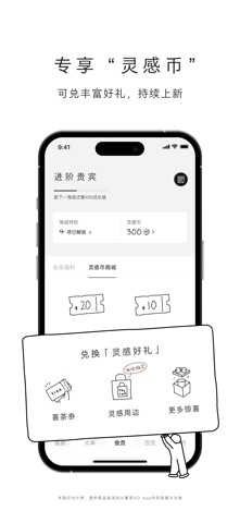
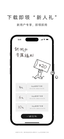
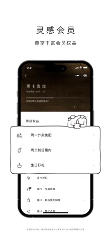
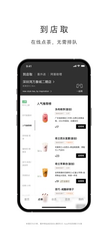
喜茶GO官方App,专享“灵感币”积分体系,可兑丰富好礼。下载即领“新人礼”,更多福利等你体验。 下载有礼:App新用户专享优惠券包,即领即用。 体验专属的会员权益 灵感币:App专享积分体系,兑喜茶券、灵感周边,丰富好礼持续上新 灵感会员:尊享丰富会员特权,周一外卖免配、周二加倍果肉、生日好礼... 体验便捷的线上服务 到店取:在线点单,无需排队 喜外送:足不出户,送喜上门 一起喝:一键邀请多人拼单,自动分账更便捷 体验丰富的个性功能 喜茶百货:瓶装饮品、灵感周边,送货到家 DIY专属喜茶:特调一杯只属于你的灵感茶饮 喜贴创作:定制专属喜贴打印在杯子上,心意随杯呈现 更多「喜茶GO」App专享福利持续更新,等你解锁。
App details
What you can learn from 喜茶GO
Every shipping app on the App Store has gone through the same decisions you're working through right now: which screenshot goes first, what caption sits over it, which device frame to show, what color the background should be. The 5 screenshots above are 喜茶GO's answers to those questions — they're public, they're real, and they made it through Apple's review.
What the numbers say: 喜茶GO runs a light set with one background colour (#FCFCFC) carried across every screenshot — the listing reads as a single poster when the shots sit side by side in search results. The accent colour we picked up, #543C24, is the one to reuse for badges, arrows and highlighted words if you borrow this look. Hit Use this style to open the editor with these exact colours and drop your own screenshot in.
Notice the first screenshot in particular. It's the one users see in search results and on the product page, and it's where most apps spend their best caption and tightest design. Look at the proportion of background to phone, where the text sits, what one thing the image is trying to communicate.
Want to see how other Food & Drink apps approach the same problem? Browse more Food & Drink apps in the showcase.
Take what works into your own screenshots
Open LaunchShots and design your App Store & Google Play screenshots — pick a device frame, drop captions, ship in minutes. Free, in your browser.
Open the screenshot editor →Apps with a similar look
Closest background + accent colours among the listings we've analysed — useful when you want to see the same palette handled by a different team.