Chart position — tracked daily by LaunchShots
Screenshot changes — detected by LaunchShots
Screenshot style breakdown
Sampled from 6 of nosh / ナッシュ's App Store screenshots — background, accent and theme, measured by LaunchShots (not something Apple publishes).
#2C1C1C bg
#493B3B
#8C1C04 accent
#FFFFFF text
Screenshots




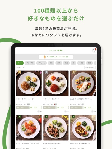
iPad screenshots





Icon palette
About this app
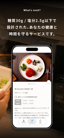
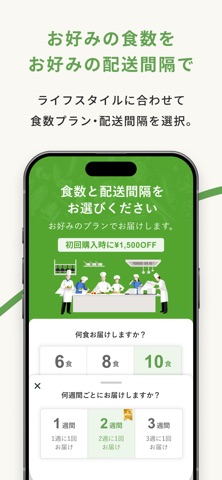
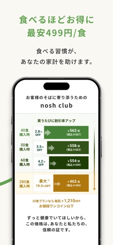
---------------------- アプリからの購入の方限定で総額3,000円OFF! ---------------------- \糖質30g以下・塩分2.5g以下のヘルシーな食事をお届け/ 『nosh-ナッシュ』は糖質30g以下・塩分2.5g以下の食事を 一流の料理人と管理栄養士が監修し、 急速冷凍したお弁当をお客さまにお届けするサービスを提供します。 ▼ noshはこのようなお客さまに選ばれています - 調理の手間なく美味しい食事をしたい方 - 健康的な食生活を送りたい方 - 仕事や家事で料理をする時間がない方 - 好きな時にお好きなメニューの食事をしたい方 - 体質改善チャレンジ中の栄養管理を手軽にしたい方 ◆ 定期配送 ライフスタイルに合わせて配送間隔が選べます。 様々な食材を使用した、食事・スイーツをお届けします。 - 配送間隔 ・1週間に1回 ・2週間に1回 ・3週間に1回 - 業界初のスキップ機能 ・必要がない週の配送は簡単スキップ ・解約金一切不要でいつでもキャンセル可能 ※配送地域に応じて、配送日から4〜5日前には手続きを行う必要がございます。 ◆ 約100種類の豊富なメニュー…
App details
What you can learn from nosh / ナッシュ
Every shipping app on the App Store has gone through the same decisions you're working through right now: which screenshot goes first, what caption sits over it, which device frame to show, what color the background should be. The 14 screenshots above are nosh / ナッシュ's answers to those questions — they're public, they're real, and they made it through Apple's review.
What the numbers say: nosh / ナッシュ runs a mixed light-and-dark set where the background shifts from screenshot to screenshot (first shot #2C1C1C) — each image has to stand on its own, so the captions carry more of the story. The accent colour we picked up, #8C1C04, is the one to reuse for badges, arrows and highlighted words if you borrow this look. Hit Use this style to open the editor with these exact colours and drop your own screenshot in.
Notice the first screenshot in particular. It's the one users see in search results and on the product page, and it's where most apps spend their best caption and tightest design. Look at the proportion of background to phone, where the text sits, what one thing the image is trying to communicate.
Want to see how other Food & Drink apps approach the same problem? Browse more Food & Drink apps in the showcase.
Take what works into your own screenshots
Open LaunchShots and design your App Store & Google Play screenshots — pick a device frame, drop captions, ship in minutes. Free, in your browser.
Open the screenshot editor →Apps with a similar look
Closest background + accent colours among the listings we've analysed — useful when you want to see the same palette handled by a different team.