Chart position — tracked daily by LaunchShots
Screenshot style breakdown
Sampled from 5 of WACOAL CARNET's App Store screenshots — background, accent and theme, measured by LaunchShots (not something Apple publishes).
#FCFCFC bg
#DDDDDD
#FC9CB4 accent
#111111 text
Screenshots

Icon palette
About this app
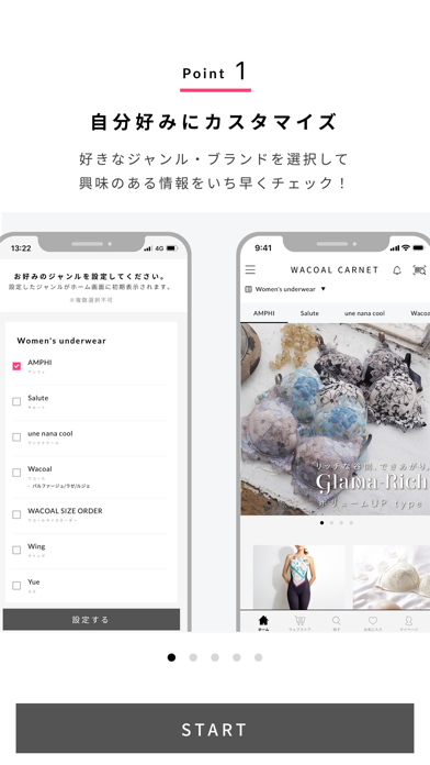
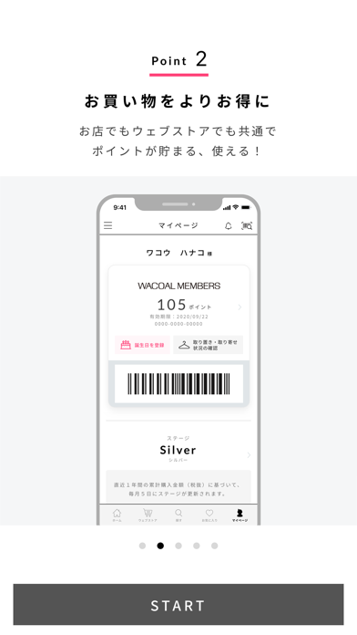
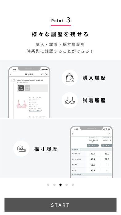
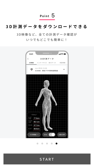
ワコールの公式アプリ「WACOAL CARNET(ワコールカルネ)」。 ワコールの商品やお店の情報が満載のアプリです。商品やお店の情報だけでなく、下着についてのアドバイスや、美・健康に関する情報など、キレイになるためのヒントがたくさん詰まっています。既にワコールの商品をご愛用いただいている方にも初めての方にもお楽しみいただけます。 ◆WACOAL CARNETの特徴◆ ・ワコールの多彩な商品を知ることができる デザイナーが商品への想いを語ったり、ショップスタッフがおすすめ商品をご提案したり。今まで知らなかったワコールの商品にも出会えるきっかけを提供いたします。 ・キレイになるヒントが見つかる 人には聞きづらい下着のことや、美・健康に関する情報が盛りだくさん。気になる情報はお気に入り登録して、自分用にカスタマイズできます。 ・アプリ会員になってポイント活用 アプリ会員への入会は、お名前やメールアドレスの登録など簡単な操作で、すぐに手続きができます。ワコールのお店やウェブストアでご購入をされる都度ポイントが貯まり、お…
App details
What you can learn from WACOAL CARNET
Every shipping app on the App Store has gone through the same decisions you're working through right now: which screenshot goes first, what caption sits over it, which device frame to show, what color the background should be. The 5 screenshots above are WACOAL CARNET's answers to those questions — they're public, they're real, and they made it through Apple's review.
What the numbers say: WACOAL CARNET runs a light set with one background colour (#FCFCFC) carried across every screenshot — the listing reads as a single poster when the shots sit side by side in search results. The accent colour we picked up, #FC9CB4, is the one to reuse for badges, arrows and highlighted words if you borrow this look. Hit Use this style to open the editor with these exact colours and drop your own screenshot in.
Notice the first screenshot in particular. It's the one users see in search results and on the product page, and it's where most apps spend their best caption and tightest design. Look at the proportion of background to phone, where the text sits, what one thing the image is trying to communicate.
Want to see how other Lifestyle apps approach the same problem? Browse more Lifestyle apps in the showcase.
Take what works into your own screenshots
Open LaunchShots and design your App Store & Google Play screenshots — pick a device frame, drop captions, ship in minutes. Free, in your browser.
Open the screenshot editor →Apps with a similar look
Closest background + accent colours among the listings we've analysed — useful when you want to see the same palette handled by a different team.