Chart position — tracked daily by LaunchShots
Screenshot style breakdown
Sampled from 3 of Антирадар GPS・анти радар камер's App Store screenshots — background, accent and theme, measured by LaunchShots (not something Apple publishes).
#2C3464 bg
#495079
#646CF4 accent
#FFFFFF text
Screenshots
Icon palette
About this app
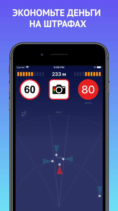
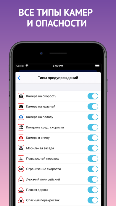
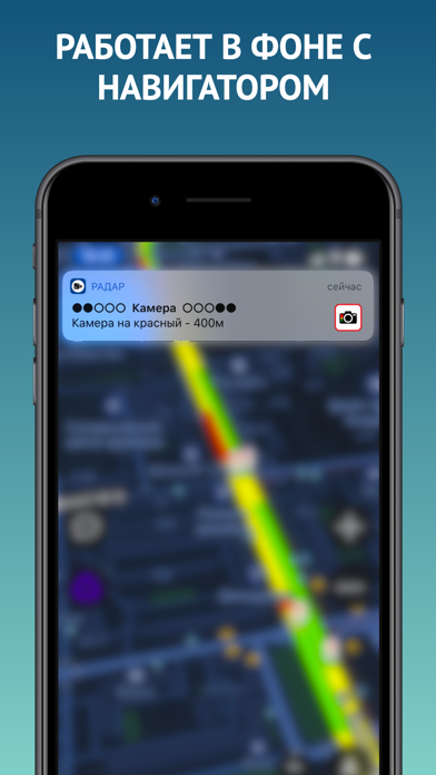
Предупредит Вас о всех типах камер, постах ДПС, лежачих полицейских и других опасностях на дороге, поможет защититься от штрафов за нарушение ПДД. • видит камеры, которые не видят аппаратные антирадары • всегда актуальная база камер, регулярные обновления • информация о возможных местах дпс и треног • не расходует интернет, используется только сигнал GPS • работает в фоне совместно с приложениями для навигации Приложение работает в следующих странах: - Россия - Украина - Белоруссия - Казахстан - Узбекистан Для работы предупреждений нужно нажать Старт и начать движение. При минимальной скорости оповещения не работают. Также не забывайте нажимать кнопку Стоп по завершению поездки, чтобы отключить отслеживание геопозиции и не тратить заряд телефона. ВАЖНО! Некоторые виды камер могут одновременно контролировать и скорость и полосу и обочину и стоп-линию. Использование приложения не га…
App details
What you can learn from Антирадар GPS・анти радар камер
Every shipping app on the App Store has gone through the same decisions you're working through right now: which screenshot goes first, what caption sits over it, which device frame to show, what color the background should be. The 3 screenshots above are Антирадар GPS・анти радар камер's answers to those questions — they're public, they're real, and they made it through Apple's review.
What the numbers say: Антирадар GPS・анти радар камер runs a mixed light-and-dark set where the background shifts from screenshot to screenshot (first shot #2C3464) — each image has to stand on its own, so the captions carry more of the story. The accent colour we picked up, #646CF4, is the one to reuse for badges, arrows and highlighted words if you borrow this look. Hit Use this style to open the editor with these exact colours and drop your own screenshot in.
Notice the first screenshot in particular. It's the one users see in search results and on the product page, and it's where most apps spend their best caption and tightest design. Look at the proportion of background to phone, where the text sits, what one thing the image is trying to communicate.
Want to see how other Navigation apps approach the same problem? Browse more Navigation apps in the showcase.
Take what works into your own screenshots
Open LaunchShots and design your App Store & Google Play screenshots — pick a device frame, drop captions, ship in minutes. Free, in your browser.
Open the screenshot editor →Apps with a similar look
Closest background + accent colours among the listings we've analysed — useful when you want to see the same palette handled by a different team.