Screenshot style breakdown
Sampled from 5 of Siriraj Connect's App Store screenshots — background, accent and theme, measured by LaunchShots (not something Apple publishes).
#FCFCFC bg
#DDDDDD
#0C5C0C accent
#111111 text
Reading the caption text from the screenshots in your browser…
Screenshots
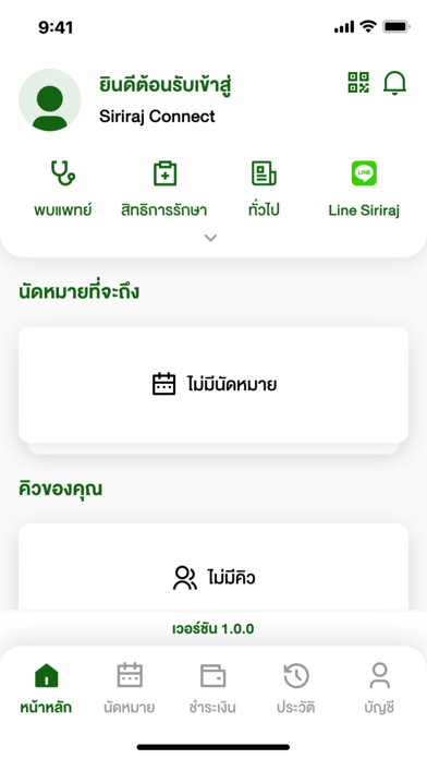
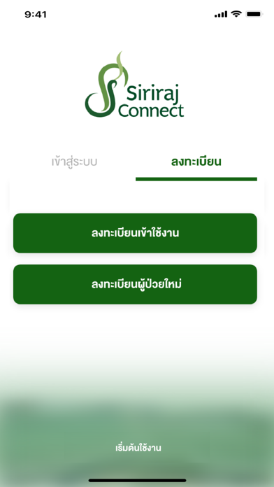
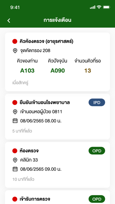


iPad screenshots


Icon palette
About this app
Siriraj Connect เป็นแอพพลิเคชั่นที่นำเสนอประสบการณ์ที่ดีในการให้บริการแก่ผู้เข้ารับบริการต่างๆ ของโรงพยาบาลศิริราช ซึ่งจะสามารถเรียกดูข้อมูลทั่วไป หรือข่าวประชาสัมพันธ์ต่างๆ ของโรงพยาบาล รวมทั้งสามารถเข้าถึงข้อมูลการนัดหมาย, คิวการรับบริการในจุดต่างๆ และการตรวจสอบสิทธิในการรับบริการของตัวเอง รวมทั้งสามารถส่งเอกสารเพื่อรับรองสิทธิการรักษาล่วงหน้าได้ผ่านทางโทรศัพท์มือถือ หรืออุปกรณ์พกพาต่างๆ เป็นการเสริมสร้างภาพลักษณ์ที่ดูทันสมัย และสะดวกสบาย รวมทั้งสร้างความพึงพอใจให้กับผู้ที่มารับบริการที่โรงพยาบาลศิริราช Siriraj Connect is an application to present the good experience in services to customers of Siriraj Hospital. The General information and public relations information are provided by this application. The customers can access the appointment information; queue system alerts customers of upcoming appointments and customer privilege self-service. Siriraj Connect can be sent a custome…
App details
What you can learn from Siriraj Connect
Every shipping app on the App Store has gone through the same decisions you're working through right now: which screenshot goes first, what caption sits over it, which device frame to show, what color the background should be. The 10 screenshots above are Siriraj Connect's answers to those questions — they're public, they're real, and they made it through Apple's review.
What the numbers say: Siriraj Connect runs a light set with one background colour (#FCFCFC) carried across every screenshot — the listing reads as a single poster when the shots sit side by side in search results. The accent colour we picked up, #0C5C0C, is the one to reuse for badges, arrows and highlighted words if you borrow this look. Hit Use this style to open the editor with these exact colours and drop your own screenshot in.
Notice the first screenshot in particular. It's the one users see in search results and on the product page, and it's where most apps spend their best caption and tightest design. Look at the proportion of background to phone, where the text sits, what one thing the image is trying to communicate.
Want to see how other Medical apps approach the same problem? Browse more Medical apps in the showcase.
Take what works into your own screenshots
Open LaunchShots and design your App Store & Google Play screenshots — pick a device frame, drop captions, ship in minutes. Free, in your browser.
Open the screenshot editor →Apps with a similar look
Closest background + accent colours among the listings we've analysed — useful when you want to see the same palette handled by a different team.